As our first week diving into Alteryx comes to a close, I have developed an appreciation for Tableau's coloring within calculated fields.
Something so simple and something I have consistently taken advantage of isn't available within most of Alteryx, except within the Formula Tool.
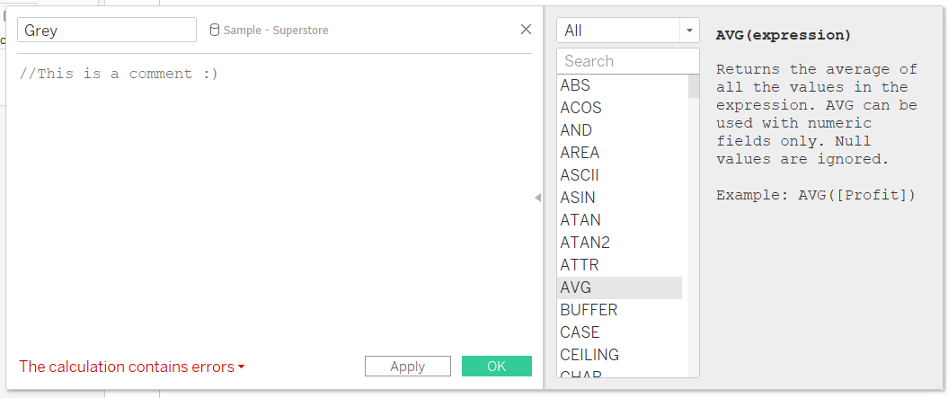
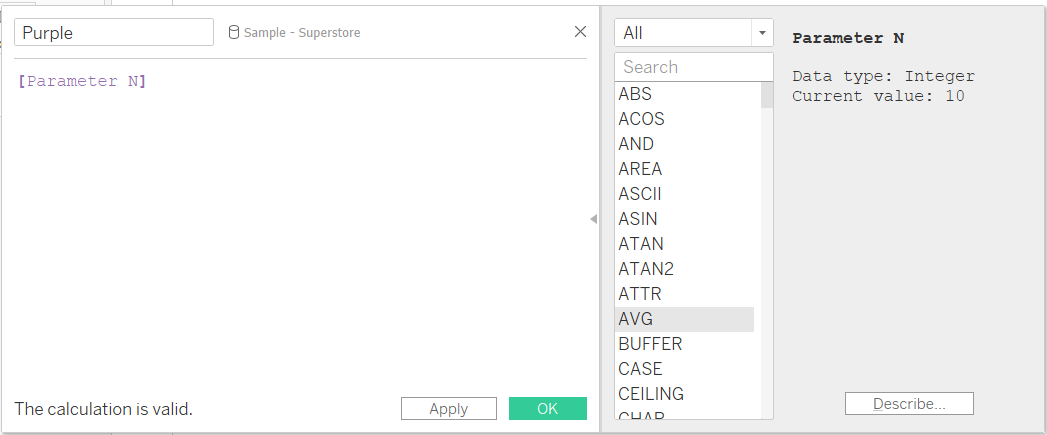
Here's a breakdown of the various colors you will see within calculated fields:
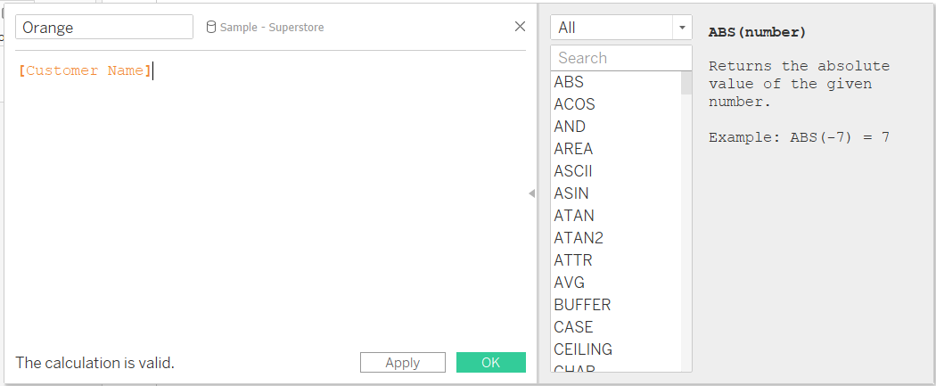
ORANGE:
Represents a field within the data.
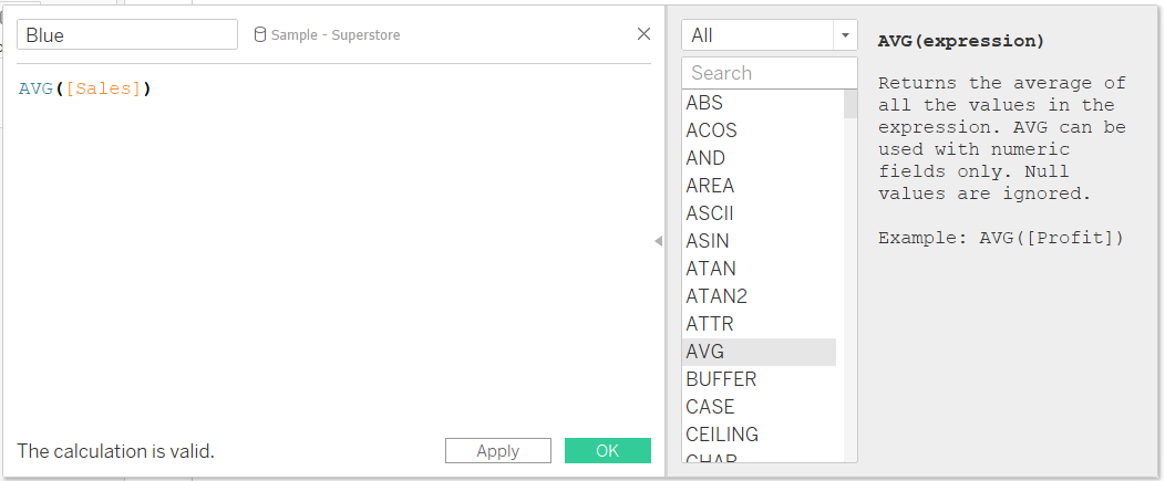
BLUE:
Represents an aggregation.
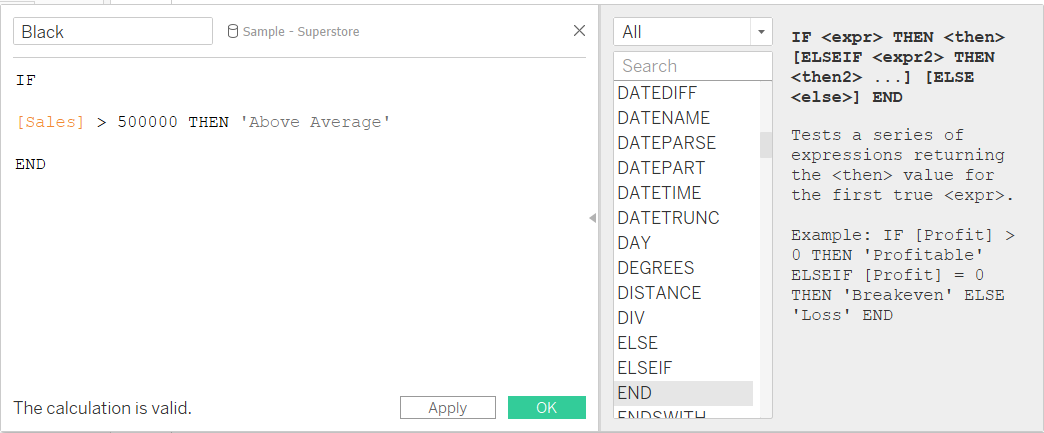
BLACK:
Represents other syntax-related text.
GREY:
Represents Comments.
PURPLE:
Represents parameters.
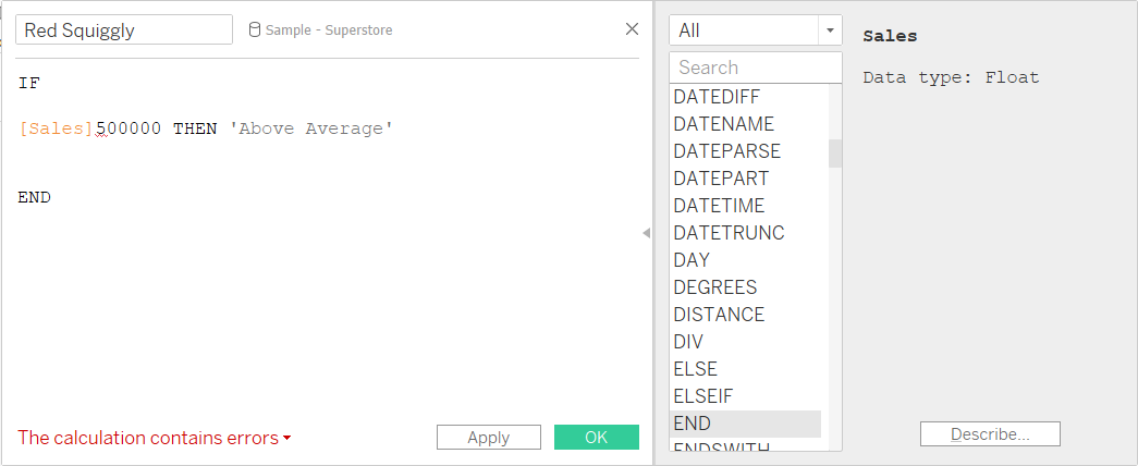
RED:
Will appear as a squiggly line and represents an error.