Overview
A Trellis Chart or Small Multiple charts in Tableau are a great way of showing trends across different subsets of a dataset, and can be used to explore the same data in a unique way. The format involves a repeated grid of small plots which each normally show a line chart, bar chart, or heat maps, but of course can be used for any chart type.
Since they show all subsets of the dataset at once, you can easily compare and contrast across, and as a result it can be a much better way of viewing the data as opposed to just looking at the graphs In isolation, for example when just filtering down.
Here’s how you make it:
Steps
1)
Create an Integer Parameter called Total Columns:
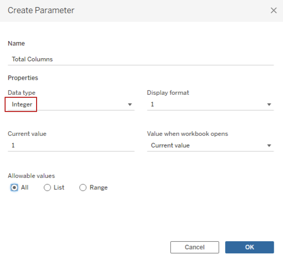
Show this parameter that we made and change it to a value of 5 for now.
2)
Figure out what you would like each plot to show. In this example we will be plotting Quantity against the Profit Ratio as a Bar-on-Line for Each Month, and this is for every Sub-Category (as shown by the filter on chairs):
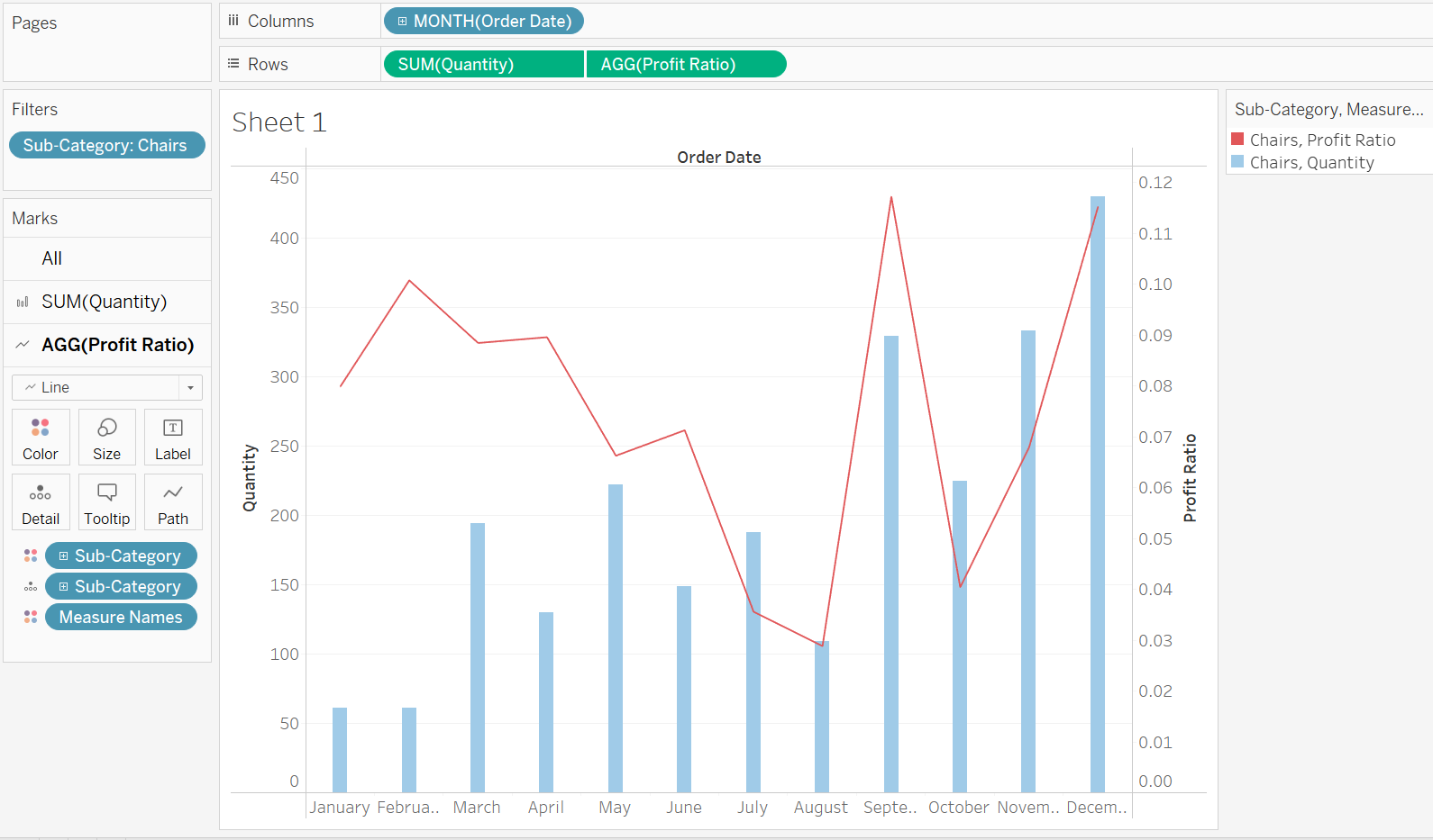
Create this view on a sheet so we have reference for the next few steps.
3)
Create 3 Calculated Fields:
- Index: Index()
- Column: ([Index] - 1) % [Total Columns]
- Row: (([Index] - 1) - [Column]) / [Total Columns]
These are simple calculated fields which determine the small plots created, as well as interacting with the parameter we created earlier.
Feel free to copy and paste these calculated fields (making sure that the parameter and other calculations have the same names).
4)
Next, we begin to build the visualization on another sheet.
- First add the Column calculation to columns and the Row calculation to rows (no surprise there). Make sure these are discrete dimensions.
- Next we add the Index calculation to detail.

- The next step is to recreate the view that we previously had and want to see in each plot, and we initially do this by adding the fields to columns and rows as previously, but this time in front of our new calculated fields, and adding Sub-Category now to detail.
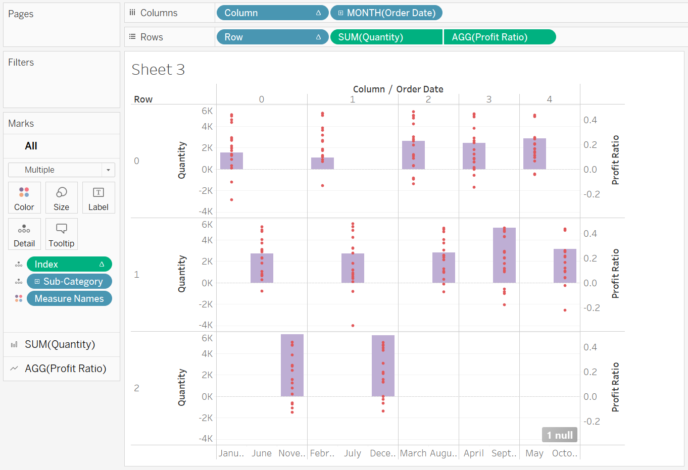
- At the moment this does not look promising, however, after editing the table calculations it all changes.
- We then edit the table calculation in the view for all 3 of these calculations we made (Row, Column and Index) to specific dimension and tick only Sub-Category as that is what we want each plot to show.

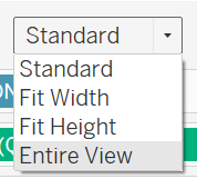
- Make it 'Entire View' to see all of the plots in total, using the view drop down at the top:
- Finally, adjust the formatting and the colours in order to get your desired outcome, as well as changing the amount of columns with the parameter we made earlier, called Total Columns.
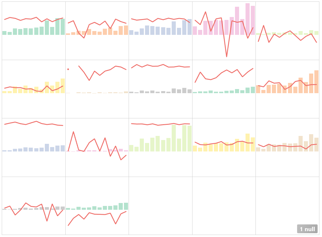
As a bonus: You can add custom labels for each of the plots, and this will be covered in a future blog.
I hope you have followed along okay and that this blog has been useful.
