Today we were given a dataset from https://www.scq.ubc.ca/so-much-candy-data-seriously/, which was looking at american candy data and their popularity over 4 years. Initially this seemed like a very fun dataset and I expected little to no data prep to be involved, however, since our task was to do the entire project in the cloud (Tableau Prep Online & Tableau Web Edit), this proved to be more challenging.
First of all, using the Tableau Prep online version seemed to be refreshing, as it was quick, responsive and easily cleaned data, with little-to-no difference from the desktop version. I went about looking at each of the tables and deciding what structure I would want the data to be in, as well as what fields were relevant or not.
The interesting thing about this dataset was that after surveying individuals to ask their views on 100 or so candies, they also asked some other random questions, including 'How close do you think you are to Beyonce' or 'How do you eat an apple - Left to Right or Up to Down'. This intrigued me, and as a result I decided to place my focus around this accompanying information - which seemed to be a lot more exciting and stupid.
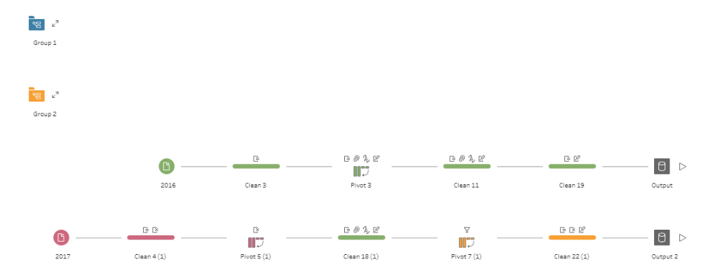
I decided to first ignore the first 2 years (2014&2015) as they had the most useful information for my ideas, and I then transformed the data using pivoting, as well as changing some of the datatypes and performing general cleaning of the data.

Here I met a large obstacle, the 'bugginess' of tableau prep online. The workflow managed to save, but it was not outputting. After many attemps to figure out the vague error response, I decided to seek help, and following this I managed to figure out 2 main problems that was causing the error:
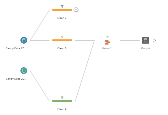
- Tableau Prep doesn't like unions sometimes, and so I decided to first output each segment
- There was a column name with a lot of punctuation that I figured was causing the crash
After making these changes, I was able to output these 2 flows, and then in another workflow I was finally able to union them in the manner I had hoped.

The next part was the fun part but also the most stressful part (if thats possible) - the dashboarding.
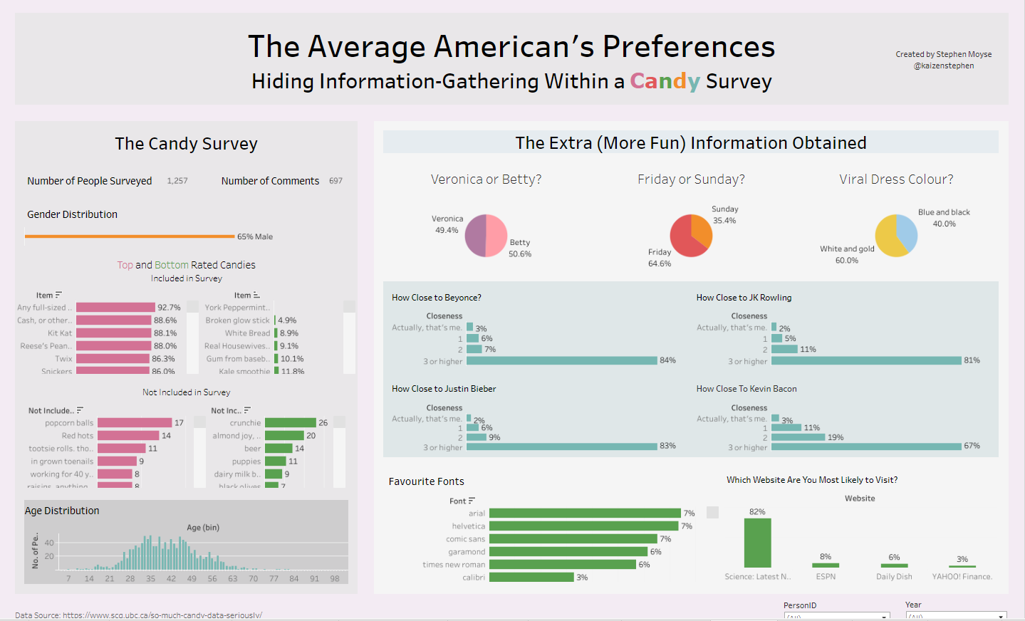
I had the intention of showing focus around the resulting information that was gathered in the inital dataset as opposed to the candy information, as well as theming the dashboard to have a fun and colourful look - something that aligned with the colour of sweets. Using tableau web edit to create this dashboard resulted in several limitations, including in very limited formatting, as well as bizarre errors that are not normally occuring in Tableau dekstop.
Here is my final viz:

Because of the time pressure I was unable to produce some more complex or fun chart types, however I was happy with the result and really excited to present it in front of my cohort!
