


The barbell/dumbbell chart is an excellent way to show a direct comparison between two measures: either two different measures within the same category, or the same measure across two points in time." . Picture two dots connected by a line, like a barbell at the gym. One end is your "before," the other is your "after." The bar connecting them is the whole point of the chart. Long bar, big change. Short bar, not much movement. No bar, nothing happened at all.
The main question a barbell chart answers is: how much changed? And who/what ended up on the “right side” of the change?
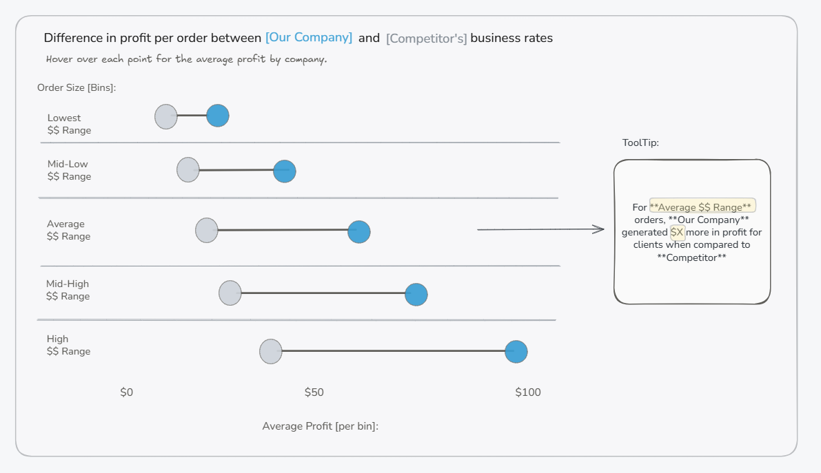
I recently had the opportunity to create a barbell chart for a client to show the difference in profit between their services and their competitors' services. The key insight is that my client’s services increased profit for their business partners as the partners sold higher order sizes.Paired with another chart showing that most customers fell into those higher order size brackets, this made the case that my client was well positioned to deliver greater value to their partners. The barbell chart looked something like this:
This is not the only use case for a barbell chart. Other great use cases include:
- Sales this year vs. last year, by region
- Before/after prices, by product
- Starting salary vs. current salary, by department
A good rule of thumb: if you find yourself building the same graph with a slightly different measure just to compare them side by side, consider a barbell chart (or another comparison chart). The barbell chart shortens the distance the end-user’s eyes have to travel, so the comparison can happen automatically without mental math.
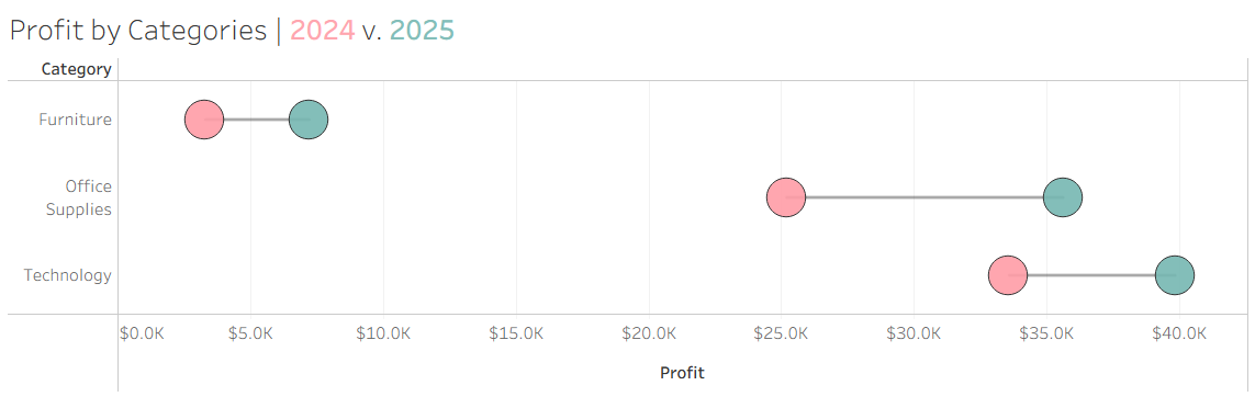
Today, we'll build a barbell chart comparing profit by category in 2025 vs. 2024, using Sample Superstore. The final product will look like this:
Instructions
Assuming you’ve opened a workbook and connected to Sample Superstore, you’ll begin by:
- Creating your two measures. The goal is to eventually put them on a dual axis to create the dots. In order to do this, we need to create calculated fields that specify to Tableau what we want:
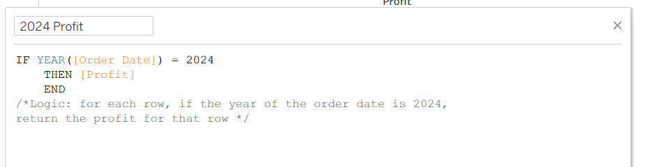
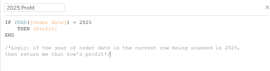
- Bonus level: instead of using 2024 and 2025 as our time spans, we’ll create a calculation to identify Last 12 Months vs. Previous 12-month. Although Superstore is a static dataset, this calculation will come in handy for datasets that frequently update. We will call these calculations Trailing Twelve Months and Prior TTM.
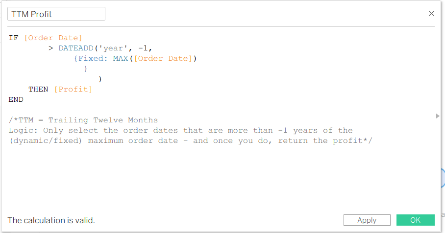
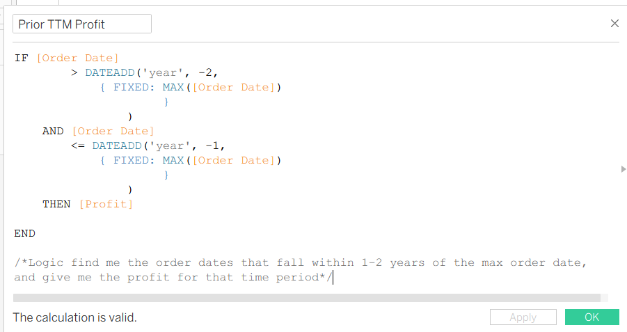
- Drag your dimension onto rows and Measure Values onto Columns. You can find Measure Values on the bottom of the fields listed in your data pane. You’ll notice that once you drag that in, all of the measures in your data set are plotted.
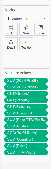
- Drag everything but your 2024 and 2025 Profit off (or TTM and Prior TTM). Change the marks type to circle. At this point, this is how your graph should look.
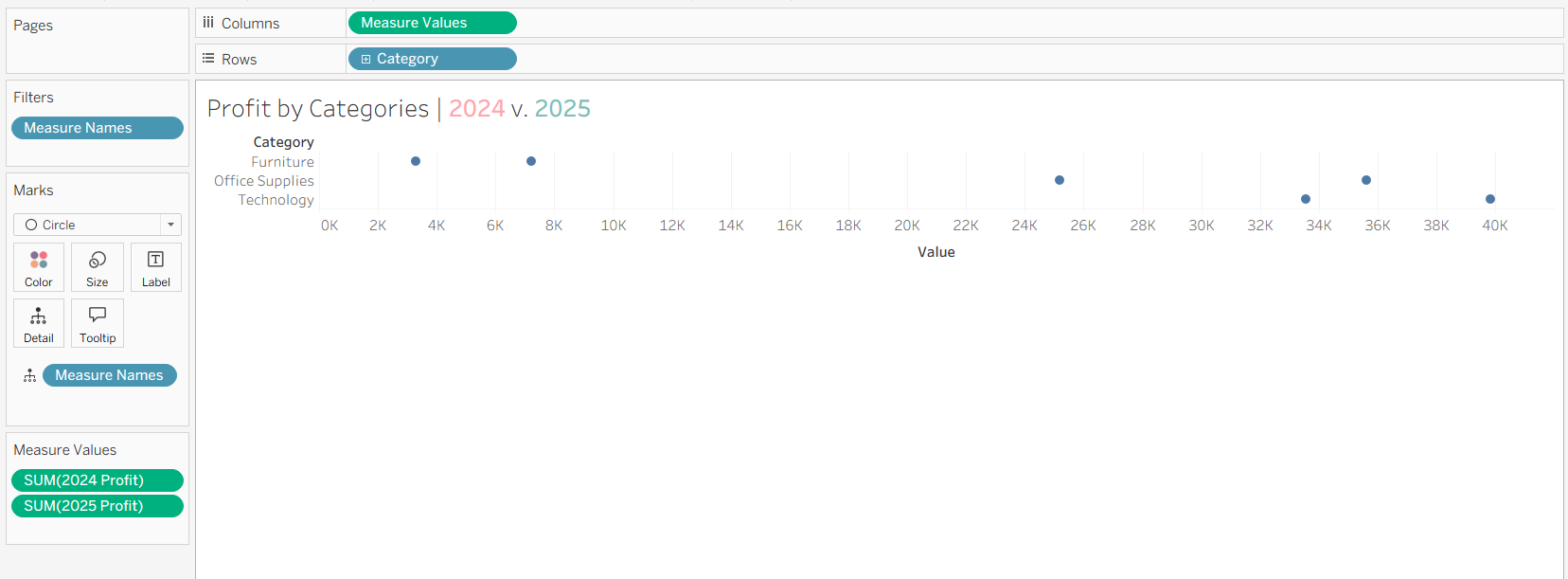
- You may notice that once you began to filter Measure Values, Tableau created a Detail and Filter for the Measure Names. Drag the detail Measure Names onto color to get a distinct color for both measures.
- Now we’ll work on creating the line. Duplicate your Columns’ Measure Value pill (either control + drag or redo). Once you have that, right-click the second one, Dual Axis -> Synchronize axis.
- Now, click specifically on the second marks card you just created by duplicating the pill and set it to a linechart.
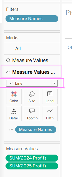
- You’ll notice that the Line Chart setting has produced a line that connects every single point in the data. You’ll also notice that using Line as the marks type has added Path as an option. We’ll drag Measure names onto paths to dictate the line path (as seen in screenshot above). By now, you should see this.
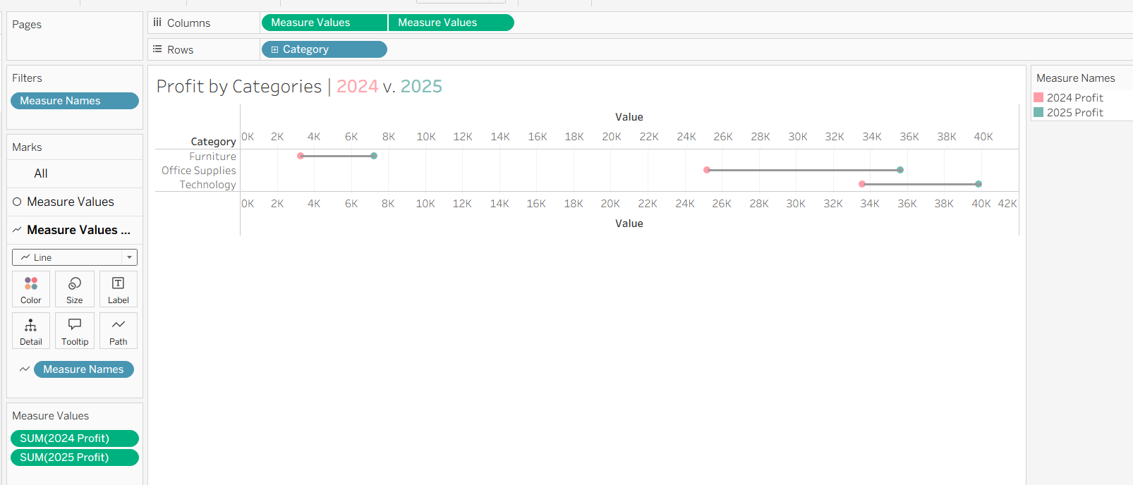
All that is left is to make cosmetic changes!
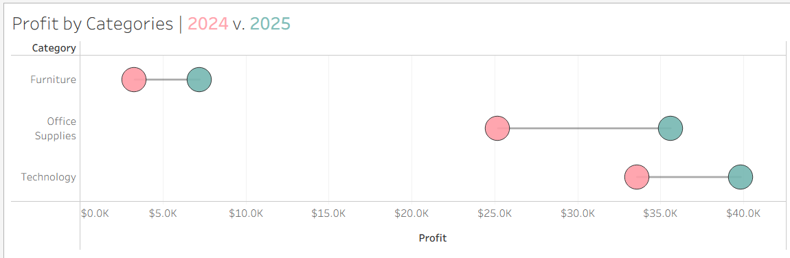
A barbell chart is really just two dots and a line, but that simplicity is the whole point. Once the dual axis and path are set up, the last mile is all cosmetic: layer the line behind the circles by keeping its pill first in Columns, mute its color so it recedes, and sort your dimension by the size of the gap instead of alphabetically so the biggest movers surface first. Small formatting choices like these are what turn a technically correct chart into one that actually tells a story.