


Tableau Pulse was launched by Tableau in 2024 as part of the Tableau Cloud ecosystem. It integrates time-based metrics and natural language processing in order to reach business users who are less dashboard-heavy.
Tableau Pulse is a way for end-users to monitor the business metrics that are the most important for them. Instead of navigating to a dashboard and filtering to a particular view, users filter a Pulse metric once, subscribe, and receive notifications on the evolution of that metric on the regular. Pulse is named and stylized after a heartbeat - it represents an easy way to get to the true heartbeat of the business.
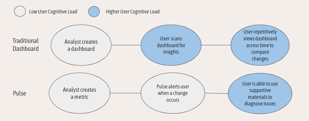
The Tableau Pulse insights platform is designed to help users answer descriptive questions about their metrics - in other words, understanding what happened and when did it happen. Due to this, it's perfect for users who either do not want to or have time to be in Tableau dashboards waiting to uncover a significant change in value. Pulse is able to lower the cognitive load on the user because it negates the need to constantly look for a problem and allows the user to focus on problem diagnosis.
In this way, Tableau Pulse is not designed to replace dashboards or other BI methods, but work as a supplement.
Tableau Pulse was also an early move from Tableau to integrate AI features. While the base-layer is not a generative AI, Tableau Pulse is able to use natural language to speak to the user about the changes of a metric, making it a good supplement to end-user interactions.
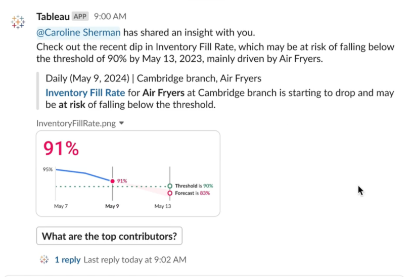
As seen above, Pulse also curates a few key questions for the user to drill into if desired.
Ultimately, Pulse works well everyone, especially end-users who don't work with data daily, but can still benefit from data alerts.
Pulse Metric Lifespan
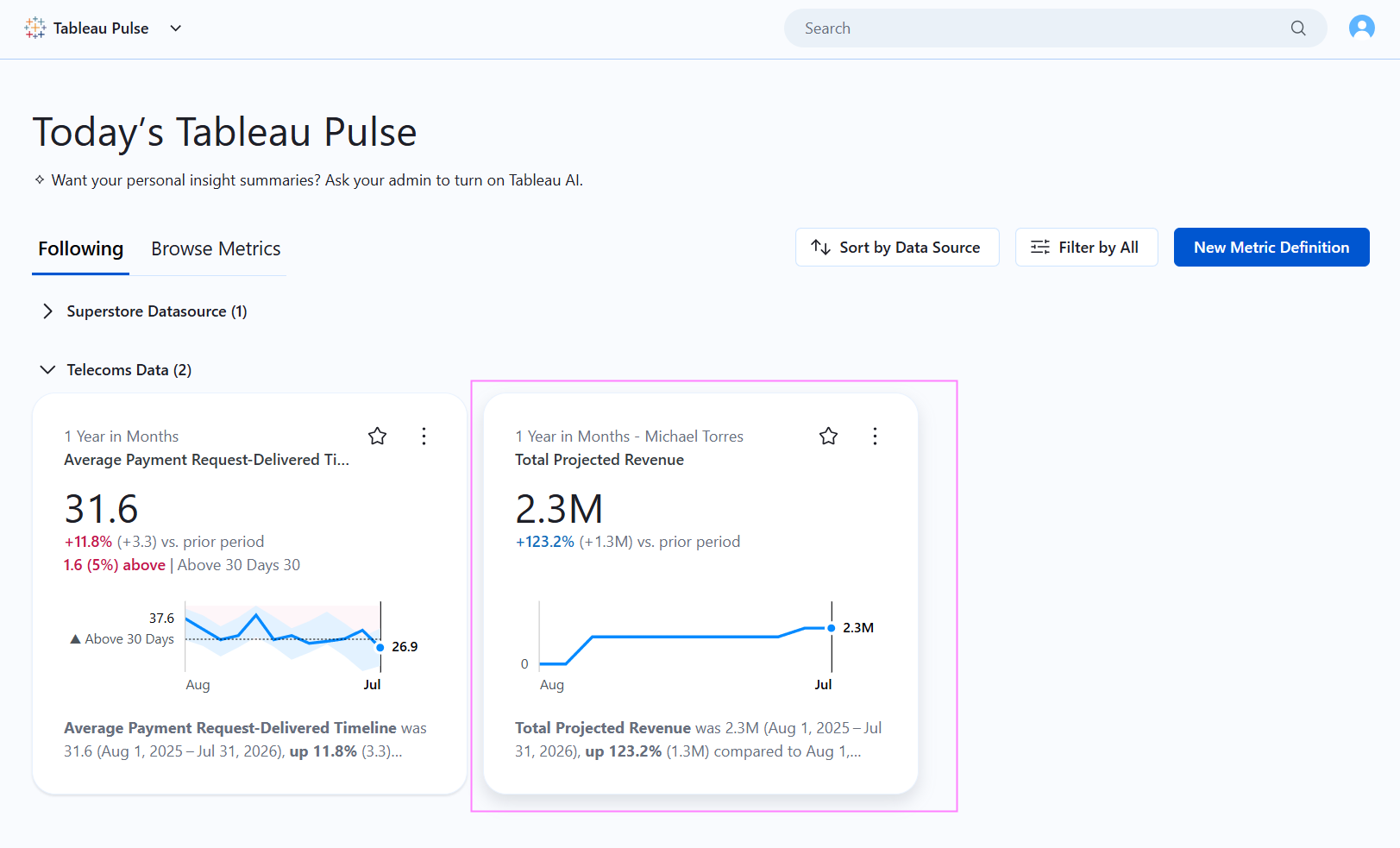
A Pulse Metric is first given a definition by a Cloud user with a creator license. After it is published, other users have the option to Follow metrics (either the general view or filtered to the slice of data that is relevant to them. Filters applied will show up next to the date field (first line of text). The metric highlighted in pink is an example of a filtered metric.
Anatomy of a Pulse Metric
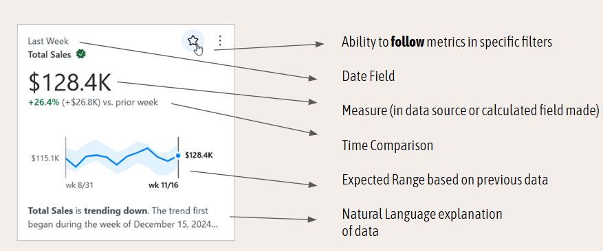
Pulse has three requirements for all metrics:
- A Date field
- A Measure Field (either within the data source or a calculated field made from the
- Filters accessible to the user in order to toggle between
Once those three features are added to the metric, Tableau automatically calculates time-based comparisons, expected ranges based on previous data and the creation of natural language to explain the data.
Other notable features you’re able to add to the metric definition include:
- Goals and thresholds
- Defining what changes are positive, negative, or neutral
- Record-level definitions
The types of analysis you can turn on in Pulse include:
- Period Over Period Change
- Record-level Outliers
- Current Trend
- Trend Change Alert
- Unexpected Values
- Goal and Threshold Breakdown
- Concentrated Contribution Alert (Risky Monopoly)
- Top Contributors
- Bottom Contributors
Analysis only available with a Tableau+ license:
- Correlated Metrics
- Forecast
- Pace to Goal
If all analyses are turned on, Tableau Pulse uses an algorithm to determine which analysis types are the most significant for the metric. In practice, this means no two metrics "read" the same way, even if they're built off the same list of available analyses; Pulse is doing a bit of editorial work behind the scenes, deciding what's actually worth a user's attention rather than showing everything and letting them sort it out.
Pulse Integrations
Part of what makes Pulse feel less like a tool you visit and more like a service you subscribe to is how many places it can show up:
- Dashboards: Pulse metrics can be embedded directly alongside existing dashboards, so the AI-generated context sits right next to the visualization it's explaining.
- Email: Scheduled digests land in a user's inbox, as well as off-cycle alerts when a metric crosses a threshold.
- Slack & Microsoft Teams: similar to email, metrics can be pushed straight into the tools people already have open all day.
- Tableau Agent (formally known as Einstein CoPilot): included in the Tableau+ Bundle, and allows for deeper conversational analytics to take place right inside of Pulse. Otherwise, users can only select the pre-determined analysis questions.
Pulse Considerations
Pulse is a great addition to a BI stack, but isn't a complete replacement for a dashboard, and it's worth being upfront with stakeholders about where it falls short:
- Pulse is completely time-based, requiring a date field. If the analysis doesn’t measure over-time, Pulse may not fit your analysis.
- Pulse has limited visualization options. Pulse is intentionally narrow for greater data legibility with its primary audience (executive, non-data people). If a stakeholder requests charts different from line & bar charts, Pulse isn't where they'll find it.
- Conversational Analytics is available mostly in Tableau+ license: Some of the more powerful AI-driven capabilities, like Tableau Agent's more advanced natural-language querying and metric comparison features, sit behind the premium Tableau+ tier. However, Pulse without the + bundle is still substantial: automatic time comparisons, expected ranges, top and bottom contributors, outlier detection, and natural-language explanations for every metric out of the box.
Pulse's real strength is getting the right number in front of the right person at the right time. It excels at surfacing a metric before someone thought to go looking for it, and giving them enough context to know whether it's worth their attention at all. For a lot of stakeholders, that's the entire job done. They never wanted to explore the data, they just wanted to know if they needed to worry.
But for everything past that “what happened” moment, you're still going to want a dashboard, an analyst, or both. Pulse can point at a contributor or flag an outlier, but it can't hold the kind of open-ended, follow-the-thread investigation that a real dashboard supports. For full utility, it is worth considering TableauNext and a Tableau+ license. In other cases, it's worth setting expectations accordingly when rolling out Tableau Pulse at your business.