Building an interactive dashboard to explore Rio de Janeiro’s 48,000+ Airbnb listings sounded straightforward on paper: give users a spatial map on the left and a dynamic multi-metric visual on the right to seamlessly pivot from macro neighborhood trends to single-property micro details. However, bridging Microsoft Azure Maps with custom visuals like Inforiver Parallel Coordinates quickly revealed how sensitive Power BI is to data types and categorical keys.
User Story & Dashboard Wireframe
The project was anchored around a core user story: “I want to book an Airbnb, but I get overwhelmed by looking at options on the website. How can I compare different listings?”
To solve this, I sketched the following dashboard layout designed to eliminate decision fatigue.
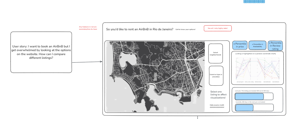
The wireframe pairs a map geographic view on the left with search slicers for neighborhoods and amenities. On the right, high-level percentile KPI cards (Price, Availability, Review Rating) sit above an Inforiver Parallel Coordinates Plot for multi-attribute trade-off analysis, alongside a 365-day capacity chart displaying past-year booked vs. available days (e.g., 300 out of 365 days booked).
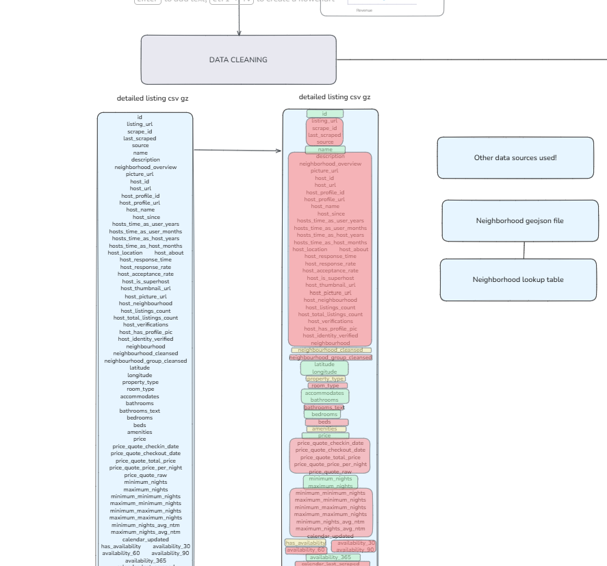
Deciding How to Clean the Data
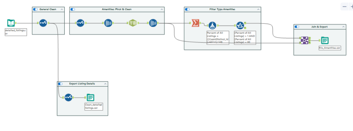
Data Prep & ETL in Alteryx