


On day three of dashboard week, the task revolved around utilizing accessibility guidelines to create products that insured members of differently-abled communities are able to use our work. It may be one thing to create a visually appealing piece of work but if the work is useless, it doesn't fulfill its purpose.
In my case, I was tasked with designing a high-level summary view of London attractions (one data set) and their nearby tube stops (another dataset), with supporting fields that spoke about accessibility features held/not held by the locations. This should be accessible to users of screen readers.
The user story I worked with is as followed: I work with the London Tourism Board, and I'm interested in promoting our top 19 attractions to a wider audience, and help it be understood that these attractions are for everyone. To do this, I envisioned a map of the attractions and nearby stations, with tables below it indicating relevant information
One of the first issues I encountered was connecting the two datasets - as attractions would currently only link to the nearest station.
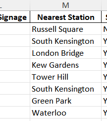
At the same time, I realized that the tube stop dataset contained 500+ stations. Left as is, this would be overwhelming for users.
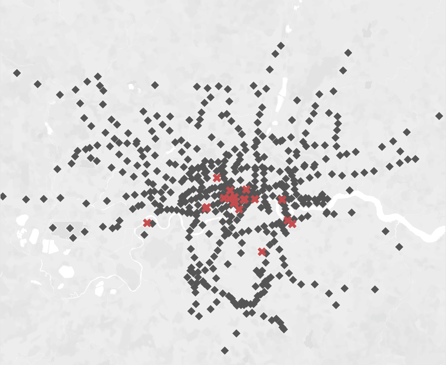
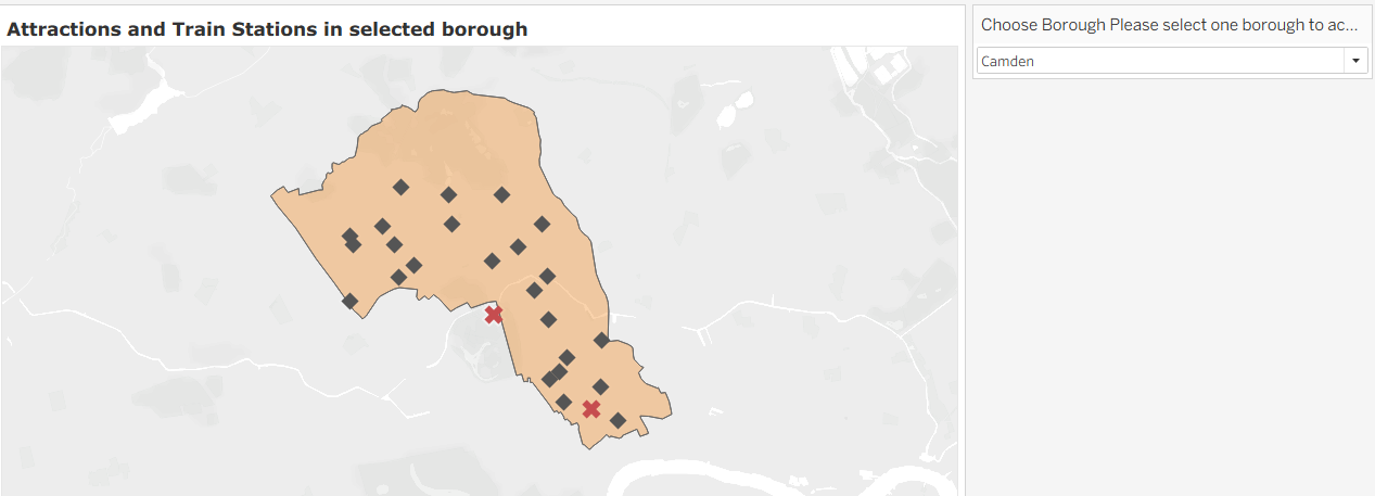
I was able to pull in outside polygon data to map boroughs with the intention to have users filter by borough.
To narrow it down even further, I wanted to give people the option to select how far they want the station to be from the attraction. To do this, I created a parameter and a buffer.
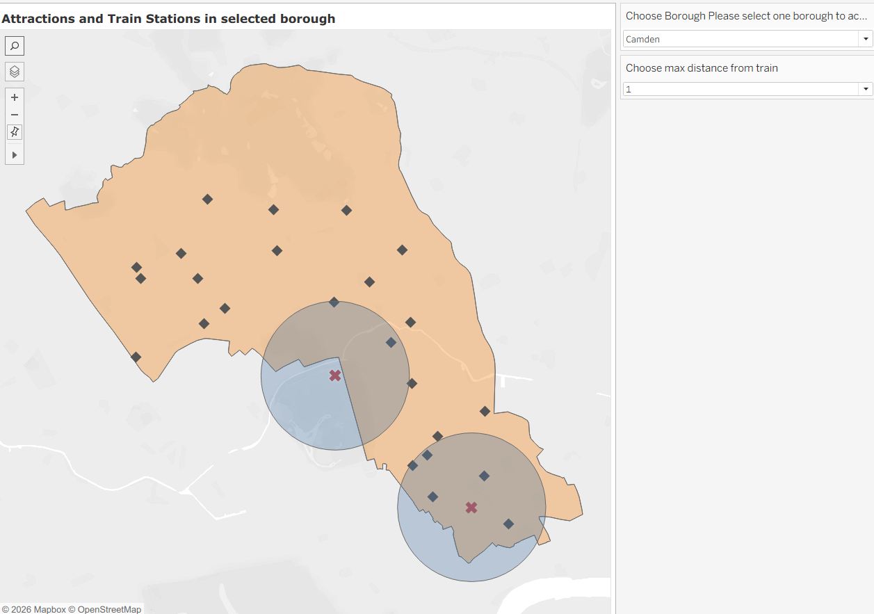
While sleek, I understand that maps are not the most accessible for screen readers. So under the map. I created tables to show the relevant information. Currently, selected under Camden, we have two attractions and two nearby stations.
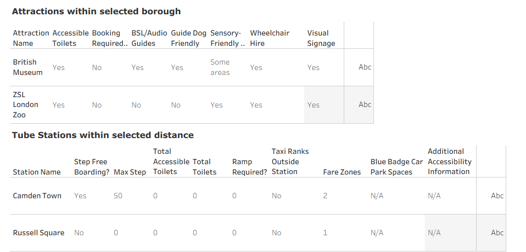
The map hooks people in, but the tables are what make it work. Solving the borough filter and buffer parameter fixed overwhelm for sighted users, but the tables underneath are what make the same information reachable for screen reader users too. That's what day three came down to: a dashboard that only works when you can see it isn't finished, it's half built. The London Tourism Board needs a tool people can actually use, whether that's a click on a map or a tab down a table.