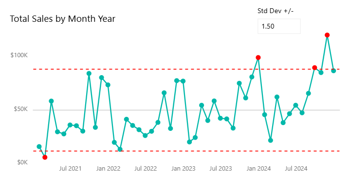
Control charts are a great way to visualize stability in a dataset, and they are quite straightforward to implement in Power BI. Adding dots over each point, however, requires a bit of a hacky workaround. In this blog, I'll show you how to implement this from start to finish.
(For this blog, I'll be working with a version of the Superstore Dataset, but you can follow along with your own data.)
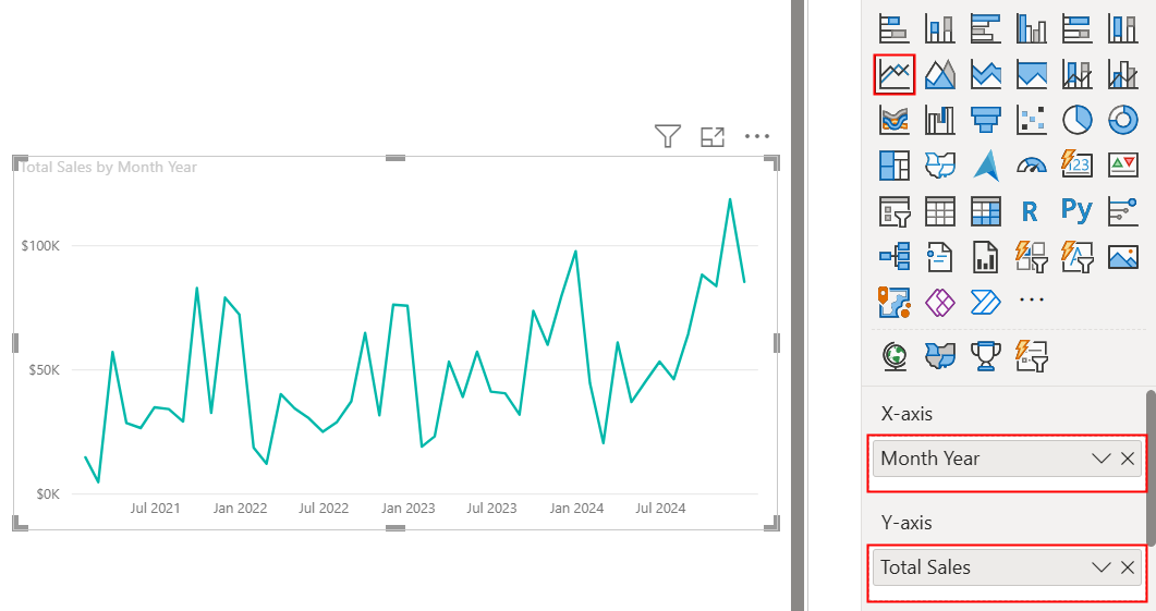
First we start with a simple line chart. In my case, I'm using Month Year on the X-axis (from a scaffolded date table I created on my own) and Total Sales on the Y-axis. I defined Total Sales as a measure (= SUM(Orders[Sales]) because I'll be reusing this calculation later on, so I recommend doing the same.
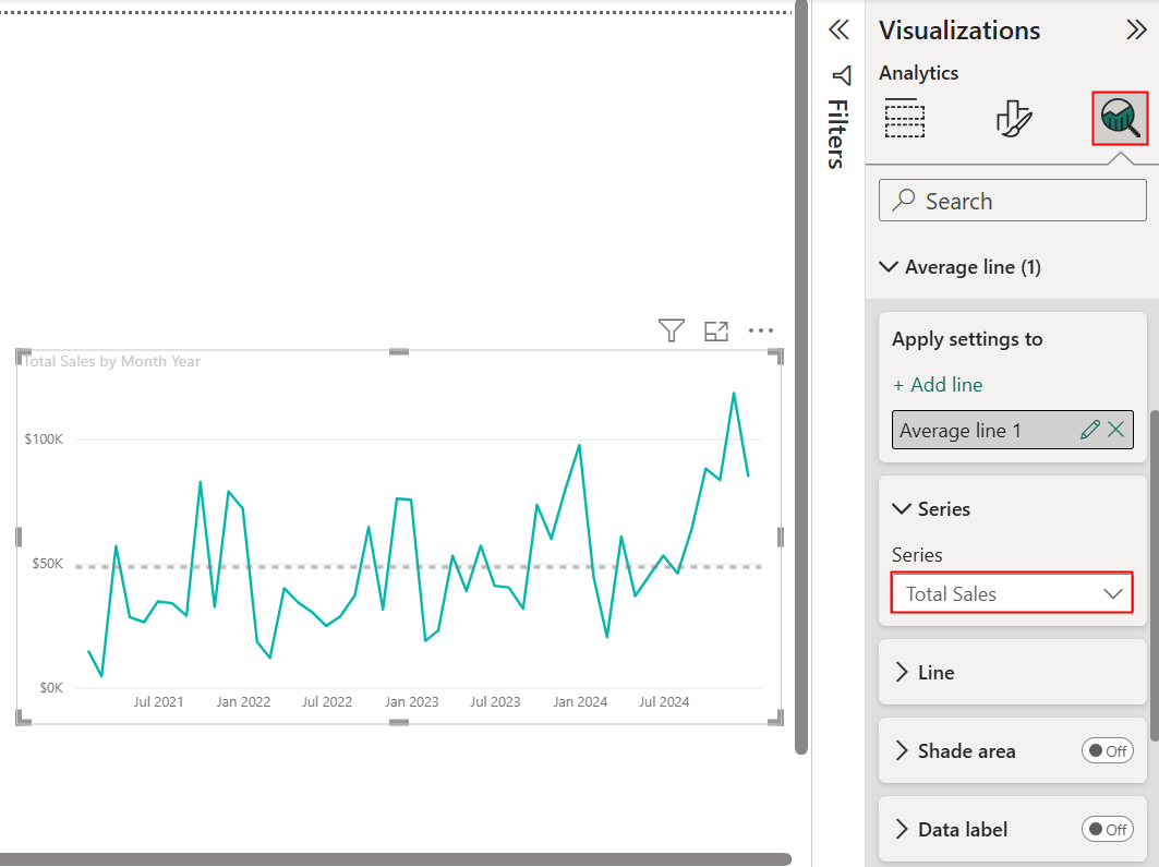
Next, we want to add an average line. Navigate to the Analytics tab in the Visualizations pane, and add an average line using the measure you defined for your Y-axis:
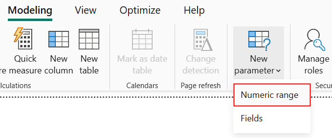
Now, let's figure out what our "normal range" for our control chart is. In this example, I'll be determining this using standard deviation. You can set this to a static value (e.g., within 2 standard deviations above/below average is considered normal), but we can also easily parameterize this value. On the ribbon, let's navigate to Modeling > New Parameter > Numeric Range:
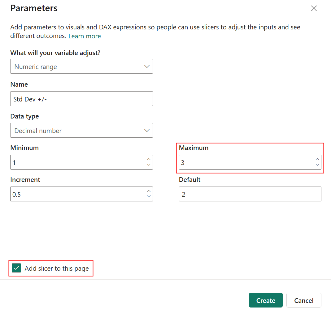
You can customize the values as you wish, but if you're using standard deviation I'd recommend only allowing a decimal number less than or equal to 3 since that should cover most of your data points. Also, make sure to check "Add slicer to this page"!
Now we can define our upper and lower bounds. Let's start with the lower bound. I've generalized the code so you can replace the fields with your own.
Control Chart Lower Bound =
    // replace with your own fields
    VAR _Avg = AVERAGEX(ALL(X_Table[X-Axis Field]), [Y-Axis Measure]) // 1
    VAR _StdDev = STDEVX.S(ALL(X_Table[X-Axis Field]), [Y-Axis Measure]) // 2
    VAR _Results = _Avg - _StdDev * 'Std Dev +/-'[Std Dev +/- Value] // 3
    RETURN _Results // 4
Let's break this down line by line.
VAR _Avg = AVERAGEX(ALL(X_Table[X-Axis Field]), [Y-Axis Measure]) // 1This first line uses AVERAGEX to calculate the average of your Y-axis measure across all values of your X-axis field. We use ALL to convert the X-axis field into a table, sinceAVERAGEX can only take a table as its first argument. In our example, this gives us the average sales across all month-year combinations.
Onto the next!
VAR _StdDev = STDEVX.S(ALL(X_Table[X-Axis Field]), [Y-Axis Measure]) // 2This second line determines the actual value of 1 standard deviation using your X- and Y-axes, as opposed to the parameter we defined earlier, which defined the number of standard deviations. I'm using STDEVX.S because I assume my dataset represents a sample rather than the entire population (the latter would require STDEVX.P). Similar to AVERAGEX, we use ALL because STDEVX.S takes a table as its first argument.
Now for the third line:
VAR _Results = _Avg - _StdDev * 'Std Dev +/-'[Std Dev +/- Value] // 3This computes the lower bound as follows: the average - the standard deviation value * the number of standard deviations. Notice that we're using our parameter value here!
Lastly, we return our results using RETURN _Results. Now, we can repeat the process for the upper bound:
Control Chart Upper Bound =
    // replace with your own fields
    VAR _Avg = AVERAGEX(ALL(X_Table[X-Axis Field]), [Y-Axis Measure])
    VAR _StdDev = STDEVX.S(ALL(X_Table[X-Axis Field]), [Y-Axis Measure])
    VAR _Results = _Avg + _StdDev * 'Std Dev +/-'[Std Dev +/- Value] // changed - to +
    RETURN _Results
The only thing we changed here was our _Results line: since it's the upper bound this time, we add instead of subtracting.
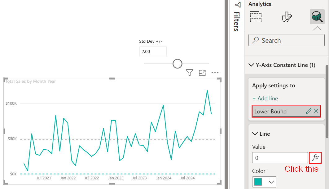
Now that we have both bounds, we can visualize them on our chart! Let's add two constant lines to our Y-axis, starting with the lower bound. Make sure to name it accordingly, then click on the fx button and change the field to the lower bound we just defined:
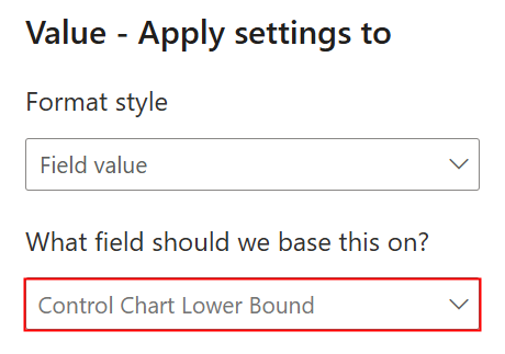
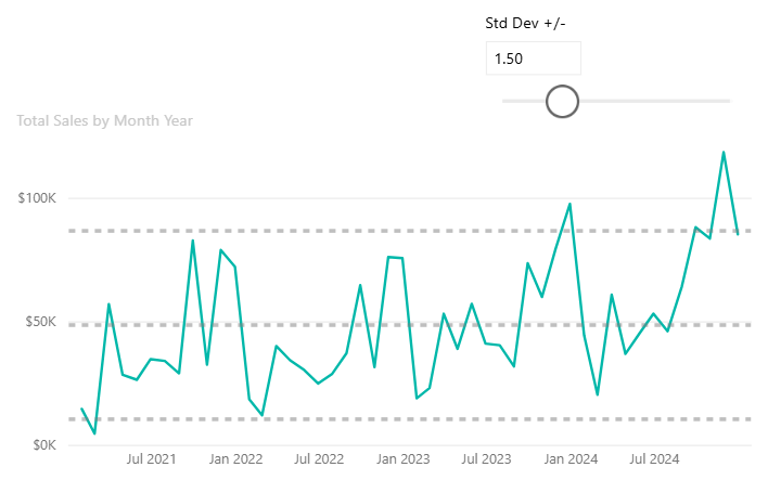
Repeat the process for the upper bound, and you'll have successfully created a control chart with user-controlled bounds!
Now for the hacky part: adding dots over each point 😱 To do this, you'll first have to change your chart into a clustered bar chart (trust the process). Then, define a measure for the bar/dot colors:
Control Chart Color =
    // adjust as you wish
    IF([Y-Axis Measure] > [Control Chart Upper Bound] || [Y-Axis Measure] < [Control Chart Lower Bound], "Red",
    "#01B8AA")
In this case I used conditional formatting because I want to highlight points outside of the normal range, but you can keep it static if you'd like.
Once you've created that, go to Visualizations > Format Visual > Bars > Color > fx:
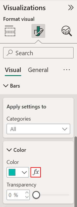
Change the Format Style to Field Value, and use the color measure you just created:
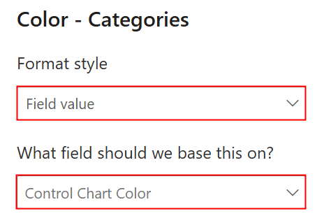
Now if you change your chart back to a line chart, you should see dots over each point! From here you can adjust the formatting as you wish.