


Today we created dashboards in Power BI using AirBnB data. I chose to work with Boston data since I've been there several times and was curious about what insights I could garner.
I geared this dashboard towards Boston tourism boards. I wanted to know about seasonal and geographic trends in terms of neighborhoods and how this could affect marketing campaigns.
The following is my updated sketch for today:
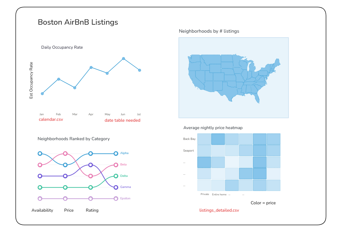
I initially wanted to work with a quadrant chart, but couldn't find metrics that were suitable, so unfortunately I had to scrap it.
After deciding on my user story and creating sketches, I moved into Power Query to do some light cleaning and merge my tables together. Then I started working on my charts in Power BI.
The hardest part of today was deciding on which charts would best portray my user story. It was definitely an iterative process and the main lesson I learned was to trust my gut instead of overthinking.
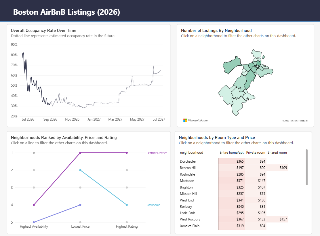
Overall, today's product was simpler than I would've liked it to be, but I hope to iterate on it in the near future.