Introduction
A donut chart or a pie with a hole chart (you'll see why soon enough) is very simple to make and quite controversial. Most people would tell you to stay away from them, but I do think they look quite good in KPI cards. They're great at showing parts of a whole or to show progress towards a target.
Let's go over how to make one for your next dashboard! I'll be using super store data to create a donut chart to show the part of sales that come from the furniture category. So feel free to follow along.
Necessary Calculations
There will be two calculations that we'll need to make before we start putting the chart together: Sales from Furniture and Sales Without Furniture. These will be our two parts to the total amount of sales. Donuts look the best with two parts. (Perhaps you can get away with doing three... but definitely no more than three.)
- Sales from Furniture: IF [Category] = 'Furniture' THEN [Sales] END
- Sales without Furniture: SUM([Sales]) - SUM([Sales: Furniture])
Creating the Pie
Now let's create the pi chart. (Remember this is just a pie with a hole!)
- First, switch the chart type from automatic to pie.
- Then, drag measure names onto the colors marks card.
- Also drag measure values onto the angle marks card.
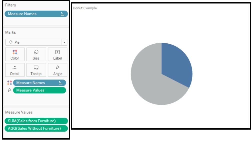
- Remove all the pills on the Measure Values shelf and leave just Sales from Furniture and Sales without Furniture.
This is what your shelves and view should look like after all these steps: Note: I have this set to entire view.

Turning it into a Donut
Now for the fun part; let's create that hole in our pie!
- Double click on either the Columns or Rows Shelf to add an in-shelf calculation. All we're going to enter is 1. Tableau will automatically sum this and it'll become SUM(1).
- Make a copy of the same pill.
- Right click either of the pills and click dual axis.
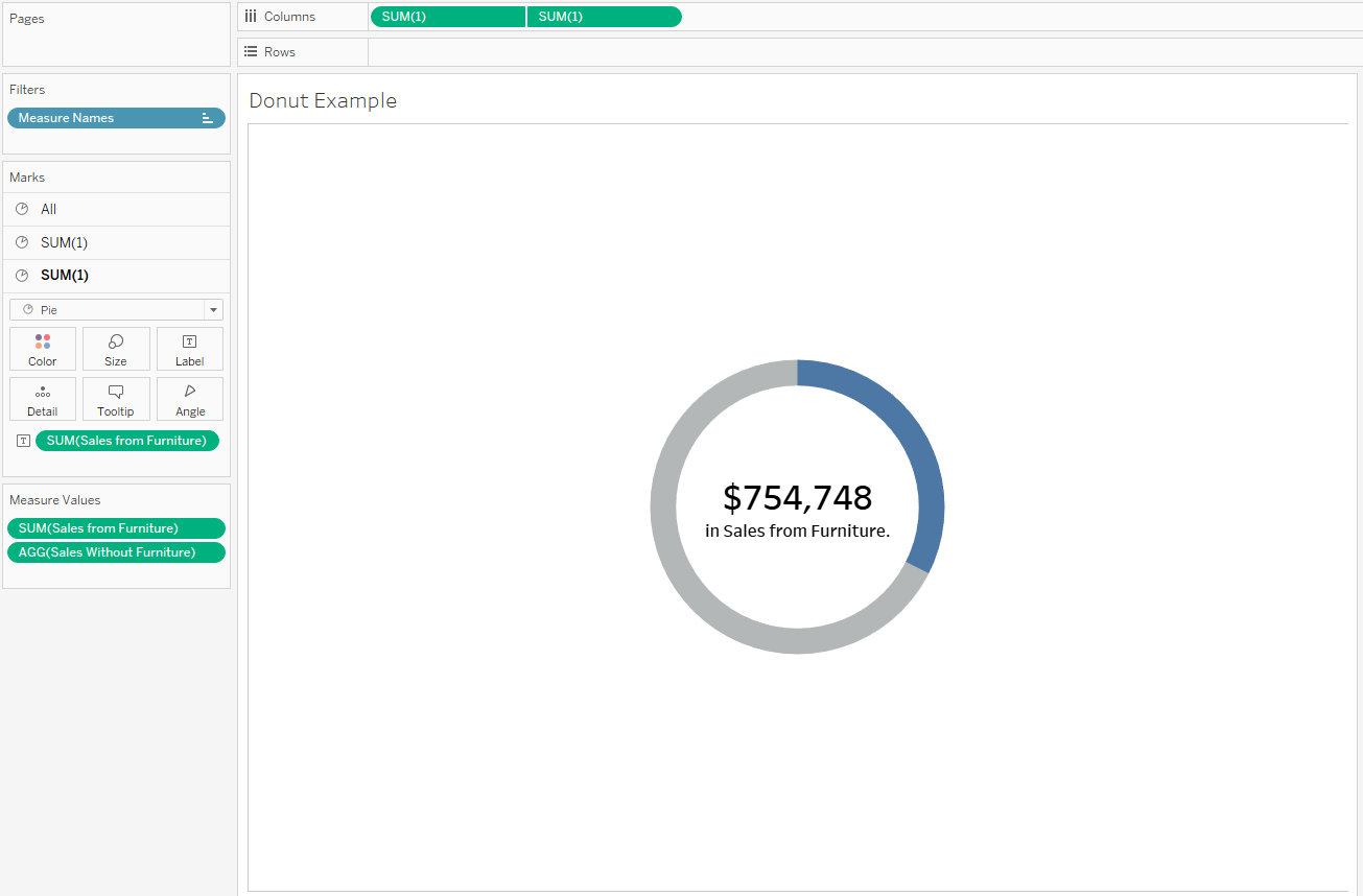
- Now you have two pie charts! There will be three marks card on the left: All, SUM(1), and SUM(1). We're going to make the first SUM(1) our main pie, and the second SUM(1) the hole.
Your view shouldn't look different for now. Let's format to finish off the donut. Tip: Make sure you're formatting the right chart and definitely NOT the All marks card.
First for the main pie:
- Increase the size of the main pie to you're liking. This should be bigger than the hole we'll make.
For the second pie:
- Remove both the measure name and measure values pills.
- Change the color to white.
- Increase the size to make the thin ring of the donut. (I personally think thinner rings look nicer, but it's up to you how thick you want the donut.)
- Drag Sales from Furniture and drop it on the label mark. Don't forget to format the pill into currency.
- Format the label to increase the BAN text size and to bold it to make it more prominent. Also add in 'sales in Furniture' to be explicit. Make this a much smaller font size so it's less prominent.
- For the finishing touches: hide the headers and remove all grid lines.
This should be what the final product looks like:

Conclusion
And that's all! Once you've learned and made it once, it becomes pretty easy to do again on your own. In this particular example, I would create three of these, one for each category. I personally really enjoy the look of creating multiple of these to use as BANs in KPI cards. Happy Tableauing!
