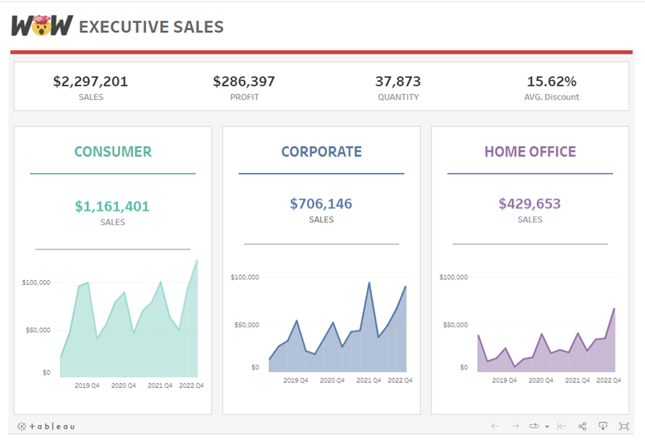
The dashboard I set myself to remake from my Tableau Public was taken from a Work Out Wednesday looking at executive sales for each segment in superstore.

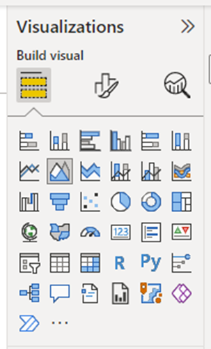
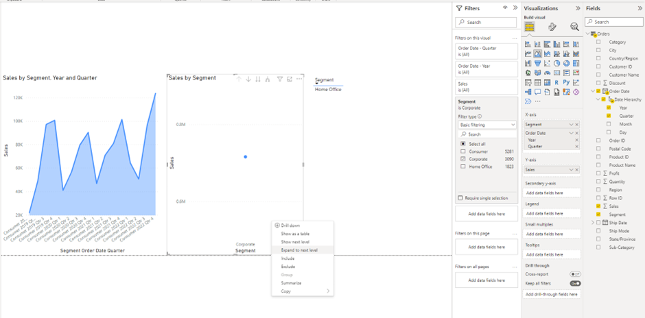
Once opening Power BI and connecting to the superstore dataset, I started to work on building the 3 area charts. I was pleased that there was an element of dragging and dropping, similar to Tableau, and dragged on 'sales' from the right hand column. I then filtered by 'Segment', as each chart only shows one measure in segment. I also chose the area chart from the 'Visualization' column on the right hand side.

How to show a time frame on the X Axis?
Once selecting the area chart, a challenge I faced was trying to get the correct time frame on the X axis, as a time frame would not show. To amend this, after making sure you have selected the 'Order Date' you wanted from the right hand 'fields' column, you can right click the x-axis and select 'expand to next level' and it will drill down into years. You will need to drill down again to get quarters. I repeated this for all 3 charts.

I was disappointed that anything you drag onto the view does not automatically fill the space, meaning it was a challenge to format my charts to be the same size, same width apart, and not be overlapping one another.
My next challenge was changing the colours of the area charts. As there are so many options to choose from within the Visualization pane, finding the right option took longer than it should have.
How to change the colour of your charts?
Under the visualization pane, choose the pain brush and visual option and scroll down to find the 'lines' drop down menu. Once there, you will need to choose 'colours' and then change the colour of your chosen measure (mine was sales).

How to change the title of a chart in Power BI?
The option for changing the title of charts was in the same place as changing the colours.

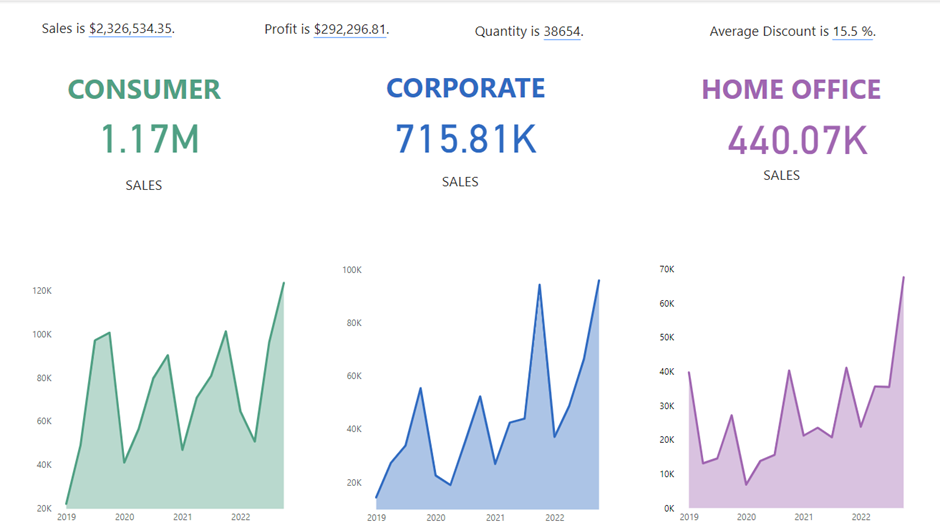
The final dashboard on Power BI was somewhat similar to my dashboard on Tableau Public, however the formatting was vastly different and I felt like it did not look as tidy as the final product on Tableau.

My experience of using Power BI was frustrating at times as the options to choose from were sometimes not intuitive as well as getting lost in the sheer mass of options to choose from. I feel Tableau is a lot more user friendly and I am more drawn to the interface.
