Excel to Excellence: Reformatting Excel Sheets for Tableau Visualization and Analysis
Today's challenge for The Information Lab's Dashboard week was to reformat an excel spreadsheet for easy Tableau analysis. We were working with Coronavirus Vaccine Efficacy data originally from the informationisbeautiful.com data repository. Now this was not as intuitive as you might expect since this excel layout was far from analysis friendly.
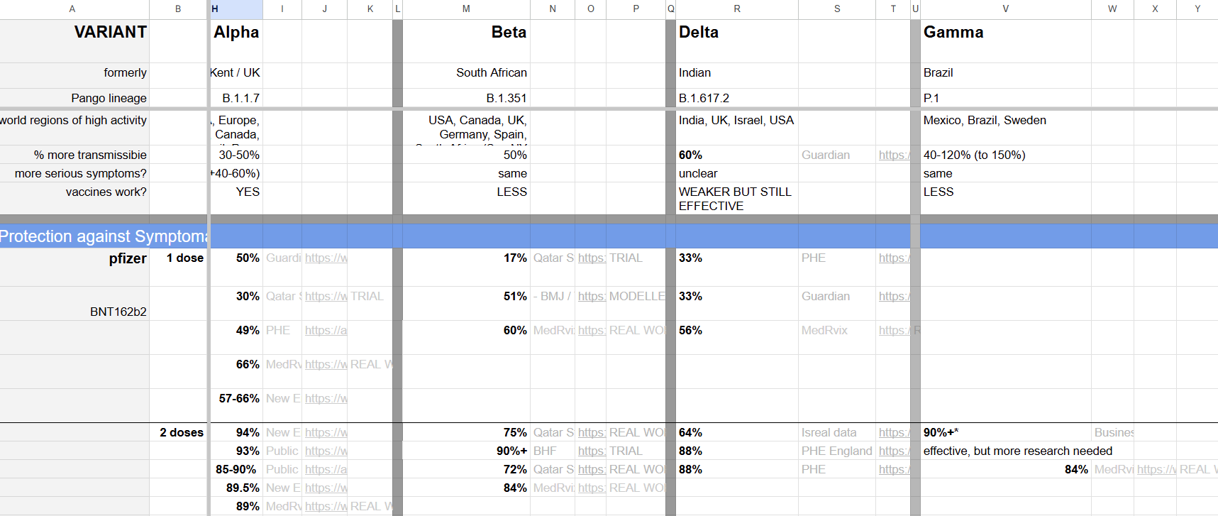
Not only were there many empty rows and columns, but there was little to no hierarchy in the formatting and it's layout begged for extensive pivoting and unpivoting.
Planning the Process
My first step after my initial scan of the spreadsheet was thinking about what I wanted my output to look like. I knew I was going to use Alteryx to help me turn this into useable data and so if I could figure out the correct formatting for my output I would be able to treat this like any Alteryx challenge and work through the steps I needed to achieve my end goal.
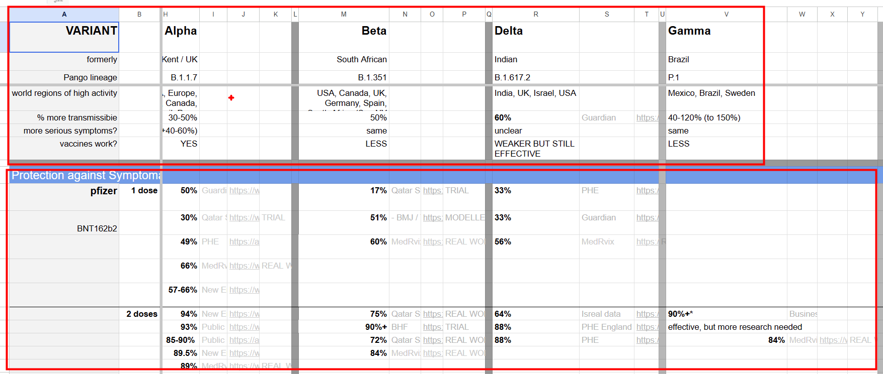
The top and bottom of the sheet had information about the variants and then most of the middle was looking at vaccine data. This gave me a sign that I wanted to output two different tables, one that had the background info about the variants and another that had the vaccine info for each variant.
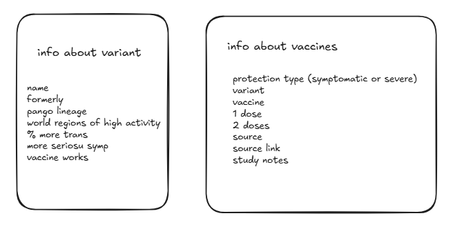
Using these two output tables with these column headers as my goal I was able to start on my Alteryx flow.
Data Prep with Alteryx
First I split out the variant info, which required creating a union between the info from the top of the sheet and the bottom and then reshaping with some pivots as well as some basic cleaning and renaming for a readable output.
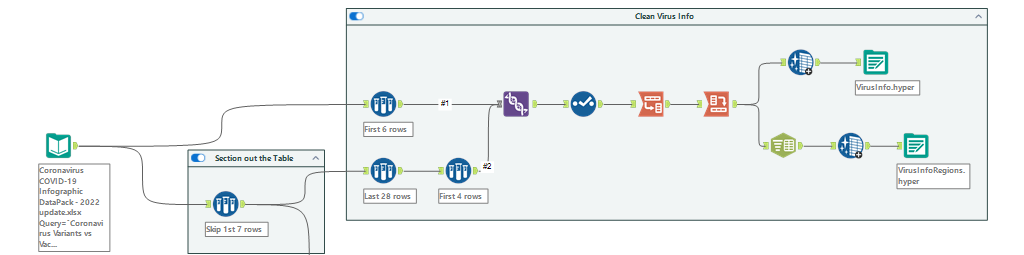
One of my final columns had information about regions of high activity. I wasn't sure what sort of visualization I wanted to do yet so to be safe I output two versions; one where I split the regions to rows using Alteryx's parse tool (split to columns) and another output where I left them together. This way if I wanted to map out regions of high activity by variant I would have the structure I needed to do so.
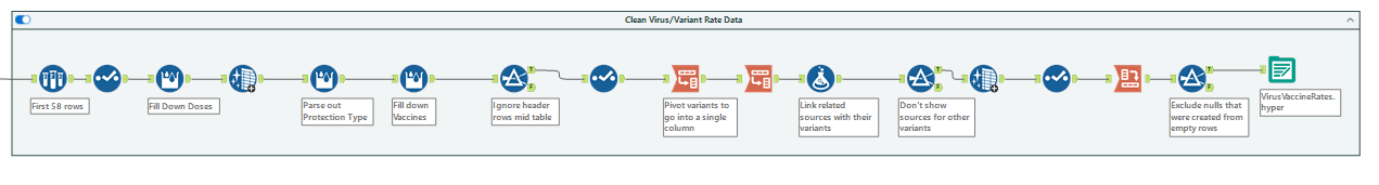
After this first part was finished I was ready to dive into the deep end and tackle the vaccine and virus info. This was a much longer flow although still very linear as I separated out the different protection types into their own column and filled down values that were left blank in excel using the multi-row formula tool in Alteryx.
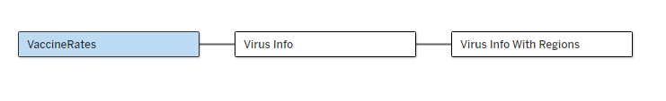
Once I had the data in the formats I intended I was able to bring it into Tableau and set up the relationships that would allow be to get the information I needed while still maintaining efficiently structured tables.
Dashboarding and Visualization
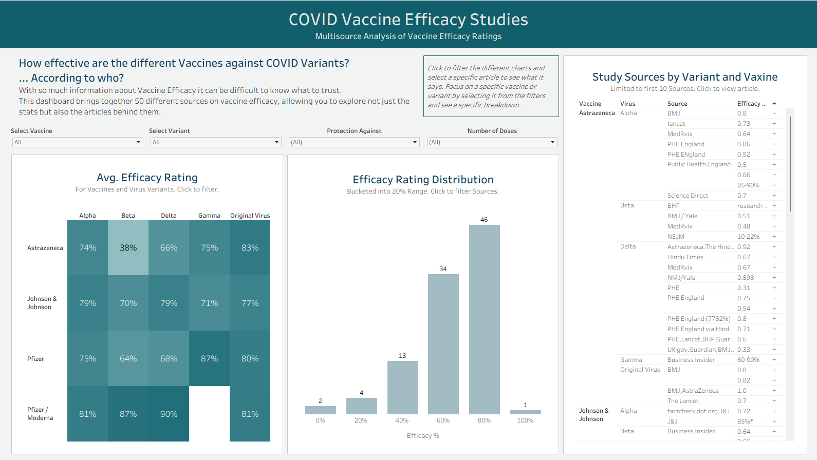
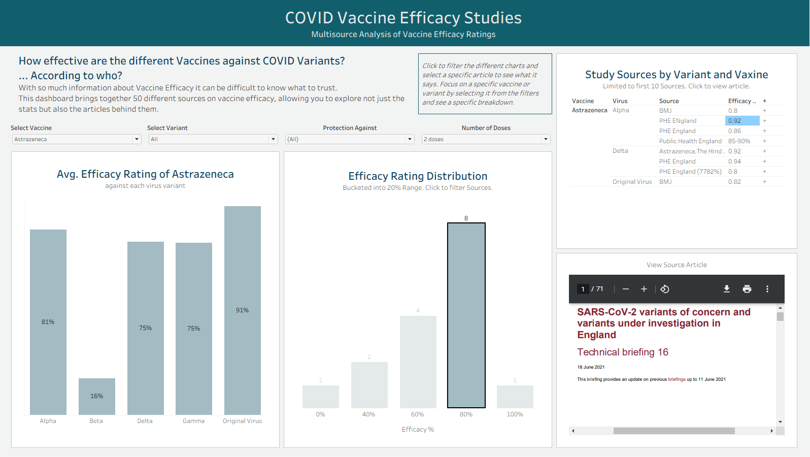
With this set up I was able to build a dashboard in just a couple hours that would allow the user to explore these different efficacy rates as well as the sources and studies behind them. Since I was able to clean the data fairly quickly I had time to play with dynamic zone visibility and embedded web pages on my dashboard.