Today was Day 3 of Dashboard Week - our challenge for today was to use the balldontlie API to get the data for our visualisation.
You can see Jenny's full brief for us here.
My Initial Plan
After having a look at the API, I decided I wanted to visualise player heights. I was curious whether players with similar positions (e.g. center, point guard... etc.) would have similar heights.
All height data was included in the "Get All Players" endpoint.
Since the endpoint could return 25 - 100 players at most per call, I knew that I would need to build an iterative macro in Alteryx with pagination to retrieve all the data. So off I went into Alteryx...
My experience with the API
I had built my iterative macro, and checked that the pagination was working as expected. However, when pulling the data, everything was super slow! Within 30 mins, only 2 pages had iterated.
After checking in with the rest of DS39, this seemed to be a problem all of us were experiencing. We wondered if it was because we were all using the API at the same time. Concious of time, I decided it might be time for me to de-scope and use the API in another way...
Rethinking my original plan (de-scoping)
My new plan was to select one (or a few) players to analyse, and find a story around that.
"But which player to choose?"
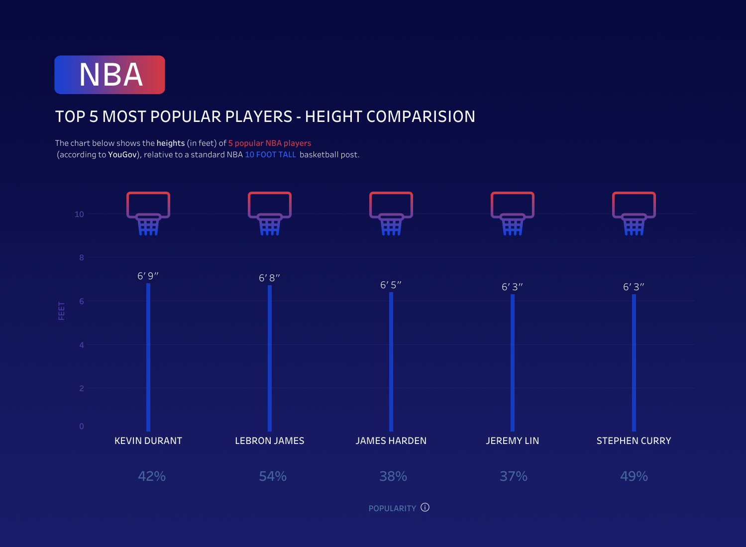
After a few minutes of thinking and googling, I came across a YouGov survey about the most popular players in basketball. I thought this might be a cool way to pick players, so I decided to look at the Top 5 most popular players according to the survey.
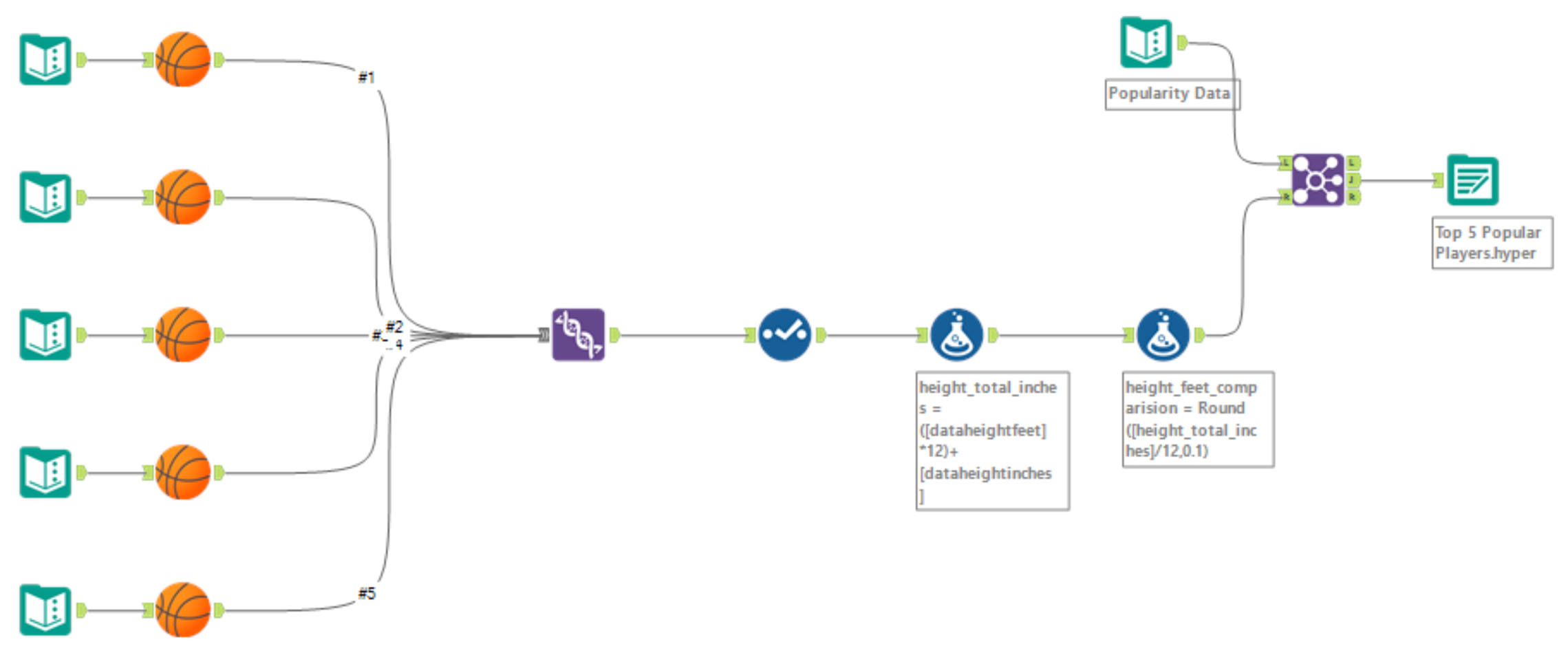
Again using the "Get All Players" endpoint, I used the "?search=" parameter to obtain data for these specific players.
I created a macro for the download, json parse and crosstab (+ data cleansing) to get each players data in a desirable format, all ready for unioning. This made it easier and quicker, as I didn't have to repeat all these steps. Also I made it into a basketball for fun :)
My Alteryx workflow:-

Outcome
This is the viz I created using the API data. I compared these popular player heights to a NBA standard 10 ft basketball hoop height.
In terms of interactivity, what I wanted to do is incorperate some Dynamic Zone Visability - so that when you click on a player height, a panel opens up showing that players stats (name, weight, team... etc.) but unfortunately I ran out of time to do this.

Final thoughts
I think my outcome for today looked nice, but I would have liked to stick my original plan of looking at player heights by position if I could - it might have been a much more cool and interesting story to tell.
In this case, the lesson from today was:
- Instead of going straight to de-scoping, take some more time to ask around and troubleshoot first - you might be able to fix the issue quicker.
And a bonus tip for any other DS'ers taking on dashboard week!
- If you're not super familiar with a topic, ask around and find someone who is. They might be able to help you find an interesting story to tell!
