


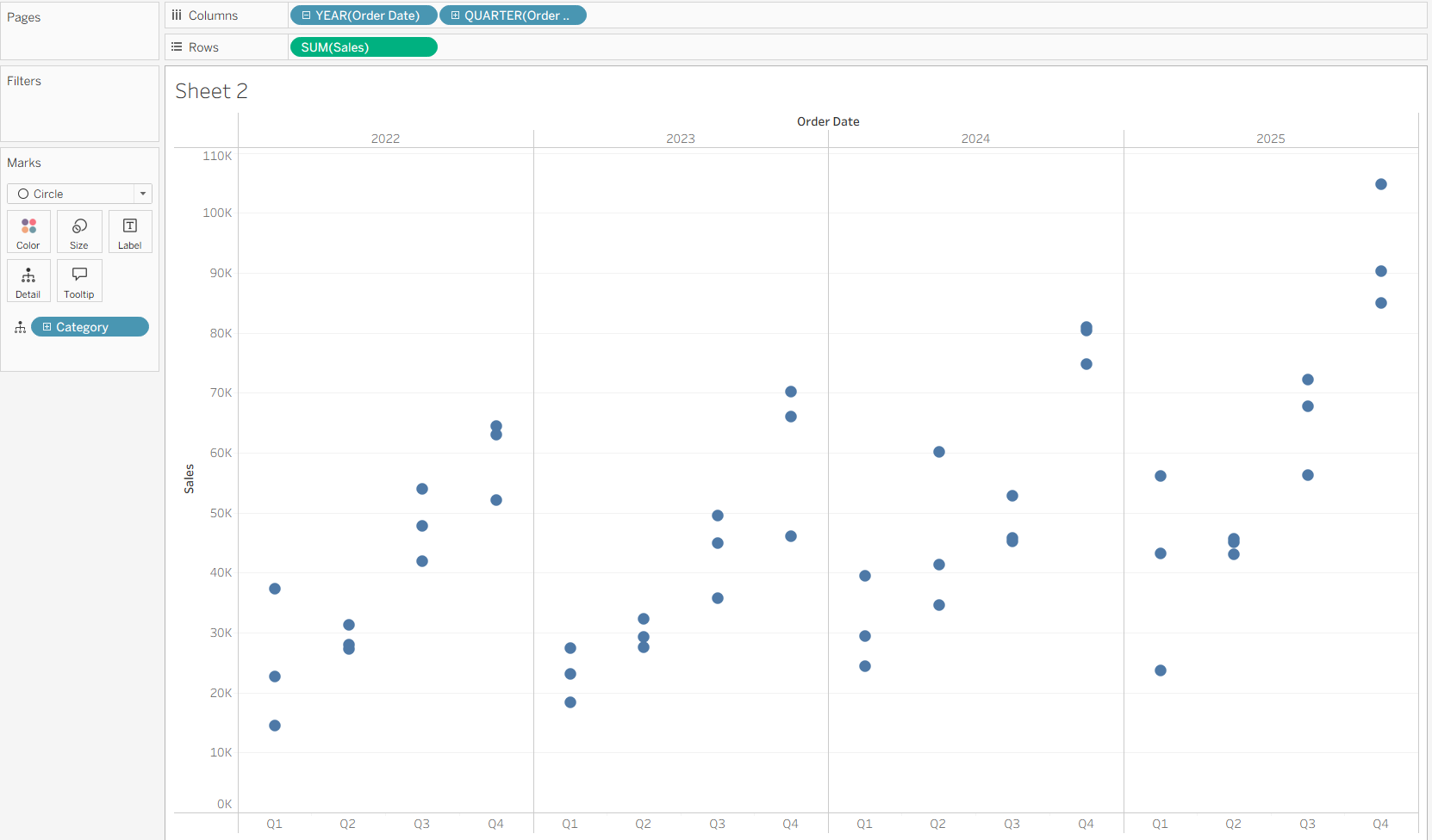
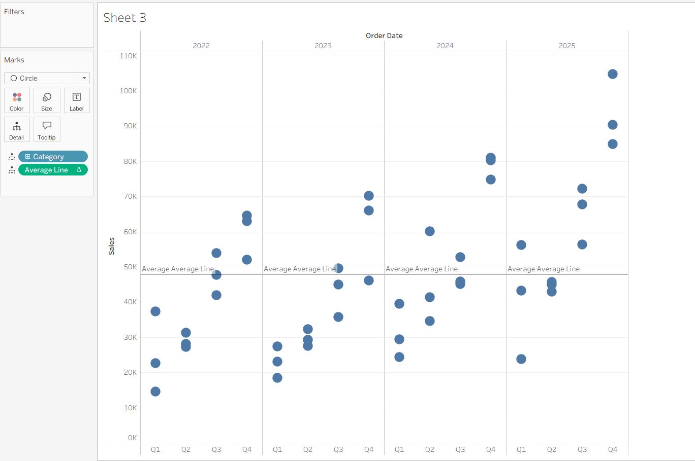
Lets starts off by making a simple chart showing sales by year and quarter and broken down by category.
We need an average line. We can drag one from the analytics pane but instead we are going to make our own table calculation. To do this we need a window calculation.
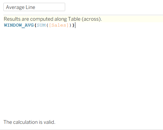
Window calculations allow you to perform an aggregation on an already aggregated calculation. So for this example, we want to find the average of the sum of sales in a period. Since our chart is broken down by year and quarter, we are saying we want the average of the total sales in that year per quarter.
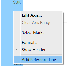
Add this calculation on detail. Right-click sales axis and click "add reference line".
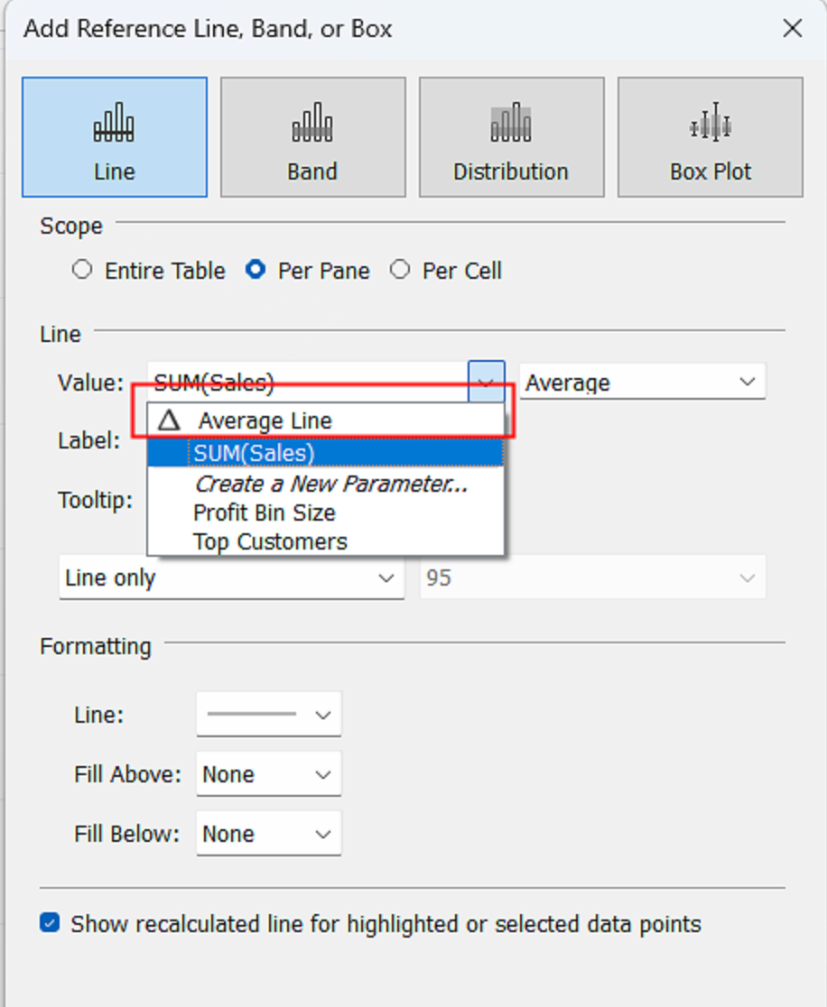
Click "Values" and find your calculated field, I called mine 'average line'. Keep the Aggregation dropdown on average and press OK.
It will look like this so we need to edit the table calc.
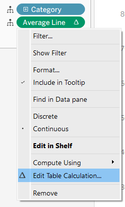
We want this calculation to restart every year, so we want to untick "Year of Order Date".
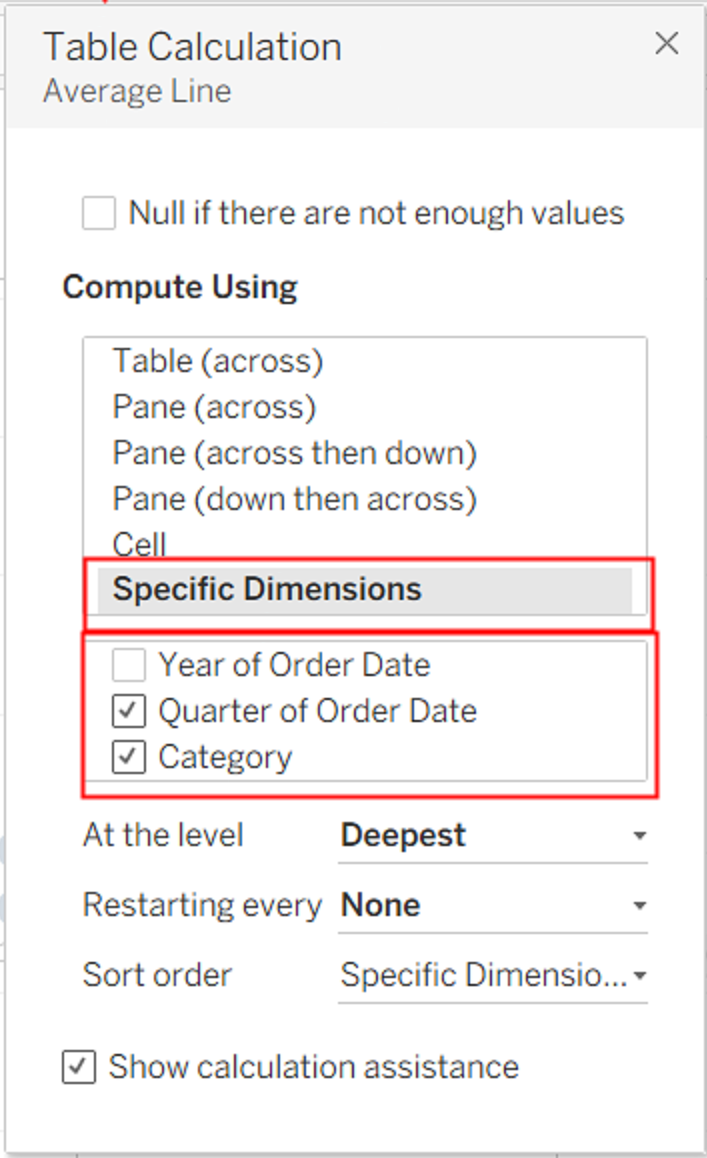
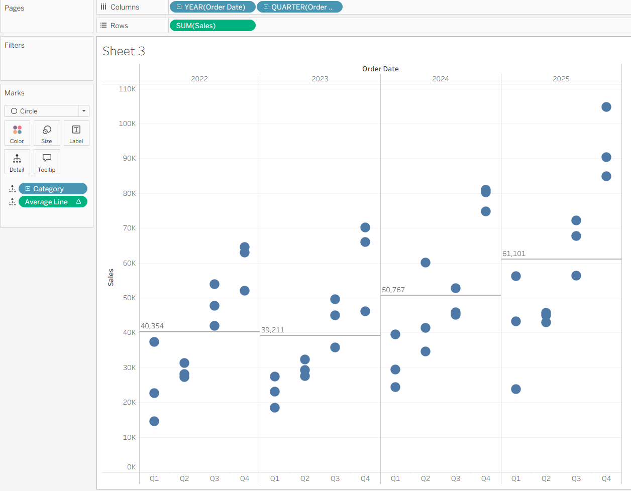
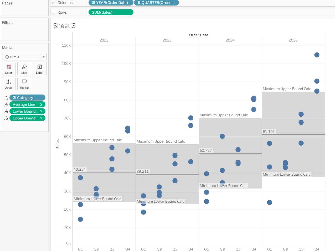
It should now look like this:
Now let us make the bands for our standard deviations.
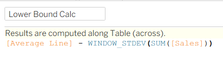
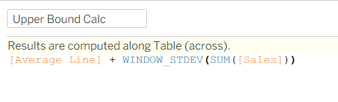
We need a Calc for the lower bound and a calc for the upper bound
Drag both of these calculations onto detail.
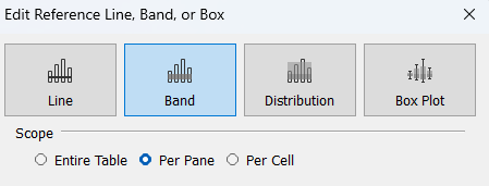
Right-click the sales axis and click "add reference line" again, but this time, click band at the top.
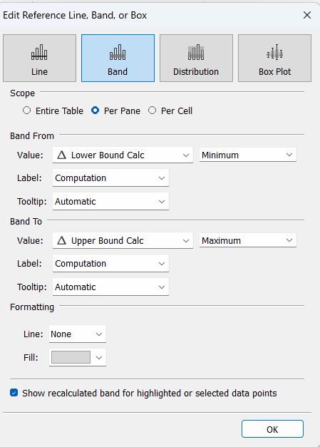
Set it up like this.
Press ok and then go back to these calcs on detail, click the "lower bound calc" and click "edit table calculation". untick "Year of Order Date". Do these steps again for the "Upper Bound Calc".
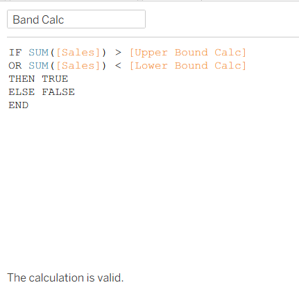
Finally, lets do an IF statement to highlight the numbers that are over or under the bands.
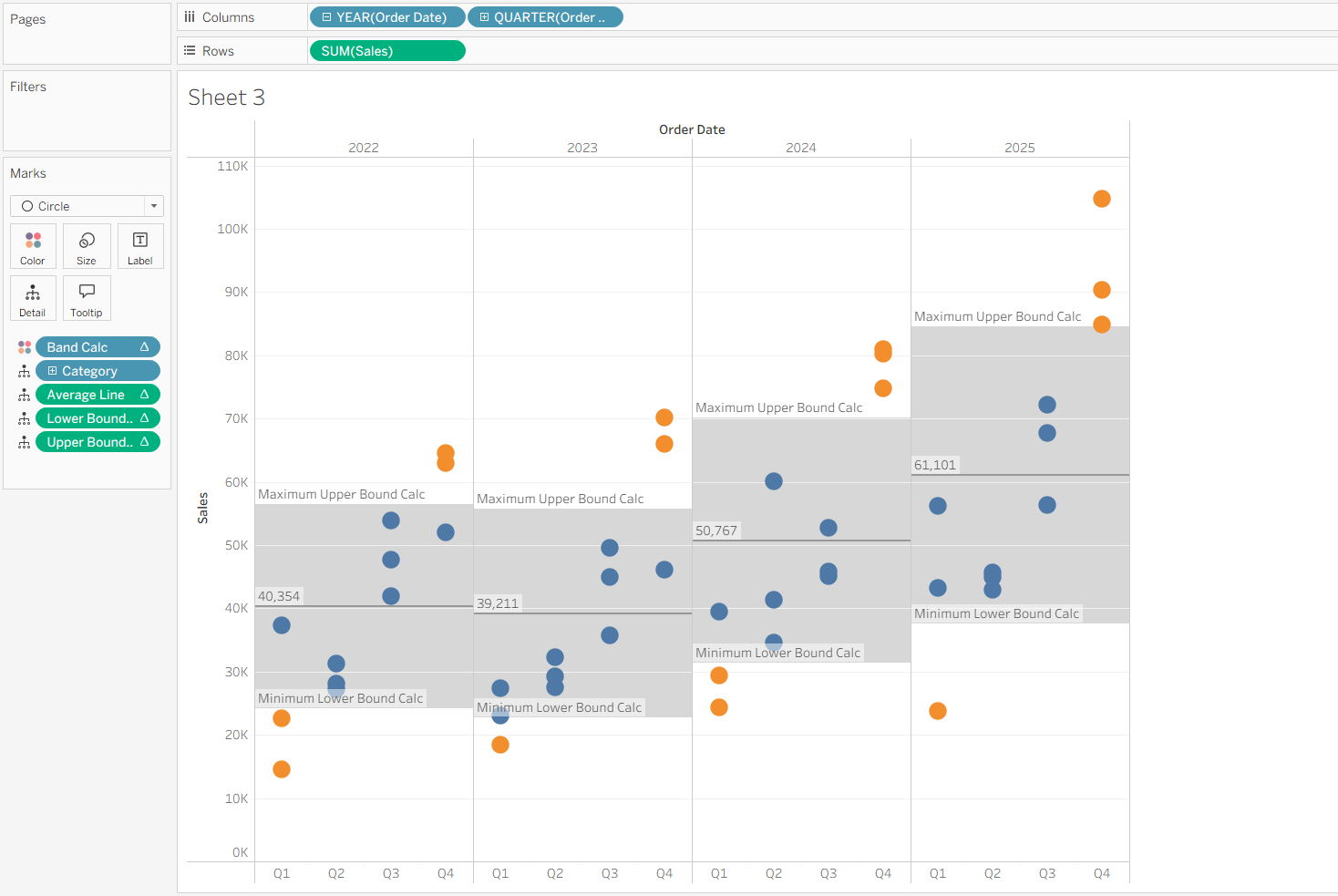
Put this calc on colour and once again edit the table calculation.
The finished result:
You could even parameterise the bands. The world is your limit, now go forth!