So far all my Tableau dashboards have been very corporate and fixed, I haven't made anything out of the realm of ordinary yet. Until this project. Data visualisation isn't just for boardroom meetings—it’s also a powerful tool for visual storytelling.
This is why when I missed the last day of dashboard week, and I heard the data was from Goodreads and the brief was to build an infographic, I knew I HAD to complete it another day.
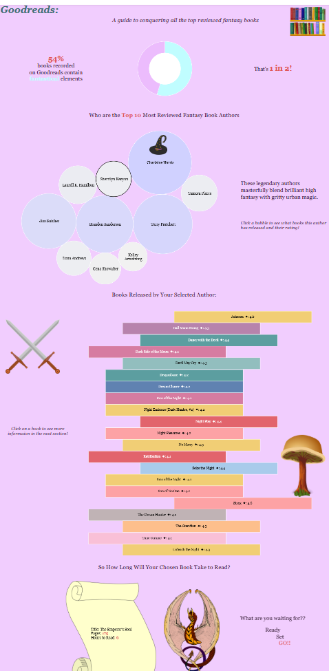
If you are a someone who loves high fantasy, ancient magic, cosy library aesthetics, and you are looking for your next read, look NO further. This dashboard is just what you need.
Phase 1: Reimagining the Standard Bar Chart (The Bookshelf Effect)
A standard horizontal bar chart is the default choice for ranking items. However, that just looks like a standard boring sales report. To build a dashboard centred around a Goodreads library dataset, I wanted the visualisations to resemble objects in that realm.
By changing the Mark Type from a standard bar to a Gantt Bar and using a negative spacing calculation on the Size card, you can transform data rows into a stylised stack of individual book spines. I added a clean white border to isolate each block, creating a floating, dynamic bookshelf layout.
Phase 2: Choosing an Immersive, Story-Driven Theme
The colour, font, and layout all were especially intentional throughout the dashboard.
- Colour Palette: The twilight lavenders, mystical purples, and cosy parchment tones set the magical tones.
- Font: I used Georgia which is one of the many fonts included in Tableau.
- Decluttering the Canvas: All axis headers, gridlines, zero lines, and colour legends were hidden to create room for the data to breathe and give the illusion of freedom and otherworldly.
Phase 3: Passing Actions to Custom Thematic Cards
I chose to make the dashboard interactive to mimic the user going on a quest. It is almost as if one needs to complete the request in the previous graph to unlock the hidden secrets of the next graph.