


So we've all made scatter plots on tableau before but I've recently come across a problem when trying to color my scatter plots by different quadrants which I painstakingly overengineered when the solution was laughably simple.
So step 1 create a scatter plot:
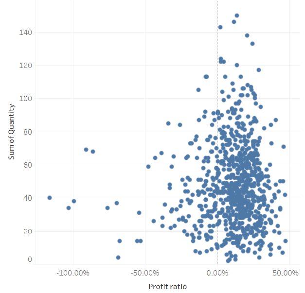
So here we've used the sample superstore data to create a scatter plot plotting quantity against the profit ratio.
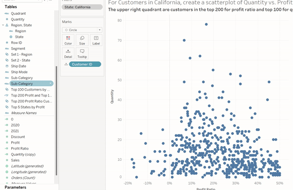
Now we want to make this into a quadrant chart by coloring the different quadrants with the the top 200 for profit ratio and the top 100 for quantity.
The next step is that we create the 2 sets necessary for the quadrants we require:
Right click on customer ID ➡️ create set ➡️Fill in the conditions for quantity and profit.
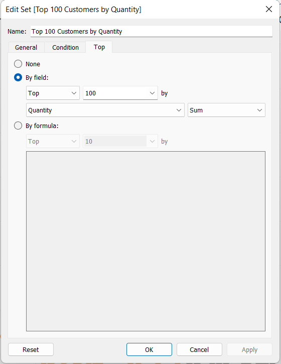
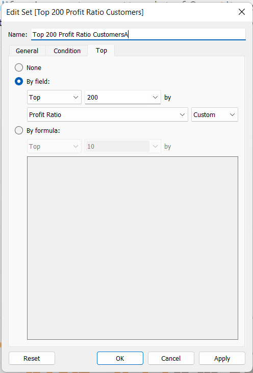
You should end up with 2 sets in your data pane:

Simple right? Well this is where my problem comes in. When you try to drag the sets onto the color marks card the sets just replace each other without creating the 4 quadrants 😤.
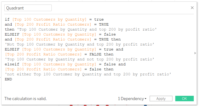
So here's where I went a bit overboard and created this calculated field to solve my problem:
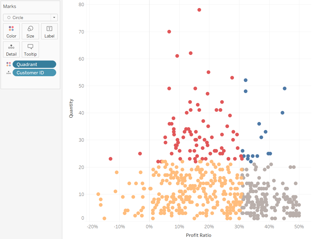
Once you drag this calculated field to the color marks card this does work:
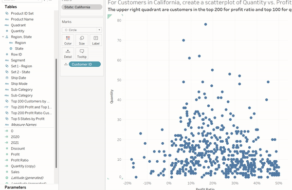
However, what I realized later on was that I could've just ctrl clicked both sets and just dragged them onto the color marks card 🤦🏽♂️.
The lesson here is if your taking a lot of time trying to do something which should be pretty straight forward chances are there is a quicker and easier solution out there you just need to ask someone!