


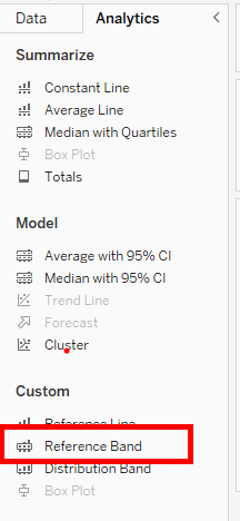
Reference bands are horizontal or vertical lines that contain an area shaded between them that are added to a chart to help provide context and comparison to the data being visualized. These lines can be used to show a specific value, such as an average or a target, or to display a range of values, such as a minimum and maximum.
In a recent project I completed I managed to use these bands to create a dynamic band for the maximum and minimum points on a graph being shown based on a parameter selected.
In this blog I will walk you through how I did this by showing you an example based off superstore data:
1) First things first lets create a line graph which we can switch with a parameter:
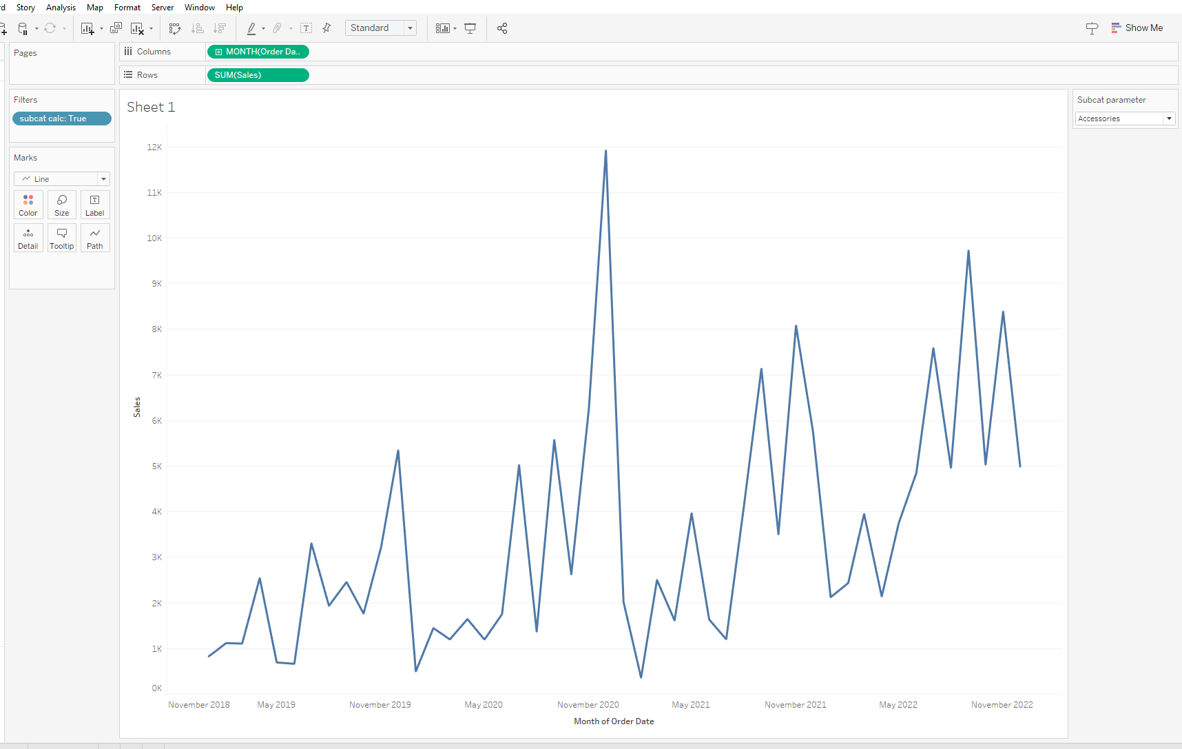
Here I've created a sales by month/year graph which changes for each subcategory when the parameter is changed.
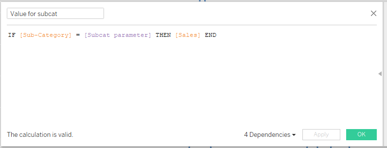
2) Now lets create a calculated field that shows us the sales based on what parameter is selected
3) Now lets create the reference band for this graph:
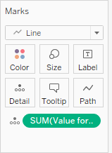
Drag the calc's onto the details shelf of your graphs marks card.
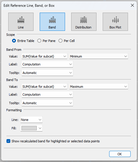
Then drag in the reference band from the analysis pane and fill in the options pane as above with the calculation set - one for min/ one for max.
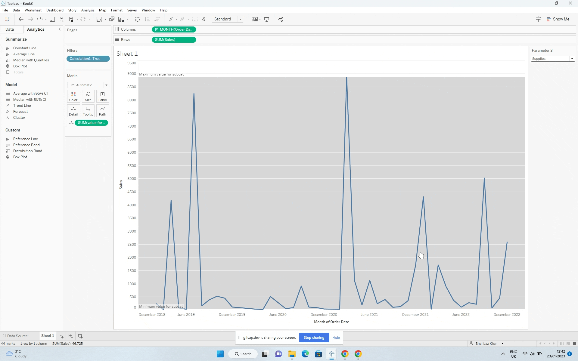
Now you have a reference band which changes with the parameter!