


I can't believe I've made it to dashboard week already, pretty scary stuff! Our first day in dashboard week was focused on accessible dashboard design, i.e. creating dashboards that can be used by people with varying accessibility needs.
The project I was tasked with was to recreate a dashboard on NHS prescription data, for someone using a screen reader. I have never used or tried to use a screen reader before, and testing it out on my computer before we got into planning was actually very overwhelming. I could have spent the whole day just trying to work out how best to use the screen reader, and thinking about how best to navigate a dashboard reading it.
Screen readers narrate what is in a dashboard verbally, so people with visual impairments for example, can hear what's in the dashboard. In Tableau, the screen readers cannot read anything within the chart area, tooltips, or headers, but they can read the sheet titles and captions. With this in mind, my plan focused on descriptive titles, informative subtitles and captions that effectively summarised the key points of a graph, without needing to look at the graph, and then plenty of KPIs that would summarise information where the graphs couldn't be accessed.
The original dashboard I had to recreate had plenty of information in tool tips, few KPIs and vague titles with words such as AVG rather than average. Furthermore, there were graphs such as maps, that could not be accessed at all from a screen reader.
I came up with the following plan, which tried to take all these factors into consideration, enabling the screen reader user to access as much information from the dashboard as possible, without relying on graphs.
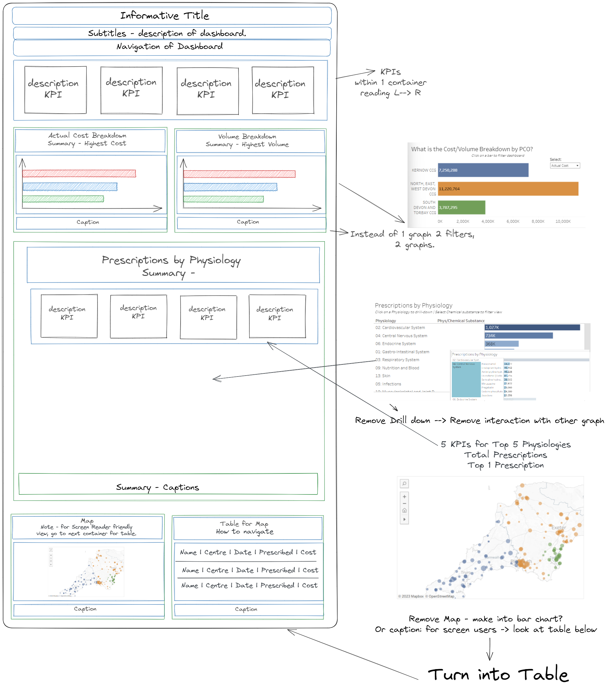
We had 4 hours to get this task done today, and I spent nearly half of that time planning and researching, which in hindsight was a bit of a mistake, as I didn't give myself enough time to test the dashboard, and make sure the screen readers could read it as I thought they would be able to. I managed to get everything in a dashboard, with captions and navigation queues throughout the dashboard. Initially I had information in titles and captions, and then text boxes for dashboard titles etc. However, after uploading this and testing it using the screen reader (with an hour to go before our presentation), it became clear that the screen reader couldn't read text in a text box. For some reason, the screen reader wasn't reading my titles and captions in the way that it was supposed to, causing some panic under the time pressure. In an attempt to fix this I moved all the text to individual sheets, but instead of creating an empty sheet and putting the text in the title box, I put the text within the sheet (exactly what I wasn't supposed to do!). I wasn't able to fix this before our presentation, which was frustrating.
Upon reflection and a little more testing post presentation, the original titles/captions that my screen reader wouldn't read are now working. As for all the text I put within sheets, I have moved them all to titles on empty sheets, and put all my KPIs within titles of empty sheets too. The dashboard is now readable using a screen reader. The takeaways? When creating a dashboard using software/elements that you haven't used before, give yourself enough time to test! It was frustrating that I was able to fix the issues I had had so quickly after presenting, and had I had more time to test the screen reader before hand, may have been able to resolve these problems before the presentation.
Today has been an interesting challenge, and has really highlighted for me how much we take for granted in terms of how we access dashboards, and I want to try keep these considerations in mind when creating future dashboards.