


Today we worked on a dashboard that focused on being user friendly and accessible to all people. In the morning we had a session where we learned exactly how to make our dashboard more accessible, such as preparing for color blindness, or formatting for people who used screen reader.
From here, we were given a data set regarding London Tourist Attractions, their accessibility, and the distance from Tube stations. We were also given data regarding the accessibility of those stations.
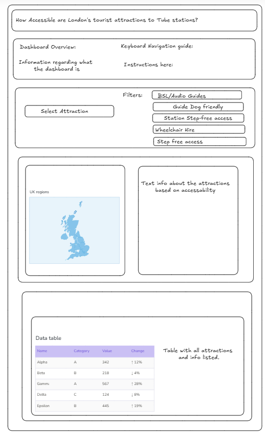
I began sketching in Excalidraw, where I drew up a rough draft of how I wanted my dashboard to be formatted. I figured that it would be easier for screen reader to start from the top of the dashboard and work its way down.
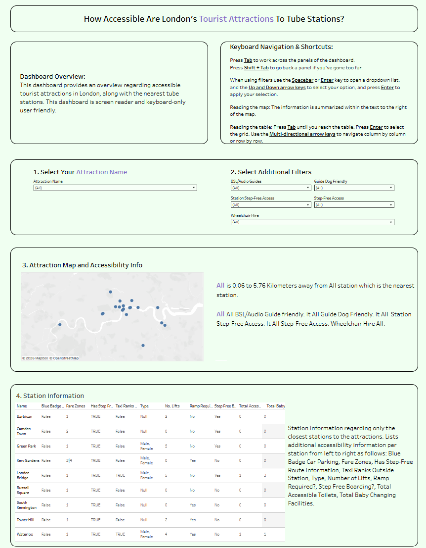
I then inputted my data into Tableau, and began creating the dashboard as a whole. One of the main blockers I was running into was actually getting screen reader to read what I wanted it to. I had a dynamic text field that was not getting read, despite turning on captions. Eventually I found out that I had to move the text into the title of the sheet, otherwise it would not be read.
Some other blockers included finding ways to get rid of UI elements that screen reader would take a while to read through, including dropdown boxes or other visualizations.
I learned a lot about accessibility functions today, and how they play a part in being an inclusive data analyst.