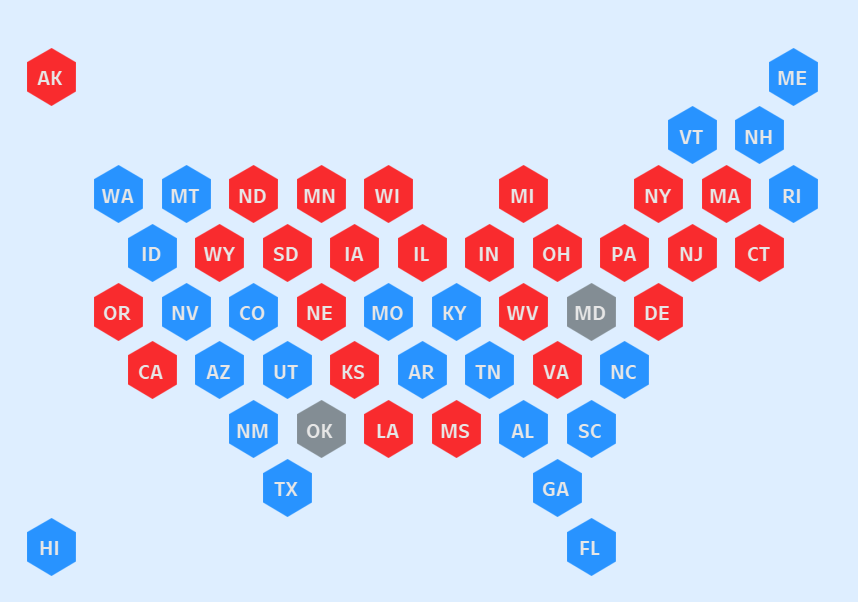
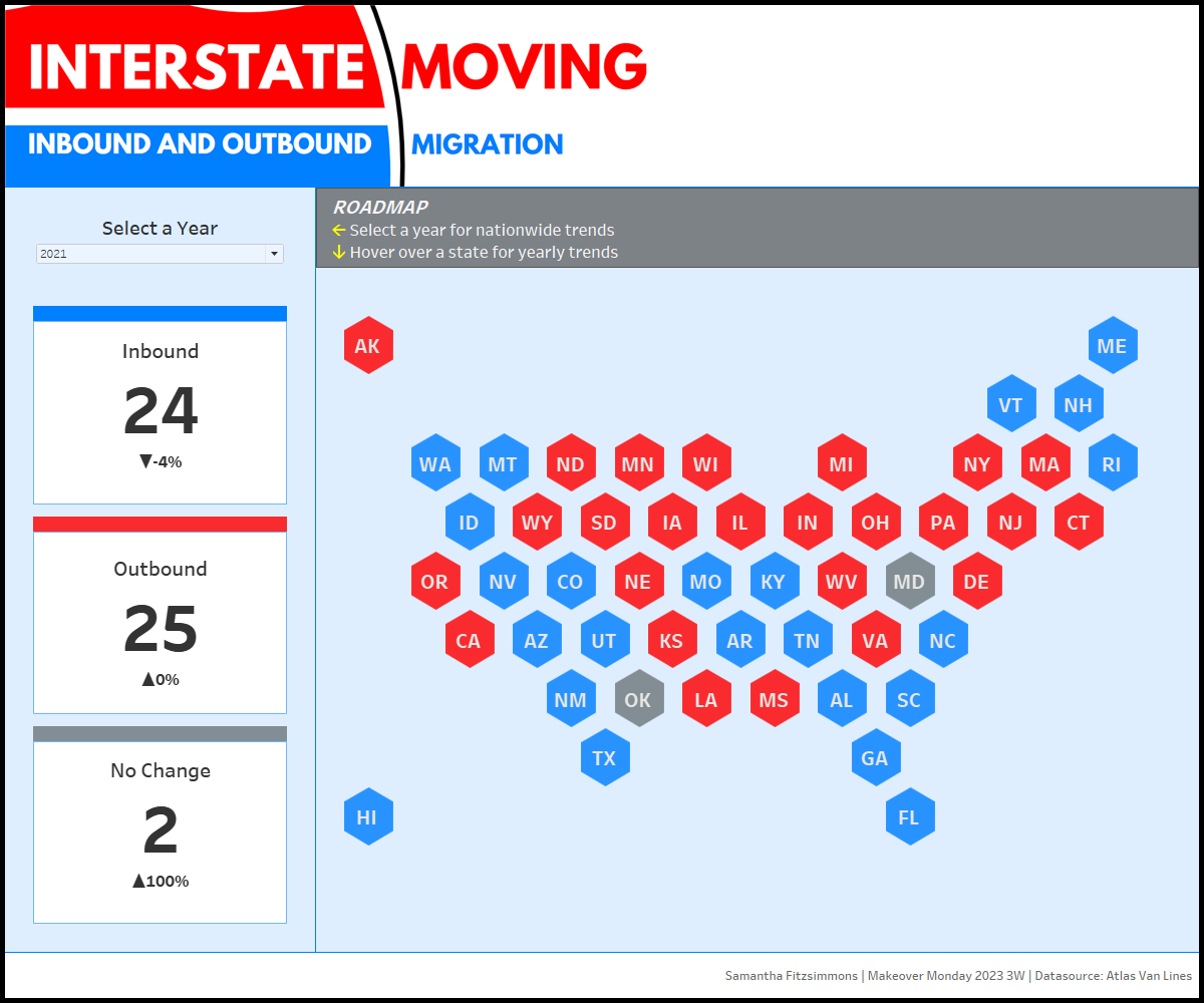
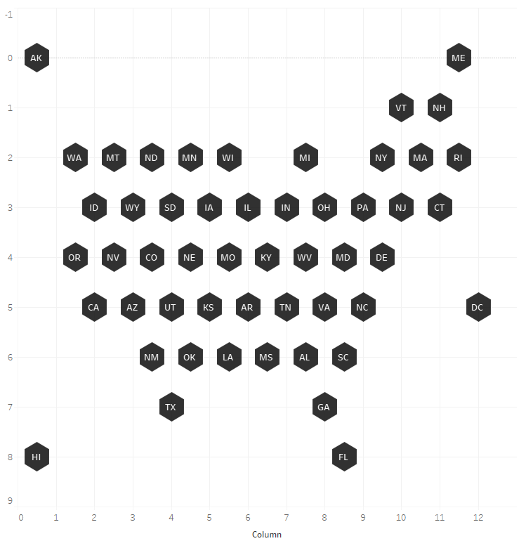
Awhile back I built a hex map for a Makeover Monday about interstate moving. Using a hex map lets you show geographic information differently. It doesn't emphasize area or where things are as much, making sure each part on the map gets equal space. Keep reading to learn how to build one.
Steps for Building a Hex Map
You can get both of these from Sir Viz-a-Lot's blog.
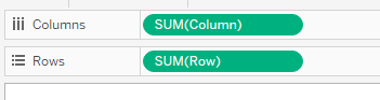
In this case, I formed a relationship of the hex map data set to the interstate moving data set in Tableau.
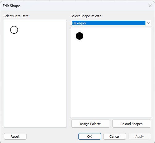
If you need help with uploading custom shapes to your Tableau repository, you can watch this video.
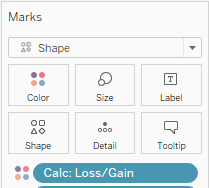
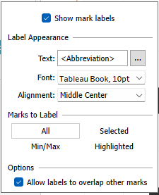
To format the label, click label, and then tick "Allow labels to overlap other marks." Change the alignment to "Middle Center."
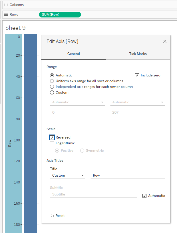
At this point you should see a map forming. Since the hexagons are still black, I changed the labels to white.
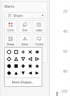
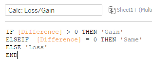
In order to change the hexagons' colors, y0u need to create a calculated field. For my hex map, I needed colors for when a state increased, decreased or had no change in population, so my calculated field needed to allow for 3 colors.
Then, I dragged the calculated field to Color on the Marks card.