Being able to create customizable charts can always be useful. Especially when trying to show many different pieces of information at once. In this blog I will quickly go over how I created the measure switches for the dashboard I created in day one of dashboard week.

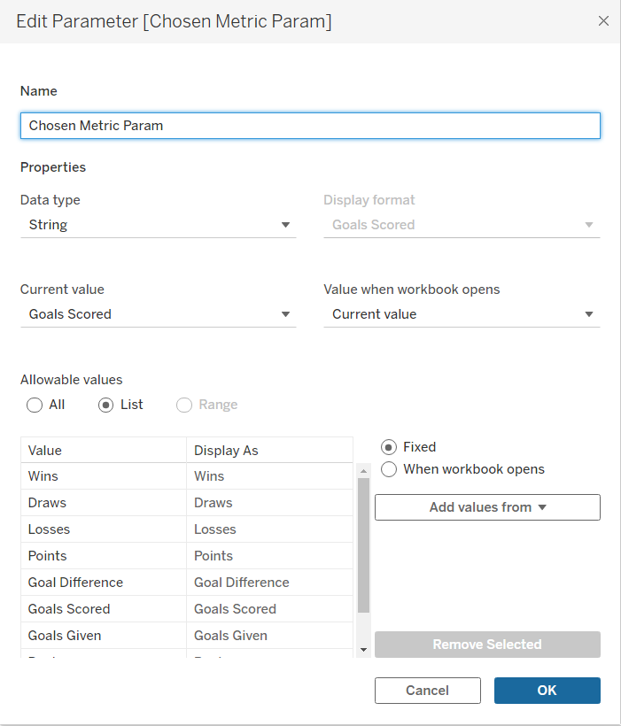
To create this line graph I needed three parameters. Two of them were for choosing which team each line represented and the last one is to choose what metric to compare them with.

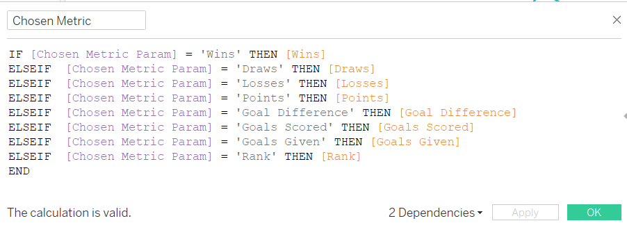
To set up this parameter we need to type in the different measures we want to include as an option into the list of allowable values for the parameter. Next we need to bring this parameter into a calculated field.

This calculated field will return the metric that we choose in the parameter. For example, if we choose 'Points' it will return whatever was in the points field for that row.
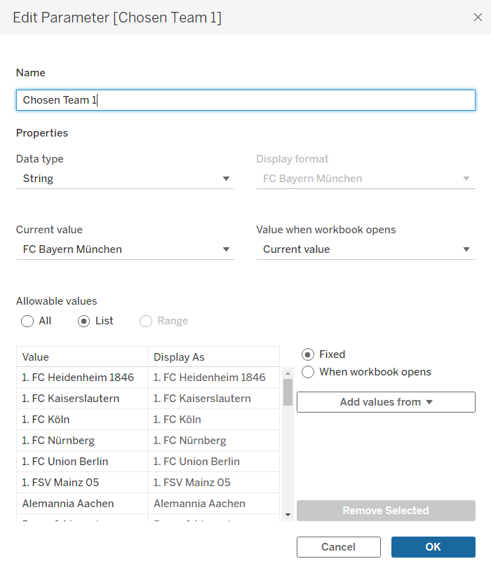
Next, we can create the parameters for the teams.

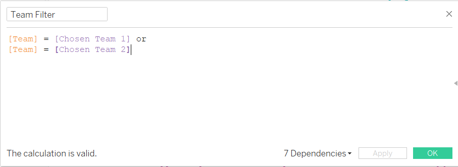
Here we create the list of teams by adding them from the Teams field. We then create a copy of this to have a parameter for the second chosen team. Using these two parameters we can filter the the sheet to only have information about those teams.

If we leave it at this, the data for both teams would be aggregated together. Instead we want to add teams to detail so we can keep them separated.
Then we add the date field to columns and the calculated field with the measure switch to rows.

Now using the parameters, we can change what the chart shows.
