For our second day of dashboard week we were given the results of a survey conducted on people from Slovakia aged 15-30. We were challenged to create a dashboard about anything we choose from the results of this survey.
The survey contained demographic data on each of the respondents along with their responses to various questions. After looking through the data I decided that I wanted to focus on the preferences that the respondents had on movies and music genres.

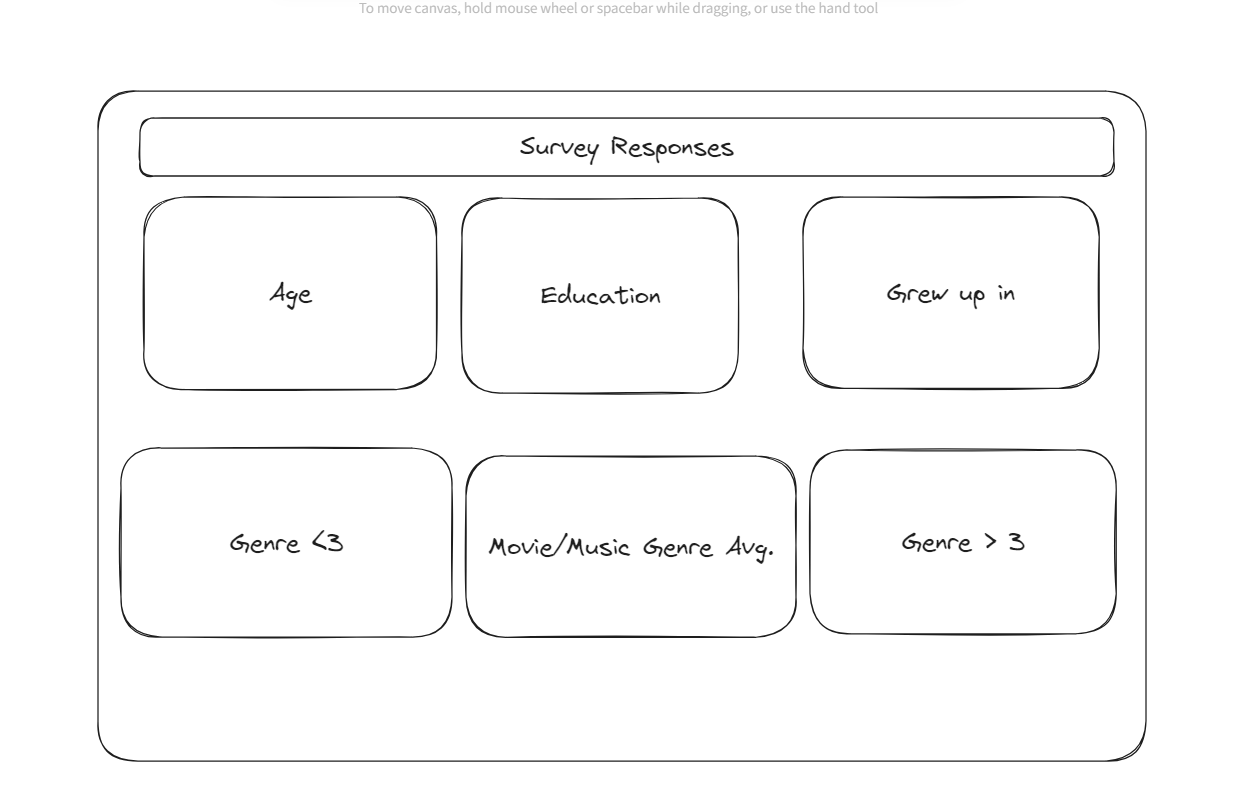
The goal is to use their demographic data near the top of the dashboard to filter the results of their preferences at the bottom of the dashboard. However, to have the data filtered and displayed properly without dozens of separate parameters, I needed to pivot the data.

I grouped each column into categories of: music, movies, phobias, and hobbies. This was so I could label the questions for each of these categories and filter them later when I work in tableau. This meant that if i only wanted to look at the responses to questions about movie genre, it would be easy to do so.

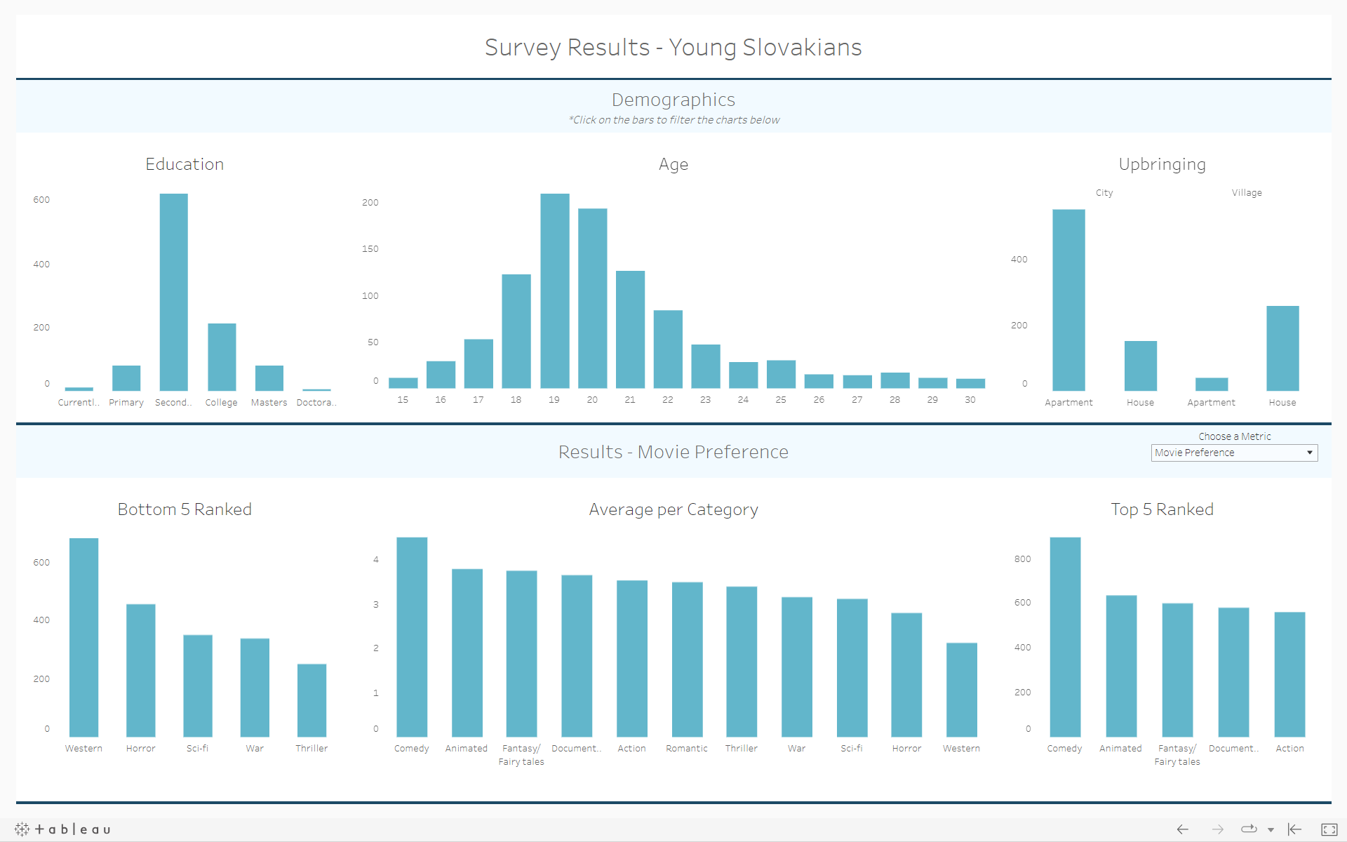
After the data prep, it was quite easy to build this dashboard. The user can select bars on any of the graphs at the top to filter the bottom three. The graphs in the bottom give the user an idea of the distribution of responses in the data. This allows the users to have the flexibility to answer multiple questions. for example, you can see the average for 22 year olds in a village household with a bachelors degree thinks about different movie genres. The bottom 5 ranked looks at responses with a rating less than 3 while top 5 ranked looks at responses greater than 3. I excluded the neutral responses to have a better idea of which questions people felt more strongly about.
