


DS59 are settling in nicely to their 4 month training period, so it's a great time to look at what it took for them to get into The Data School and start checking out their blogs, tableau public, and follow their social media posts!
You can apply for The Data School here.
Over time, we notice applications are getting longer and longer as candidates try to out-do each other in effort and length. But the length is never why anyone is chosen. Interview presentations are around 5 minutes and there are only a few areas we are looking for you to demonstrate your dashboarding skills. These are; understanding of visual best practice and storytelling; demonstrating a deeper analytical thought beyond listing the facts; and demonstrating your passion for learning a new software. As soon as you've done that, you can be confident that you have a competitive application!
Also remember that our interview process is not just about designing dashboards, but equally about how you think about the role of technical consultants, how well you communicate your ideas in person, and how many good ideas you can share with us.
You can see the full dashboards if you click through images, but for now, let's focus on specific elements that shone through at both stages of their application. Enjoy!
Hayfaa Al-Sheikh Hamid
Tableau Public | LinkedIn
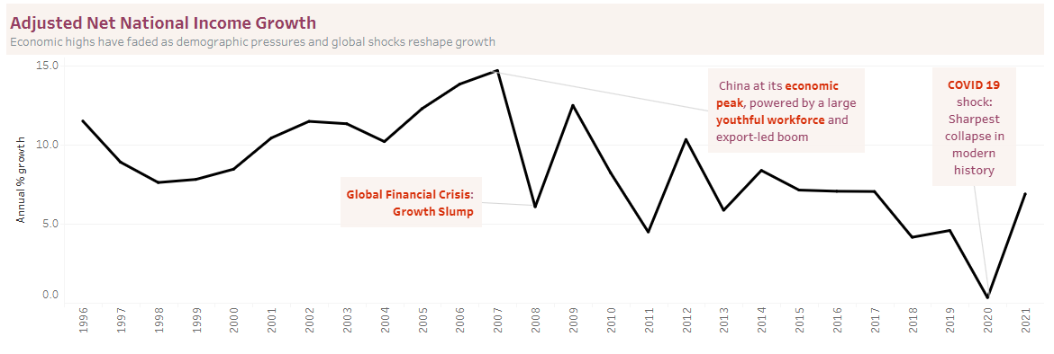
Hayfaa demonstrated commitment to storytelling with her careful annotations that enhanced the story the data was telling by adding external context. It's important to remember that external facts are useful to add an extra layer of context to your analysis, but should not be used to prove or explain away your findings. It's important that your analysis focusses on what the data you're analysing actually shows.
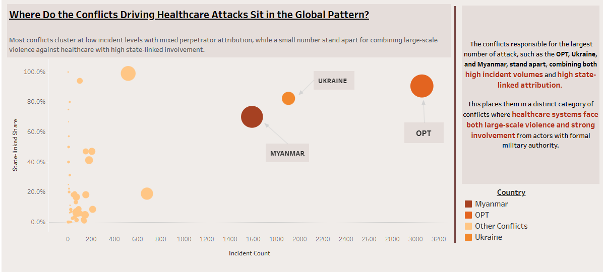
At final interview, she used both annotations and colour to highlight the outliers that her story centered around, using a single colour to set all of the unrelated data points to the background. She was careful to include a legend in this section to reinforce the fact that colours had a different meaning when used elsewhere in the dashboard. Throughout, she showed her commitment to visual best practice and thinking about how the user could easily understand the points she was making.
Kainan Hassan
Tableau Public | LinkedIn
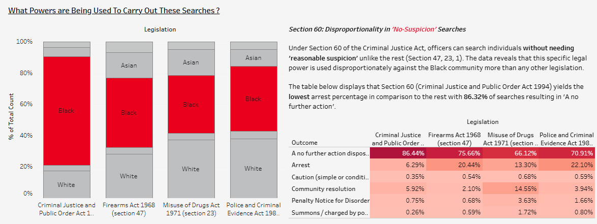
Kainan had a clever approach to chart types that supported his analysis and thought about how to clearly make important values stand out within stacked bars. In the first part of his application, he used colour to highlight the area of focus without losing the context of related values. These charts work especially well when the dimension in focus is sorted to the bottom axis.
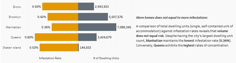
In his final application, he used a diverging bar chart to highlight a lack of relationship between volume and risk. These charts remove the confusion over length values that can arise when there are two axes on the same side of the chart. They require a little bit of learning and having a play around with calculations. Formatting percentages and rounding large numbers to something more compact, makes labels on these charts work even better.
Ken Ueda Burgess
Tableau Public | LinkedIn
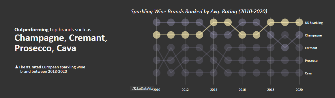
Ken took on a challenging chart for his first interview in a dashboard with beautiful narrative building and highlighting throughout. The bump chart requires familiarising yourself with table calculations but this chart neatly tells the story of UK Sparkling's consistently high performance.
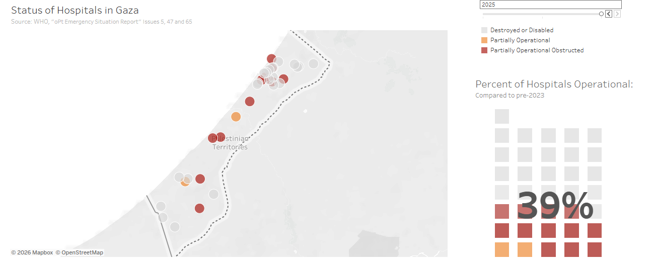
For his final interview, he upped the ante, taking on a waffle chart. Again with clear, consistent formatting, and some interactivity. There are lots of approaches to building these types of charts, but it proves someone was committed to their vision, and willing to dig through some tutorials to bring it to life.
Maria Andreetti
Tableau Public | LinkedIn
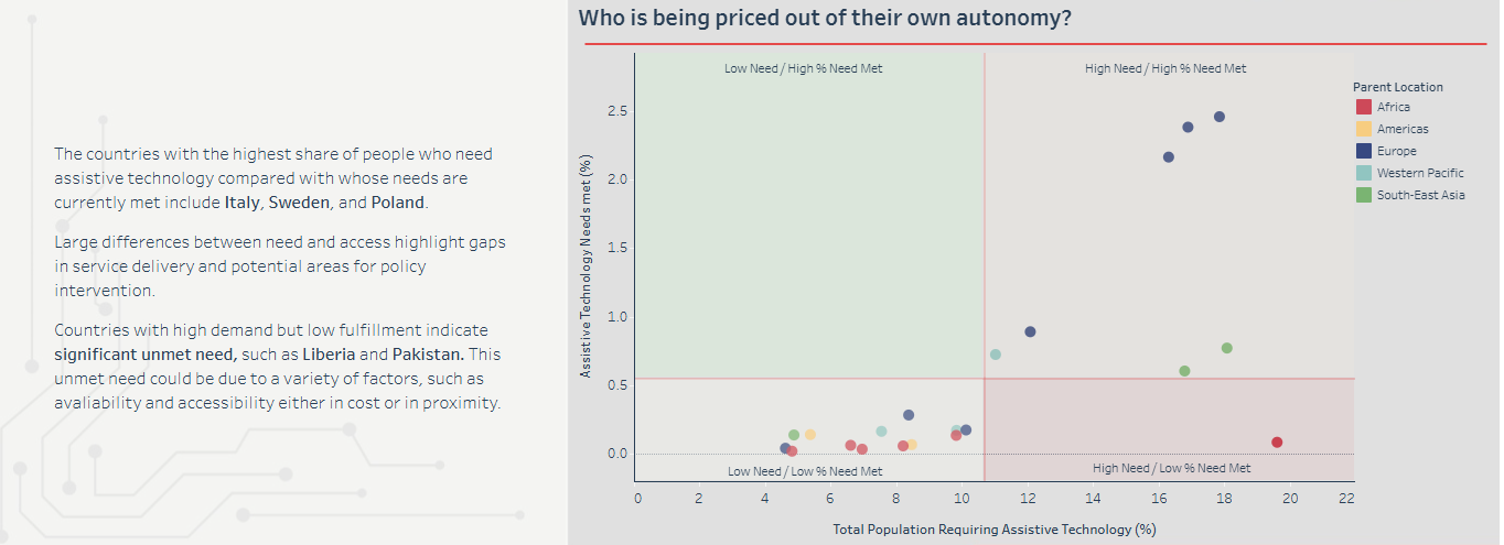
Maria took on a very important chart in the quadrant chart. This chart is a very useful tool for clients looking to set priorities or highlight areas of concern but it can be overwhelming or challenging for some. She carefully summarised the meaning of key points, to settle the user into exploring the chart some more. Given that these charts often colour the marks or background according to their quadrant, colouring by dimension too can be sometimes overwhelming. A focus colour or adding a parameter to switch between viewing by quadrant value (bad med good) or a dimension (eg country) can help.
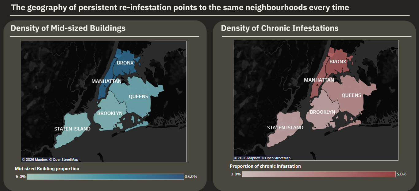
In her final viz, she took was able to dig deep for a story about re-infestation. Although the chart choice and visual best practice were not at the more competitive end, she demonstrated an intelligent approach to digging into the data on a focused direction.
Melissa Osorio
Tableau Public | LinkedIn
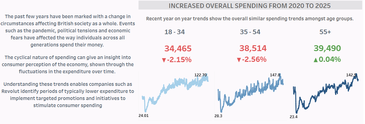
Maria demonstrated her ability to create and interpret subject-appropriate charts while being able to give intelligent conclusions based on what the charts showed in combination. Clients don't need you to give an explanation for why their data might be the way it is. And they know better than you, what they want to do with the facts you provide. But being able to confidently assert what can be concluded from the data and what the data shows, is part of the essential work we do for clients.
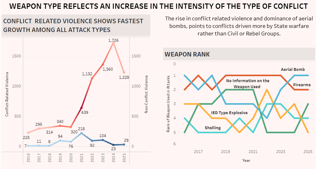
For her final interview, she took on a challenging chart but used it in conjunction with another, to make some intelligent inferrals. Bump charts can be a bit confusing when multiple colours cross, so a highlight colour in the text that corresponds to the relevant weapon in the chart would be more helpful here. The lines on the left chart seem to be coloured by their partner's value, but a single, flat colour would be more useful here too.
Nika-Kare Pierre-White
Tableau Public | LinkedIn
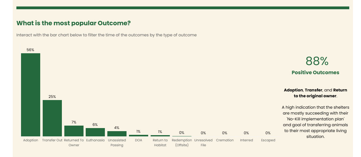
Nika brought consistent clean design and an infographic simplicity to her first application. She include clear signposting for interactivity, showing her consideration for how someone might use the product if she were not around to explain it. Dashboards this clean require a lot of formatting, attention to detail and patience with the many clicks that need to happen in Tableau's formatting panes!
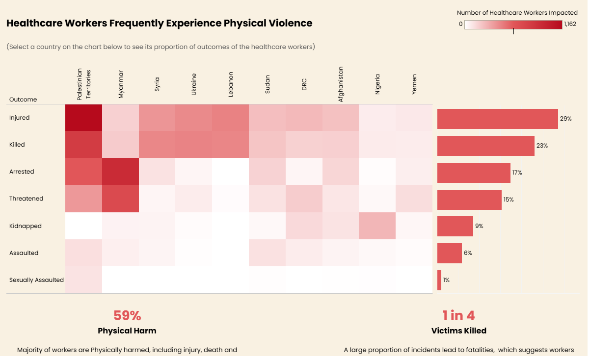
For her final interview, she carried forward her clean formatting but took on the challenge to dig deeper analytically and discover more trends and correlations in the data. She used a marginal histogram with some interactive elements to reveal relevant metrics that people might want to dig into.
___________________________________________________
That's it from DS59. Now I have a challenge to you. What would you do? Why not download their workbooks and remake some of these charts. Make sure to tag them so they can see they've inspired you.