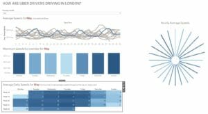
The task was to download and visualize Uber movement data. I decided to look at daily speeds across the whole year for london.

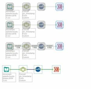
The data set was huge so I input and cached the prep and summary for each monthly sheet before unioning them and adding a pad for a radial chart.
I made a radial chart to show how average and maximum speeds changed throughout the day, with a monthly overview heatmap to choose date, and an updating line chart to show peaks relative to average values. In this example, the radial chart is based on a 24 hour clock, so the next thing to do is switch between am and pm so the values will match a traditional 12 hour clock.