Day 3 we were set an interesting task where we were given a choice of NASA API's and instructed to pull data from an API of our choice and create an interactive dashboard with the data.
After some deliberation I decided to opt for NASA's Natural Event's data that tracks times and locations of events such as Volcano eruptions, Wildfires and most importantly for my dashboard, Icebergs.
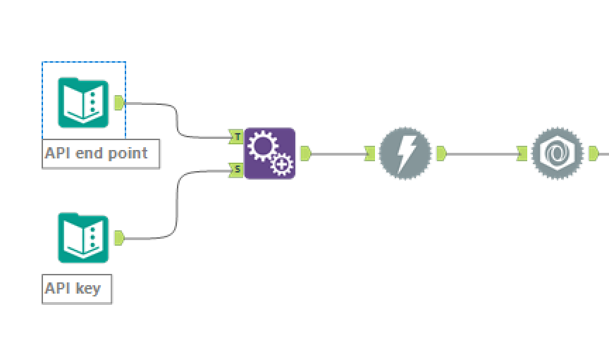
The first step was to feed the API url and my generated API key into alteryx in order to download the data. The data comes in in JSON format so needs to be fed through the JSON Parse tool before I can start manipulating the data how I want.

The next step was pivot the data into a useful data table to enable me to use the data in a dashboard. The granularity of the data after these process were one row per point where each Iceberg has multiple rows to record it's movements over time.

I filtered specifically for Iceberg events with more than one data point to allow me to build a visualisation allowing the user to watch the movement of each Iceberg over time.
Turning the points into a moving path turned out to be quite tricky as in order to achieve this, origin and destination points along the path need to be linked in order for the line to form as the animation plays out. Without the points being linked in the data it results in a series of points without lines linking between them.
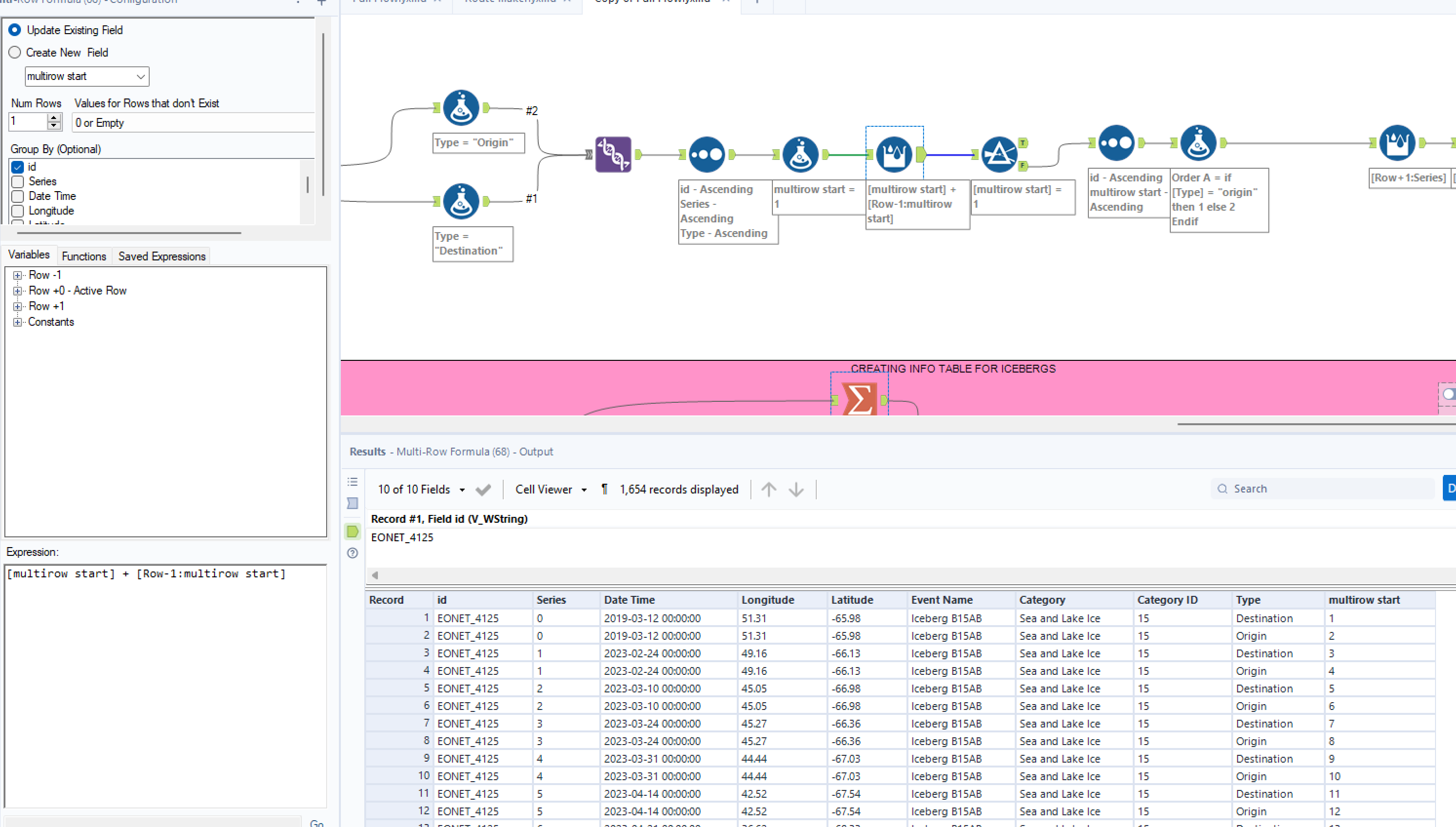
To adjust the data to this spec I used alteryx to duplicate the data set and then use a multi-row formula to add a step number for each point within the already exising series numbers. This would allow me to put the series number on the Pages shelf and the step number on the path mark card.

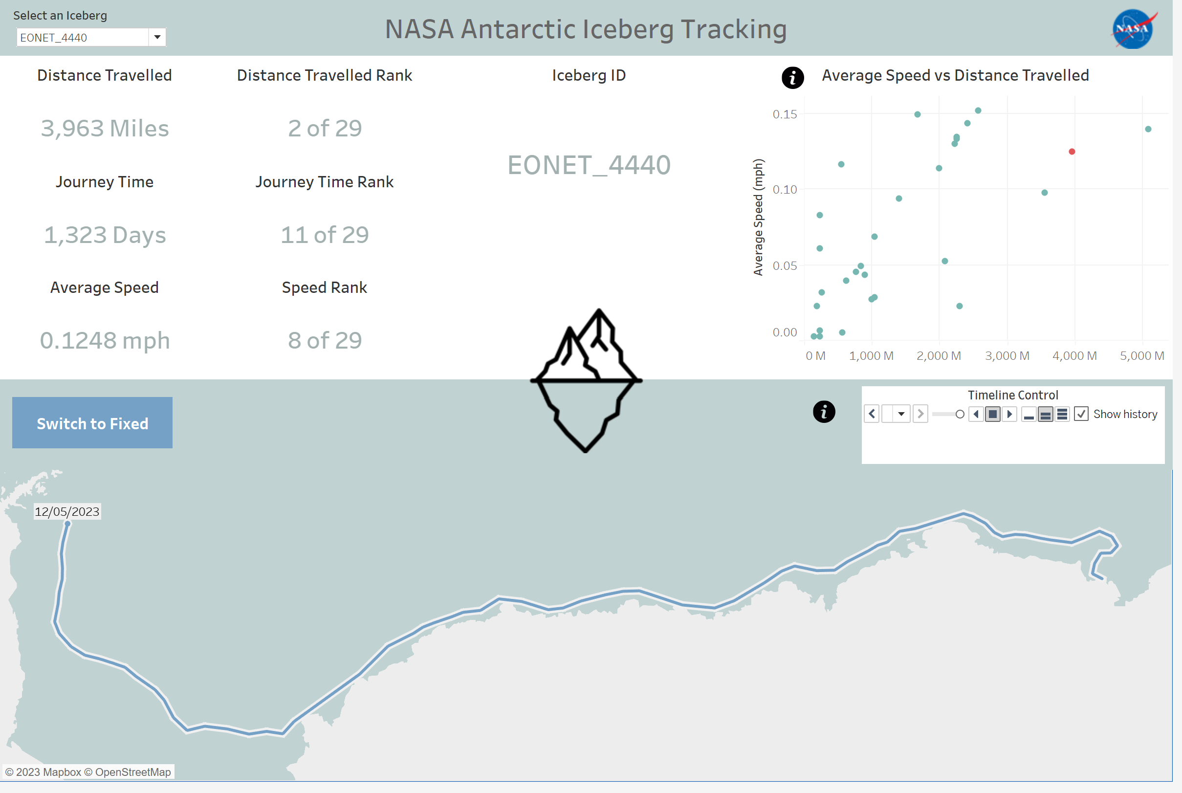
Once the data was finalised I was able to construct the following dashboard:

I hope you enjoyed this blog! Join me tomorrow for the final day of DS38 Dashboard week.
