The long anticipated dashboard week is finally here and on day 1 it hasn't disappointed with a tricky task involving building an application in Alteryx before creating a dashboard.
For this task we were supplied with data on street level crimes and stop and search events in England & Wales from March 2022 - March 2023. The first part of the task was to create an Alteryx app that would allow a user to select the data they want to see based on a bunch of options including: Date range, Crime Type and Area. The resulting data had to be pushed to Tableau Server as a Published Data Source which could then be used to create a Tableau Dashboard where the data updates every time somebody runs the Alteryx App.
As you can see from the image below, my Alteryx app ended up being a bit more complicated to construct that I anticipated:
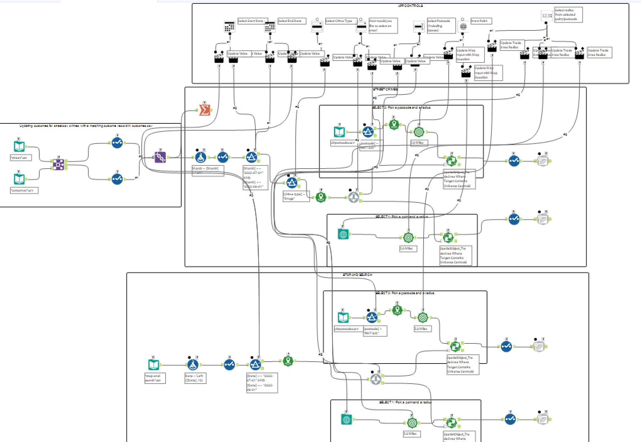
This was partly due to all of the interface actions required but mostly because I wanted to give the user a choice between select location based on postcode or based on manually selected point on a map. This would result in the workflow being split into two different paths which I will call Path A and Path B.
Before the split, all of the incidents had to have a point created to allow for a spatial match later on in the flow.
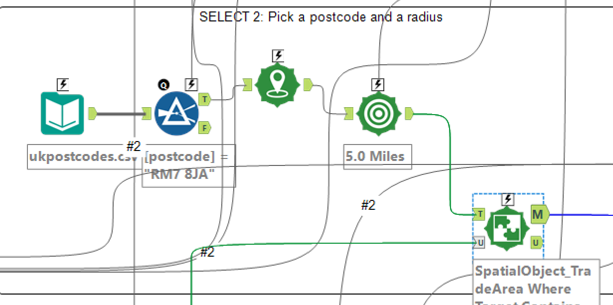
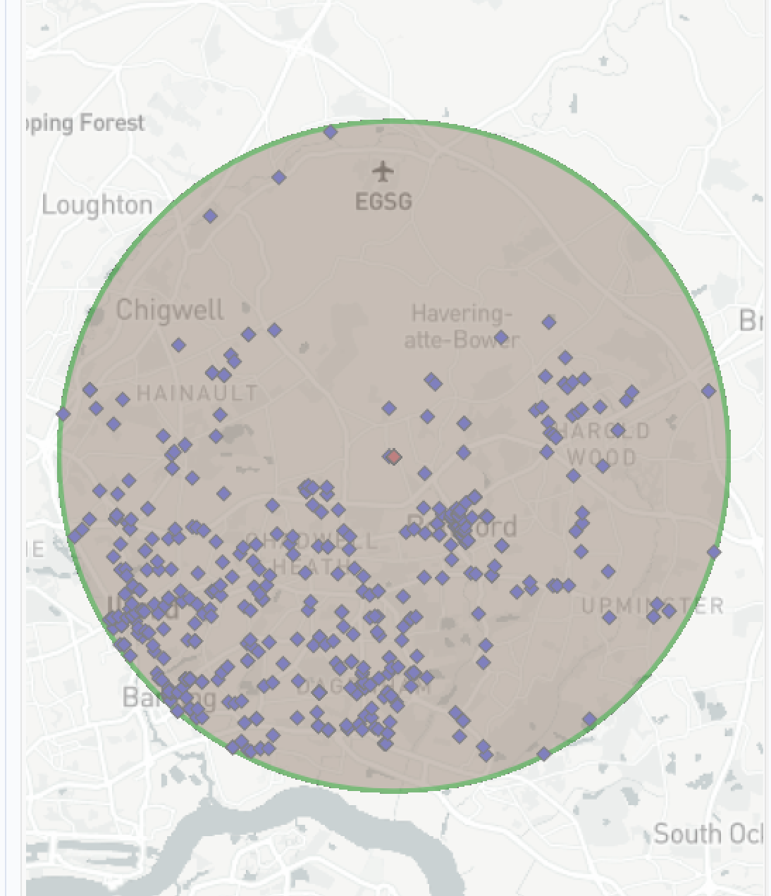
The first step in path A involved bringing in a postcode - longitude/latitude data set and creating points before feeding this through a filter to enable a single postcode to be selected, followed by a trade area tool, both of which are customisable by the user. The newly formed trade area is then fed into a spatial match tool along with the previously created incident points to filter the data so that only crimes for the selected trade area are shown.
Here is the above section of the flow as well as the results for that section:
Path B gives the user the option to select a point using a map input, the map tool allows the user to select a point on the map themselves. This data is then fed a flow identical to Path A where the longitude and latitude of the selected point is used instead of the selected postcode.
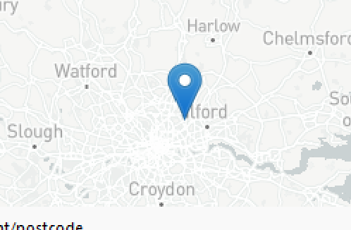
To switch between the two paths I had to a employee a tool I'd never used before called "Detour", Detour effectively works a switch that can be turned on and off to direct the flow of data down one path or the other, in this case down Path A or Path B. The Detour tool can then be connected to a radio button to allow the user to decide which direction they'd like to choose.
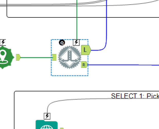
The app ended up being quite complex not only because of the multiple paths but because I chose to make this work for both the street crime data as well as the stop and search data, meaning all of the above had to be duplicated and connected to all of the same interface tools, resulting in a lot of lines across the flow which can make it look a little confusing.
Here is the final app interface:
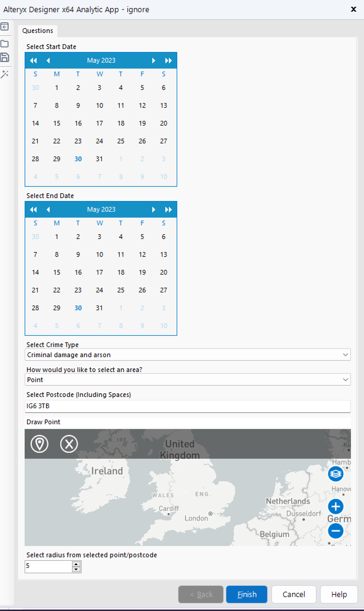
For my dashboard I decided that it should be mostly exploratory due to the fact that the user is going to be selecting a custom area meaning there will be different data being fed in depending on the user. It would be great to find a story within the data and lean into that story but then that story may not exist in a different part of the country.
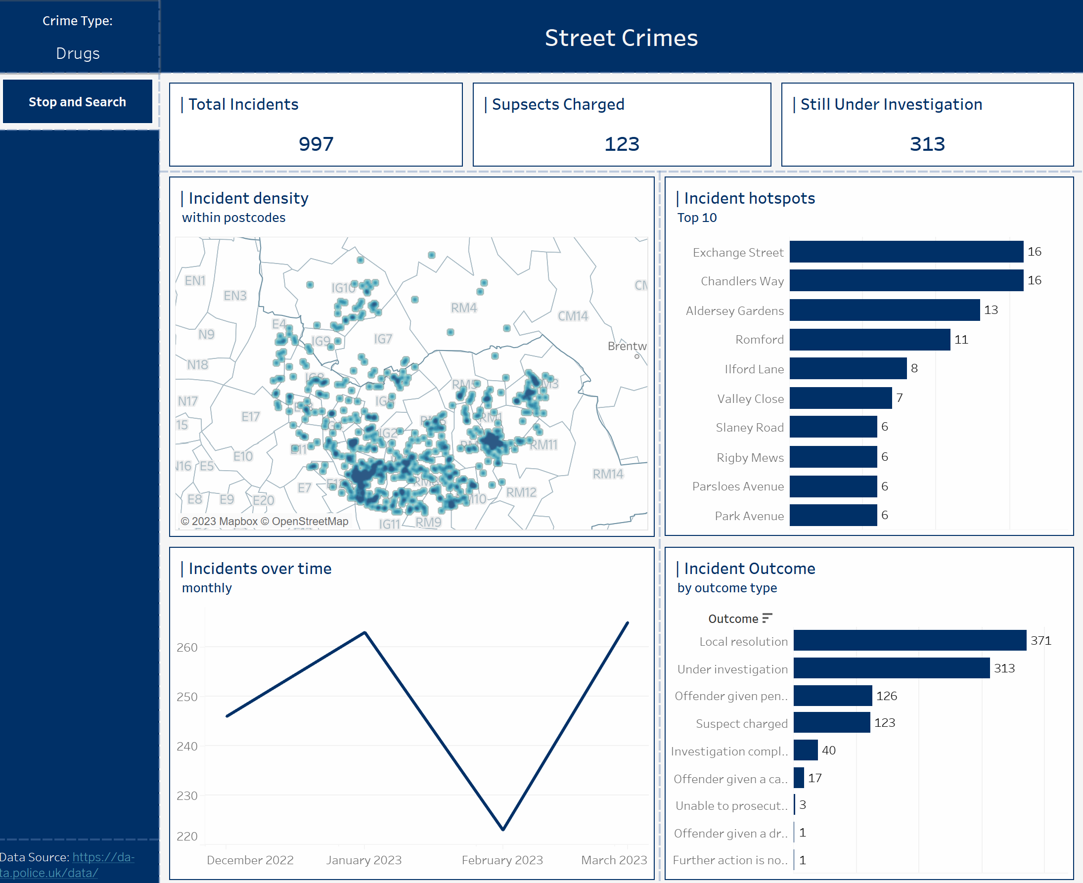
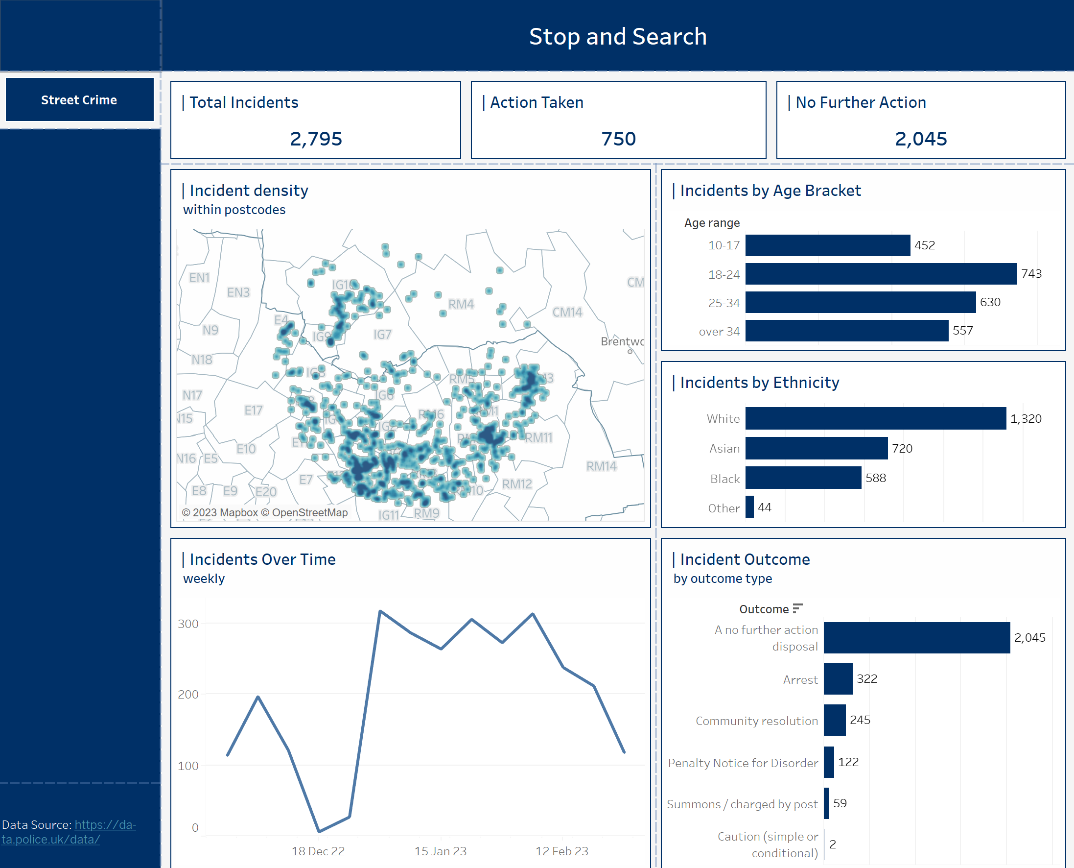
I split my dashboard into two, one for the street crime data and one for the stop and search data where each has a map of incident density in the local area, an incidents over time graph and a bar graph comparing the different outcomes.
All of the charts are inter-filterable allowing the user to look for whatever may be relevant in their area, for example if they want to find out if the number of people charged has increased or decreased and which age and/or ethnicity gets charged the most in stop or search:
Below are my pair of Tableau dashboards:
I hope this provided some useful insight into what a day in dashboard week looks like, look out for Day 2 tomorrow!
