After spending the first two weeks of training at The Information Lab, I’ve gotten comfortable working within the Tableau ecosystem (Tableau Desktop and Prep), familiarising myself with the UI, shortcuts, and where to find the actions or features I need. But when I started learning Power Query and BI in my third week, it felt like going back to my university days, where Excel's UI ruled anything data-related. The transition from Tableau's UI to Power Query’s posed an interesting challenge that I hadn’t anticipated. So, here’s a quick guide to Power Query’s UI for anyone just starting out.
Your Main Page
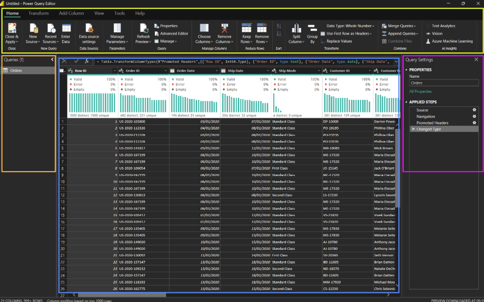
When you first open Power Query, you are greeted with this layout that is split into four main sections.
- Queries Pane (Left)
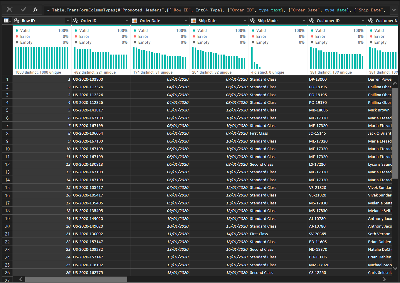
- Table Pane (Middle)
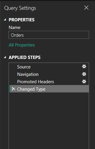
- Query Settings (Right)
- Toolbar (Top)

Queries Pane (Left)
This is where you’ll see all your active queries. Each query represents a different step in your data transformation process. When you select a query here, the corresponding data will be shown in the centre pane (Sample Superstore in my case), allowing you to shape and transform the data as needed. You can also organise your queries, rename them, or delete them from this section.

Tip: Keep your queries organised by naming them according to the transformations they represent. This makes it easier to track your progress as you work through your data.
Table Pane (Middle)
The data for your selected query is displayed here, letting you see the effects of any transformations you apply. This is where you can interact with your data—filter, sort, and perform basic analysis.

Tip: Use the refresh button to update the data preview, especially if it’s slow to reflect changes after applying transformations.
Query Settings (Right)
The Query Settings panel shows you the steps or changes that have been applied to your selected query. This section allows you to manage and modify these steps, fine-tune settings, or work with parameters for your query.

Tip: Check the applied steps list regularly to make sure everything is on track. If something’s wrong, it’s often easiest to modify an earlier step than start from scratch.
Toolbar (Top)
The toolbar gives you access to all your transformation tools. It’s like your Swiss army knife for data manipulation. The toolbar has five tabs, but the main three to focus on are:
Home Tab

Handles basic query management. Here you can create new queries, rename or delete existing ones, and manage their settings. Once you're done with your transformations, use the Close & Load button to load the final data into Power BI or Excel.
Transform Tab

Main hub for cleaning and shaping your data. You can remove duplicates, change column data types, split columns, and perform actions like pivoting or grouping data. It's where you’ll apply most of your data manipulation.
Add Column Tab

Allows you to add new columns based on custom logic or conditions. You can create custom columns using formulas, add conditional columns based on specific criteria, or generate new columns like index numbers. It’s essential for enriching your data.
Power Query’s UI might feel a bit different at first, especially if you're coming from Tableau, but once you get the hang of it, it’s a great tool for transforming and shaping your data. The key is getting comfortable with the Queries Pane, Data Table, Query Settings, and Toolbar—these are your main areas to focus on. Keep experimenting, and soon you’ll be navigating the UI like a pro, turning your data into something useful in no time!
