


Doughnut charts are a fantastic way to visualise proportions, offering a clean and impactful alternative to traditional pie charts. They draw the eye to the data, and the central void can even be used to display key metrics. In this guide, we'll walk through creating a beautiful doughnut chart in Tableau using the Superstore dataset.
Let's dive in!
Step 1: Connecting to Your Data
First things first, open Tableau and connect to your Superstore dataset. If you haven't already, ensure you have it readily available. Once connected, you'll see your data source pane.
Step 2: Setting Up the Basic Chart Structure
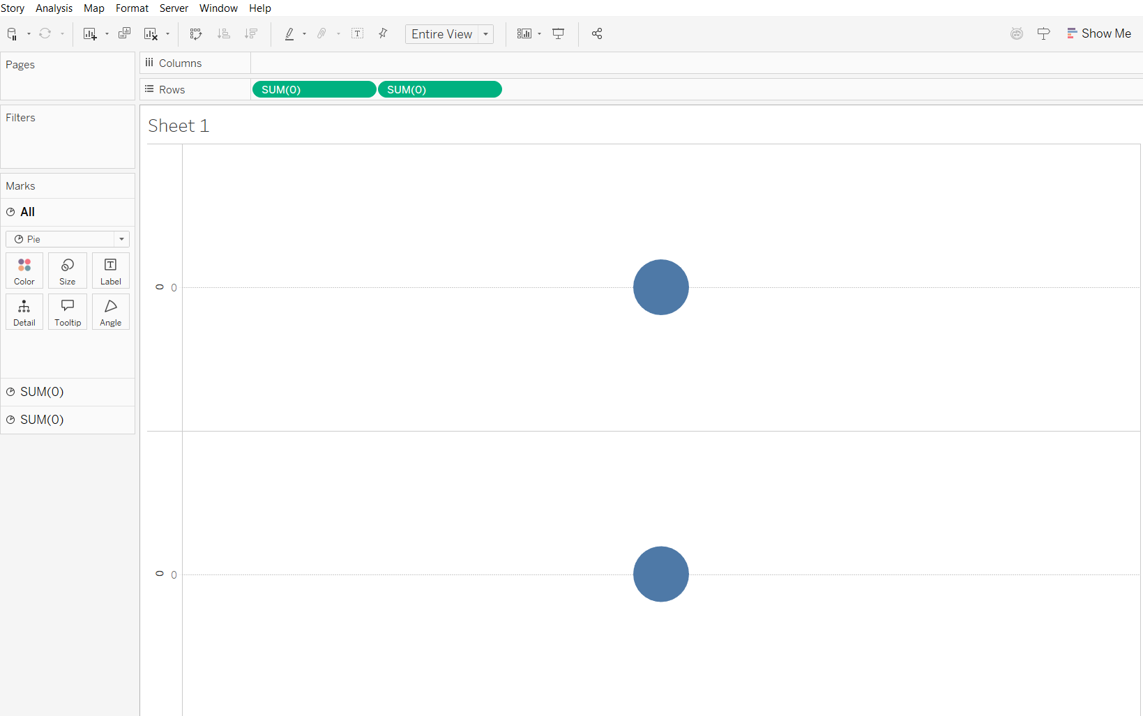
To begin building our doughnut, we'll need two instances of 0 . Type 0 into the Rows shelf twice. It will automatically change to sum(0) .
Next, change the mark type for both of these marks to Pie. You can do this by selecting the "All" dropdown in the Marks card, then choosing Pie from the dropdown. Lastly, change the view from 'standard' to 'entire view' at the top for a cleaner look.
Step 3: Adding Our Dimension and Measure
Now, let's bring in the data we want to visualise. For this example, we'll analyse Sales by Region. Drag Region to the Color card for the first Sum(0) mark. Then, drag Sales to the Angle card for the first Sum(0) mark.
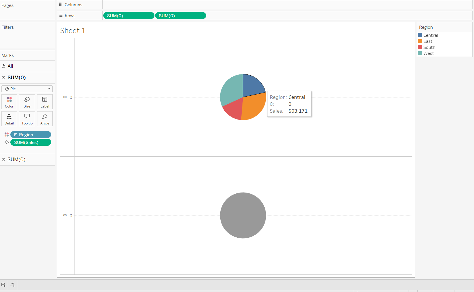
You should now see a colorful pie chart representing sales by region.
Step 4: Creating the "Doughnut Hole"
This is where the doughnut magic happens! Click on the second Sum(0)mark in the Marks card. Remove any existing fields from its Color and Angle cards. Then, change the color of this second pie chart to White.

Now, decrease the Size of this second pie chart slightly using the Size slider on its Marks card. This will be the inner "hole" of our doughnut.
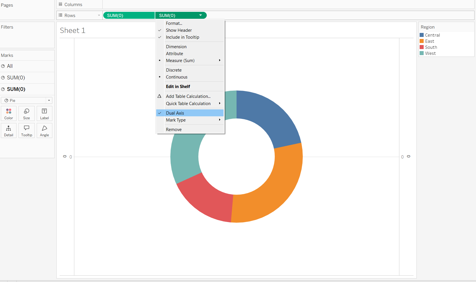
Step 5: Combining the Charts (Dual Axis)
To overlay the two pie charts, click on the second Sum(0) field on the Rows shelf and select Dual Axis.
Step 6: Formatting the Outer Ring + Legends
At this point, you should have a basic doughnut chart! Let's clean it up a bit.
- Remove Unnecessary Headers: Right-click on the
Sum(0)headers on the axes and deselectShow Headerfor both. - Hide Legends (Optional): If you prefer, you can hide the color legend by right-clicking it and selecting
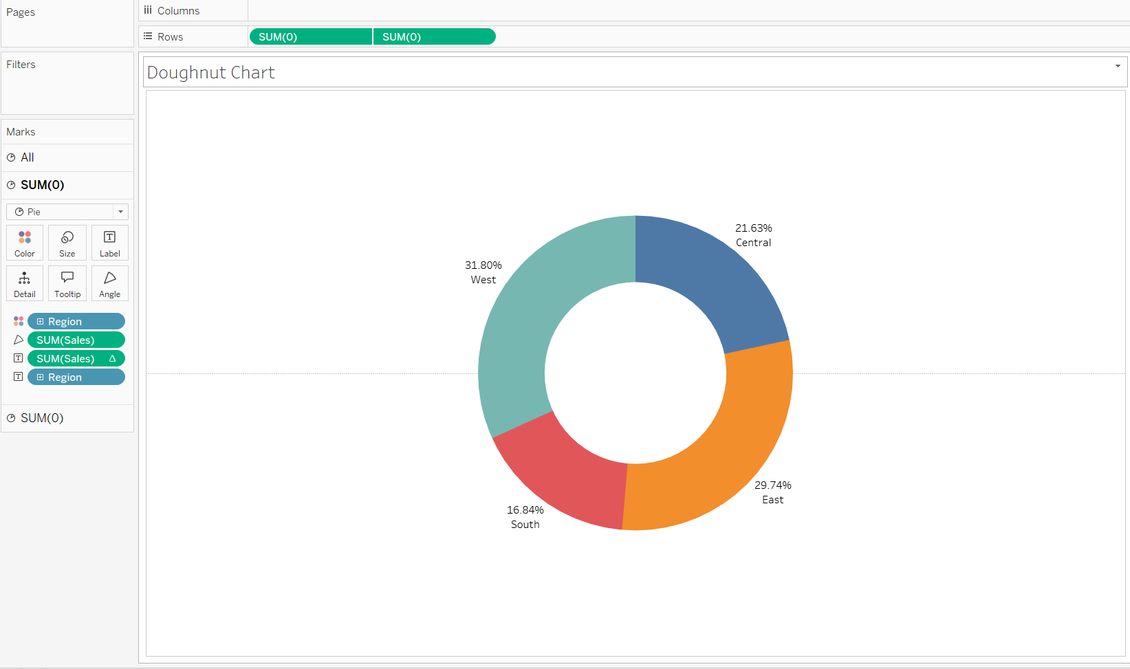
Hide Card. - Add Labels: For the first
Sum(0)mark, dragSalesto theLabelcard. You can then format the label to show the percentage of total by right clicking on theSUM(Sales)label card then "Quick Table Calculation" and click "Percentage of Total". You might also want to dragRegionto theLabelcard to show the region name.
Step 7: Adding Total Sales to the Center
In your Marks Card, click on the second instance of your measure (the one you colored white to create the hole). Any labels we add here will appear directly in the center of the chart.
Drag the Sales measure from your Data pane and drop it onto the Label icon within that second Marks Card. By default, Tableau might show a single number. Ensure it is set to Sum(Sales). You will now see a number appear in the middle of your doughnut.
Step 8: Formatting the Centre Text
To make the total stand out, we need to format it:
- Click on the Label icon in the Marks Card.
- Click the three dots (...) next to "Text" to open the editor.
- Type "Total Sales" above the number, make the actual sales figure Bold, and increase the font size (e.g., 16pt or 18pt).
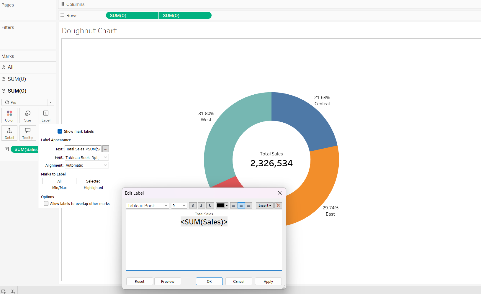
Step 9: Final Polish (Currency Formatting + Design)
If your number looks like a plain string of digits, right-click SUM(Sales) on the Marks Card, select Format, and under the "Numbers" dropdown, choose Currency (Custom). Set it to 0 decimal places for a cleaner look.
Remember to also format the outer ring labels too as you would like. You can copy the same format of the centre but reduce the font size from 18pt to 14pt. Change the colours as you wish in the marks card panel. Remove grid lines by right clicking on the sheet and go to format then click on the bit at the top that looks like a bunch of horizontal lines and then click on zero line and select 'None'.
Lastly, you can change the title by double clicking 'sheet 1' at the top and changing it as you wish.
The Final Result
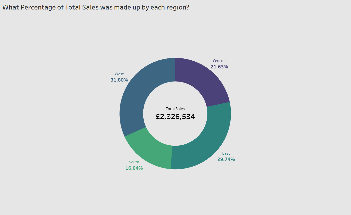
Your doughnut chart now tells two stories at once: the outer ring shows the distribution of sales across regions, while the center provides the context of total performance.