


I recently came across this Workout Wednesday, where I was challenged to create a Radar Chart. This challenge was based on a map layers technique by Johan de Groot, with a great walkthrough by Donna Coles, which I’ll link to both at the end.
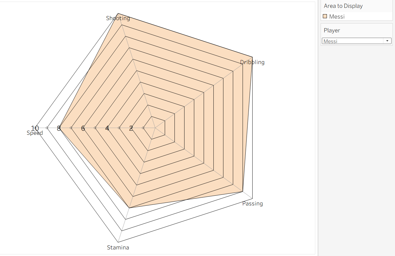
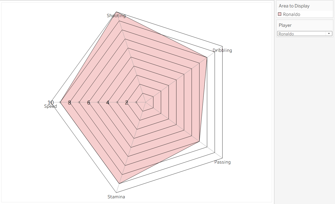
A radar chart is a great way to compare multiple attributes across different subjects, and I was curious about how I'd recreate it with my own data. For my blog today, I will be comparing performance metrics between Messi and Ronaldo.
This dataset has 3 sheets: Filled, Line, and Gridlines.
Your data for Filled and Line needs 4 columns:
- Area: What you're comparing ( departments, players, etc)
- Theme ID: a number for each spoke (Area), starting at 1
- Themes: the name of each spoke (Communication, Leadership, Speed, Shooting, etc.)
- Value: the score for that combination on a consistent scale
Some rules include:
- Every Area must have a row for every Theme. So if you have 5 themes and 2 players, you need exactly 10 rows.
- All values must be on the same scale. If one metric is out of 10 and another is out of 100, your chart will be broken.
- Theme IDs must be consistent across Areas. Messi's Theme 1 is Speed, so Ronaldo's Theme 1 must also be Speed.
Now we must understand the differences between Line and Filled data. With our data, we are comparing our areas (Messi and Ronaldo) across 5 values: speed, shooting, dribbling, passing, and stamina.
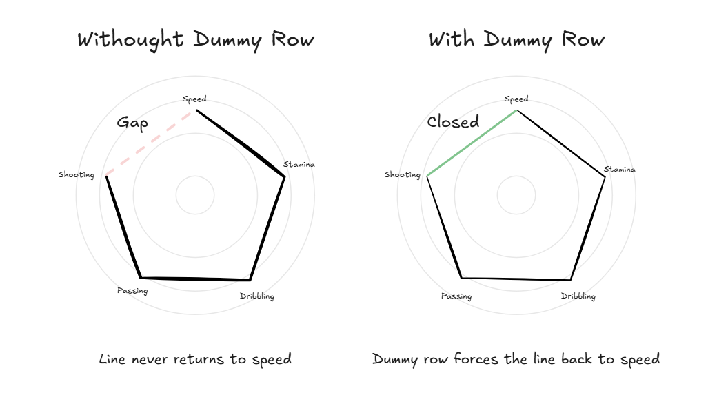
Filled: uses a Polygon mark type in Tableau. Polygons automatically connect the last point back to the first, so the shape closes itself.
Line: uses a Line mark type instead, which does not auto-close, but rather stops at the last data point. To force it to close, you must add one extra "dummy" row per area that copies the value of the very first theme. This tricks Tableau into connecting the final line back to the start.
Let's run through an example right now. How would you prepare this data for a radar chart?
Think about the areas, the first values, and how to connect them. (Scroll down for the answer.)
If you said to add these 2 lines at the bottom, you were correct. We do this because there are 2 areas, so each needs its own dummy row. We increment the Theme ID by 1 (so Theme 6), but copy the same value as Theme 1
The total number of values you have is arbitrary; you just need to make sure that every combination of Area and Themes has a value.
The last thing you need is a separate Gridlines sheet. This is a single column of numbers from 1 to 10, representing the rings on the radar, similar to a bullseye. It never changes, whether you have 2 players or 20, 5 themes or 30.
One thing to note — Donna's walkthrough uses values out of 100, so if your data is on a 1–10 scale like mine, you'll need to adjust the Radius formula from [Value] to [Value]/10 to keep the chart proportional.
Now that your data is structured correctly, you're ready to build. For the full step-by-step Tableau build, check out the original Workout Wednesday challenge, Donna Cole's walkthrough, and Johan de Groot’s original blog. Happy building!
Here is my finished radar chart, with the option of toggling between Messi and Ronaldo.
You can download the dataset I used here.