


This was our third day of Dashboard week, and today we were tasked with creating Tableau dashboards while taking WCAG and GDS accessibility standards into account. My specific task was to build a dashboard pitch to London City Council using real-world public data to showcase how you meet WCAG and GDS accessibility standards. My dashboard had to take into account:
- Color contrast rules (for color-blind safety)
- Keyboard and screen-reader navigation
- Descriptive headings and ALT text
- Clear language, no abbreviations without explanation
The data we were provided with included attractions in London, with longitude/latitude, the name, the nearest station, and many other accessibility metrics such as guide dog-friendly, accessible toilets, etc.
We were also provided with a dataset of all tube stations in London, including the name, longitude and latitude, and other accessibility metrics.
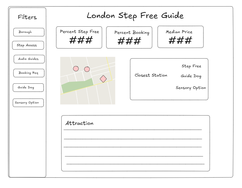
My plan was to create an exploratory dashboard that allowed a user to choose an attraction and provided the closest tube station, along with how accessible both the attraction and the tube station were.
This was my Excalidraw sketch:
And this was my final dashboard:
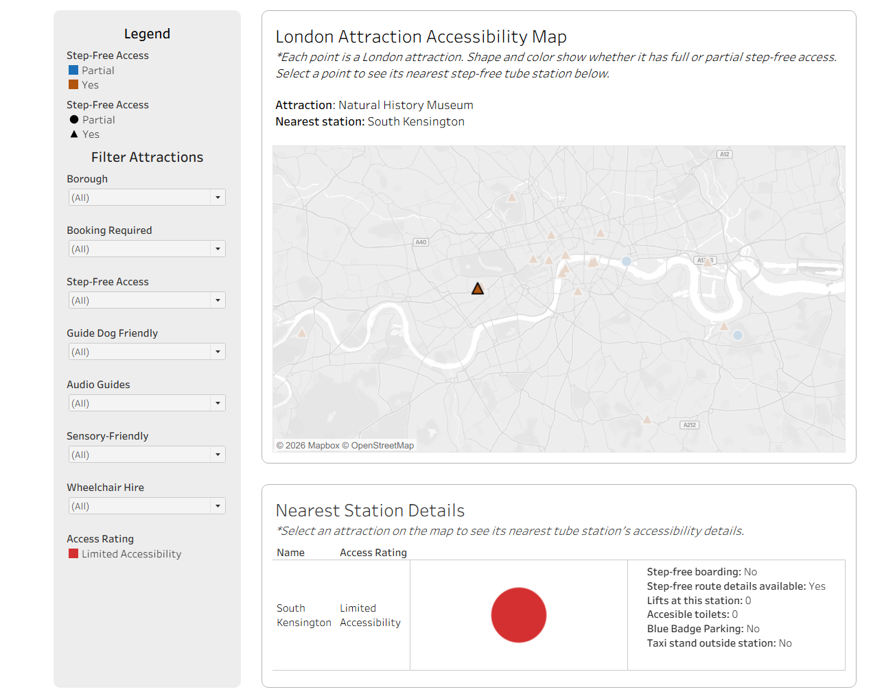
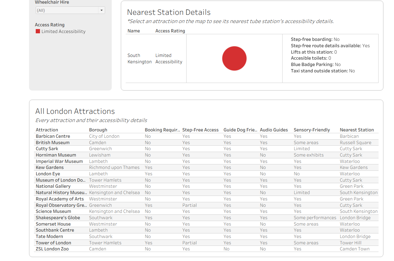
I chose not to incorporate KPIs because they did not fit into my exploratory theme and would have clashed with my filters.
You can view it here: Here