


Getting acquainted with how to create different graphs across Tableau in Power BI has been challenging, but like anything, with time, it gets easier! Here is a quick tutorial on how to create a Customer Order Frequency Chart.
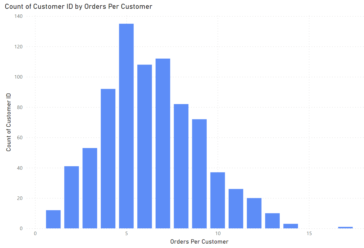
Here is the end goal. A chart showing how many customers made a certain amount of numbers. In this case, with 5 orders being the most common number of Orders per Customer, occurring 134 times.
In building the graph, we first can simply add Customer ID to the Y axis, and select Distinct Count. The X axis, however, is slightly more tricky.
If this were Tableau we could use an LOD expression something like this.
{ FIXED [Customer Name]: COUNTD([Order ID])}
Things work a little different in Power BI. Instead of the FIXED LOD, we can use the CALCULATE and ALLEXCEPT functions to get to the end result.
Our calculation looks something like this.
Orders Per Customer = CALCULATE(DISTINCTCOUNT(Orders[Order ID]),ALLEXCEPT(Orders,Orders[Customer ID]))
While this may be intimidating at first, it can be broken down very simply into the LOD terminology we are familiar with.
For each Customer ID, Calculate the Distinct Count of Order ID.
We can now simply add our new column to the X axis of our Stacked Column Chart and we are done!
