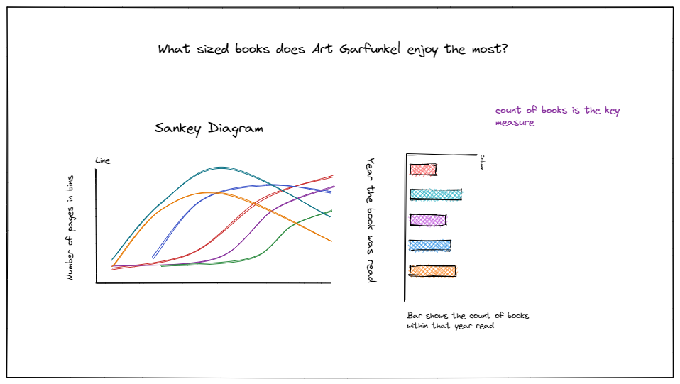
Today was the last day of DS29's dashboard week and we were tasked with creating 'fancy' charts using a very simple dataset. This chart would also do some sort of storytelling using the data, but coming up with a good story was challenging because the dataset was so simple.
The first challenge was finding some fancy charts we've never done before, this took me a while because I wasn't sure what chart would be best practice for the dataset we were given. I ended up deciding to do a Sankey diagram, this there were quite a few examples of them on the Tableau Public discover. I then created a sketch on what I planned to do as well as the fields I would be using

The next and most obvious challenge was creating the Sankey. I did try to reverse engineer many of the Sankey's I found on Tableau Public, but they either were not downloadable or the calculation were omitted in the Tableau Export. This made the day much more difficult for me because I would have to find out how to do the Sankey I wanted using my knowledge on math and the available resources.
I ended up doing many difference sheets of Sankey's using different calculations from different sources, even watching Youtube videos. However, my Sankey would just not work. I concluded that the reason must be because of the fields I had decided to use (years and book groups). The result is shown below, sadly the Sankey did not work for my idea.

