When starting our session this morning on Power BI with Nathan Leather, we were given a choice of what we would like to do for the session. Why I set out to recreate WOW2020 Week 53 is a mystery unto myself; maybe it was because I just love WOWs or maybe because I wanted to know the differences in capability and feel of Power BI and Tableau. In any case, I took on the task with my usual courageous zeal, and for that, you are very welcome, as now I can divulge to you some of these differences.
The Look
It's no surprise that Power BI and Tableau would look very different. Power BI, made and owned by Microsoft, has that usual Microsoft Office UI. The feel of Power BI almost feels like Microsoft Publisher (if anyone remembers that). Whereas Tableau is a unique design and layout, not comparable to any other software.

Dragging fields and effects
Dragging Superstore's Order date, the differences are again exposed. In Power BI, there are 'Pages', 'Report' and 'Visualizations'. There are no sheets with separate charts that can be compiled into a dashboard, as with Tableau. Instead, all the charts made will sit in a page which is in the reports tab on the left pane. Dragging a field to Power BI will create a chart wherever you dragged the field. In comparison to Tableau, sheets must be put into containers on a dashboard to be able to move the sheet in the view, alongside other charts.

Hierarchies
Right-click dragging a hierarchy (like Order Date) into the view will allow the user to choose the level of drill-down and the data type (discrete/continuous) before the chart is made. However, in Power BI, this functionality comes after the chart is made, clicking the down-arrows at the top of the chart.

Colours
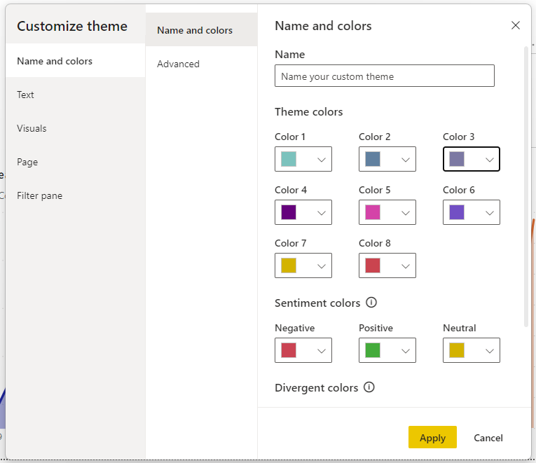
The colour formatting in Power BI worked markedly like colour themes in any Microsoft Office application and felt easier to handle than in Tableau.

Making Charts
Trying to recreate this viz was a learning curve, having never picked up Power BI before. And this is how far I got in around 2 hours.

In Power BI, for chart types there are icons that can be clicked to make any chart (and more can be downloaded). This is comparable to the 'Show Me' tab on the top right of the Tableau window. BANs were called Cards in Power BI.
Conclusions
It's too early to give a definitive stamp of approval to Power BI but there are a few observations that I can make in my short time knowing it. It makes sense why some users would prefer Microsoft's answer to data visualization. The interface is recognizable, slightly easier to navigate, giving it a sleeker feel. It holds the user's hand in making charts and formatting is much more customizable. But with this, I felt almost a bit restricted as a user, not being able to put fields exactly where I wanted them. Some of this may be due to my lack of Power BI experience but it also felt as if this was a key feature of the software. I would say Power BI may be easier for beginners, but I would need more time to better investigate and explore.
TLDR: Power BI is different to Tableau. I cannot say for certain which I prefer or which is better but for now, I will stick with my beloved Tableau.
