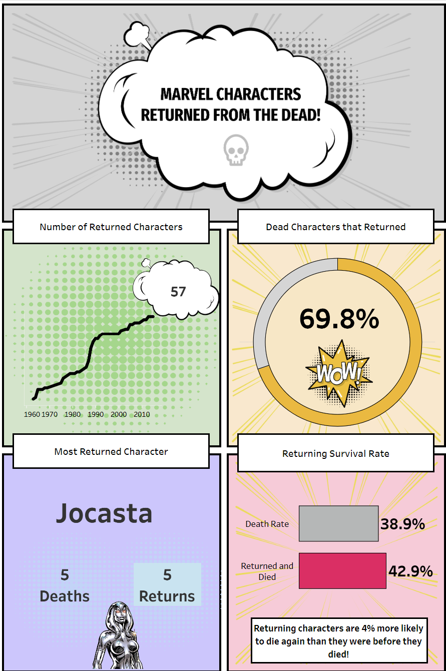
Today, we started an exciting project: creating an infographic about Marvel comicbook characters and their mortality. I decided to focus on characters who, even after they 'died' in the comics, came back to life, like a form of 'resurrection.'
When I looked at the data, it was clear that these characters had a high chance of returning, often more than staying dead. This intrigued me, so I wanted to dig deeper. I wanted to explore how likely it was for a character to come back, identify which characters had multiple resurrections, and see if these resurrections affected their chances of survival.
Once I had my charts, I began integrating them into the dashboard each chart found its place within a comic strip-like box. In terms of aesthetics, my aim was to capture the essence of 'Pop Art' comic book style, infusing the infographic with a vibrant narrative.

The primary hurdle in this creative endeavor was seamlessly integrating the pop art design elements into the dashboard, ensuring they harmonized with the overall narrative flow and balanced focus.
I thoroughly enjoyed this challenge. Admittedly, there were numerous floating containers, which at times became confusing. Nonetheless, I eagerly anticipate our next venture with Power BI, particularly the prospect of utilizing their handy snap tool, which promises to simplify our design process.
