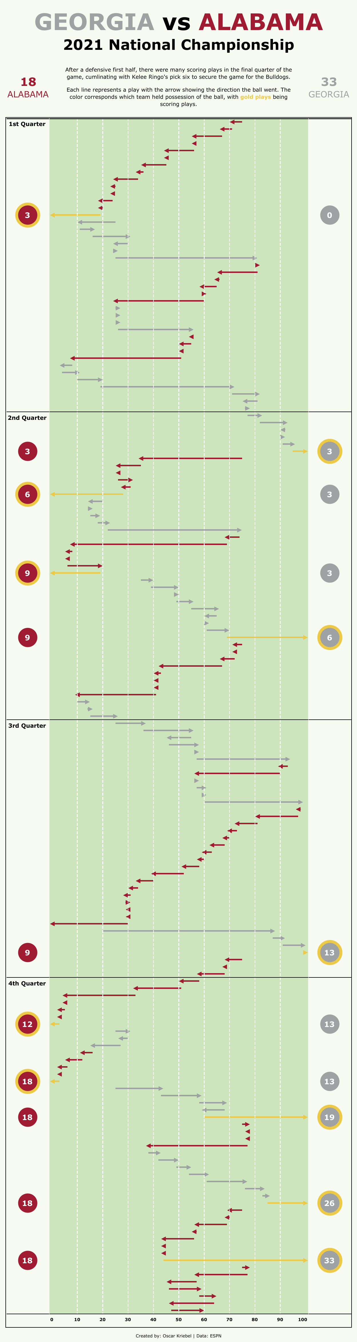
One of my hobbies is watching football, especially for my favorite teams of which the Georgia Bulldogs are my number one. And with the next season coming up, I thought it would be a fun challenge to try and represent the play by play of a game within a Tableau dashboard.
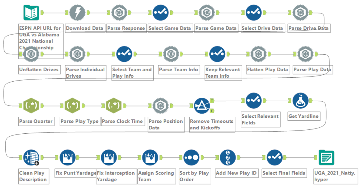
The data was retrieved from ESPN and cleaned in a Alteryx workflow I created. It pulls the data from a somewhat hidden ESPN API, which provided a lot of details which I could use. The workflow was made specifically for the game I chose for this dashboard: the 2021 National Championship against Alabama where UGA finally beat Alabama after many losses against them and finally claimed the mountaintop once again after 41 years.
I wanted a way to show the back and forth of the game and highlight the important parts of the game. These were typically scoring plays, so I wanted to highlight those as well. I thought to try and include information about the type of play ran as well, but in the end it wasn't the most feasible thing I could incorporate into this dashboard without making it more cluttered.
STEP-BY-STEP GUIDE
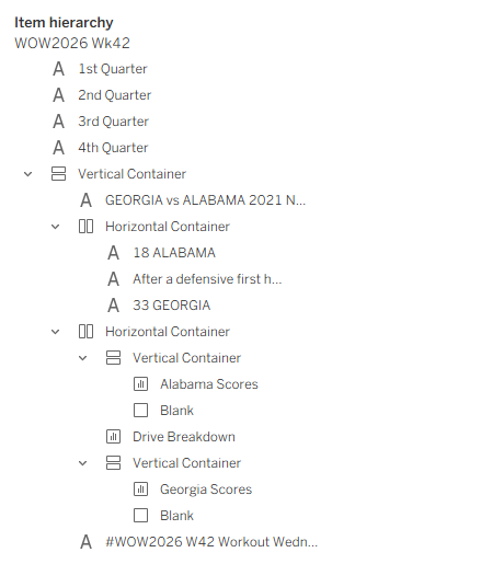
To start, we'll take a look at the general structure of the dashboard. I've set it to be a custom size of 1000 by 3750 for a very tall dashboard. It's made up of three different worksheets: one for the game itself, and two for the score of each team. A vertical container is used to structure the whole dashboard, with two horizontal containers put inside for the second layer of text and for the worksheets to live in. Some floating text boxes are used to label the quarters inside of the second horizonal container. For the two scoring worksheets, those are put into a vertical container so that a blank can be used to add spacing for the main chart's axis.
I used the Verdana font style because I like the look of it and it is natively compatible with both Windows and Mac. We can set that as the dashboard font style under Format, then Font with the worksheet default being set to Verdana.
For the main chart, the basis of it is the Yard Line field, which is where the ball starts on each play. With that on the Columns and the Play Id on the Rows, we get each play of the game with where the ball started. We can also put Quarter on the Rows to also allow the different quarters to be divided up. The Yardage represents how far the ball went from the start of the play so we want to put that on the size mark. Putting Team on color also lets us see which team held possession of the ball at the start of the play.
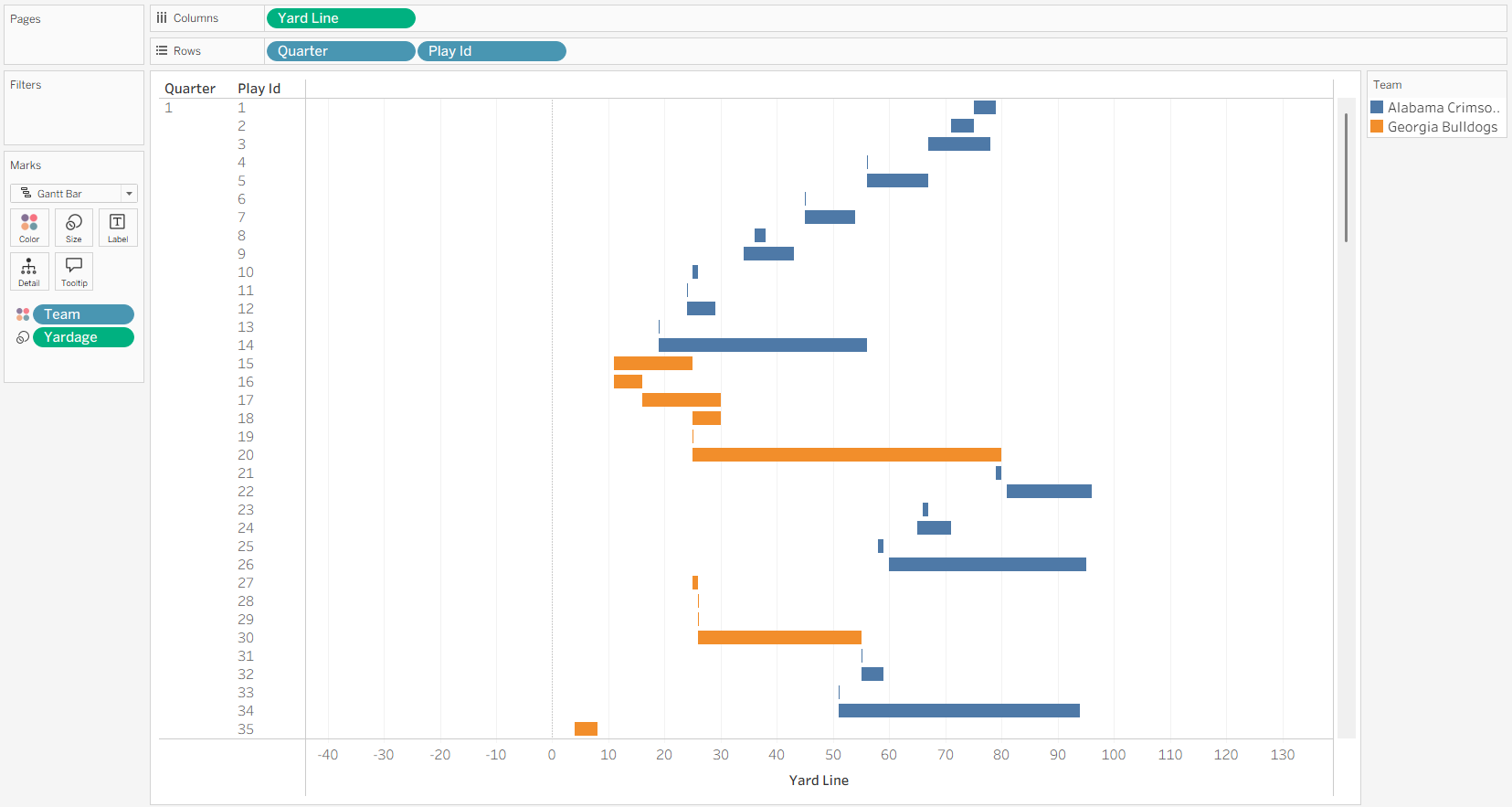
But we can see that the chart doesn't exactly look right. This is because the yard line is the exact position on the field, while the yardage is that team's gain, which moves in different directions from one team to another as they try to get to the end of the field. We can fix that with a calculated field.
We need to multiple the yardage by -1 if the team is Alabama because they want to get to the left end zone rather than the right one. I've also decided to wrap these calculations with a MIN and MAX based on the distance to each end of the field so that all lines stop at the ends of the field. This gives the following calculation for Distance Traveled:
IF [Team] != "Georgia Bulldogs" THEN
    //Alabama Going Left to 0
    MIN(MAX(-1 * [Yardage], 0 - [Yard Line]), 100-[Yard Line])
ELSE
    //Georgia Going Right to 100
    MIN(MAX([Yardage], 0 - [Yard Line]), 100 - [Yard Line])
END
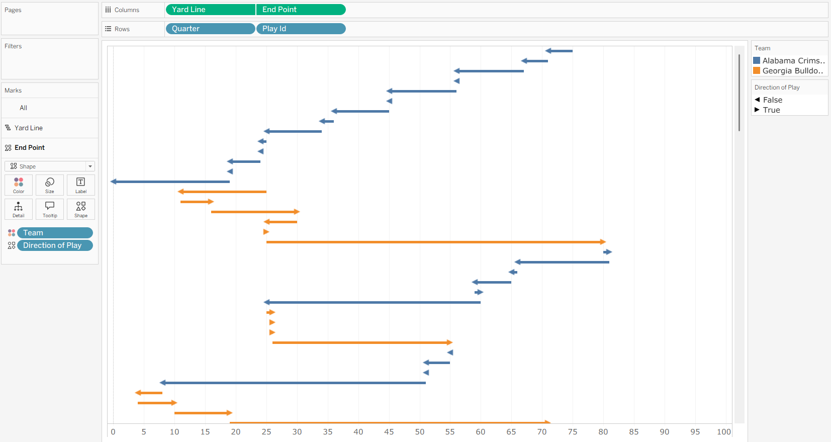
If we now put the new calculation onto the Size mark, then we see that everything looks right for the distance. The next step is to add the arrows to the ends of each play to show which direction they moved during the play. I first reduce the width of the gantt bars to make the future arrows pop out more by clicking on the Size mark and dragging down the slider. Then we need to calculate the end points of each play so we can put a mark there. Since we have the accurate distance traveled, we can have the following calculation for the End Point:
[Yard Line] + [Distance Traveled]
We can then put the new calculated field onto our Columns, removing the Distance Traveled from the size and turning it to a shape mark. Go ahead and dual axis them and synchronize their axes to have a single chart. We would now want to introduce a new calculated field to determine the direction of the play. For this case, if the ball doesn't change position, then it would still be considered moving forward to reduce the number of shapes we can have. But since the direction of moving forward is based on the team, we need to use the Distance Traveled field again. If it is positive or negative will determine which direction the ball moved, with an if statement needed to deal with 0 yard plays. That gives us the Direction of Play calculation:
IF [Team] == "Georgia Bulldogs" THEN [Distance Traveled] >= 0 ELSE [Distance Traveled] > 0 END
We can then put the new calculated field onto the shape mark for the end point and set a filled left arrow for False and a filled right arrow for true. This now shows the direction of play on each individual play, make it clearer which direction the ball moved during that play. I've also gone ahead and fixed the axis for be from -1 to 101 to allow the arrows to show in full but limited to the field of play, and got rid of the axis title.
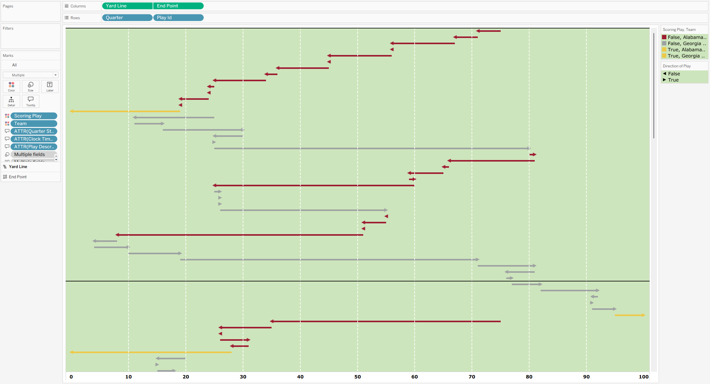
We can now fix the colors of this chart by setting the color for both marks based on the team and if it is a scoring play or not. This dataset has a field called Scoring Team, which is null for any non-scoring play, and otherwise contains the team that scored. To get a true or false on if a play was scoring, we can add another calculated field for Scoring Play:
NOT ISNULL([Scoring Team])
By then selecting both our new calculated field and the team, we can drag that onto the color mark for both marks. This creates a color for each combination between our two fields, which both have two values, leading to four total options for the color. But since we only care if it is a scoring play or not, we can set the colors to be different if it is not a scoring play and which team, or if it is a scoring play. I used a gold color for the scoring plays, and the official team colors otherwise. For Georgia, I used their Stegemen silver (#9EA2A2) as they were the away team and white wouldn't stand out as much on this chart. For Alabama, I used their home colors (#9e1b32) as they were the home team.
With those colors set, we can now add the yard lines across the chart like an actual football field. We can format the worksheet to remove the currently present gridlines and add the grassy background color to the panes, so we don't add it to the axis. We could use the gridlines to show the yard lines, but I find that we don't want to have the gridlines at the 0 and 100 yard lines, so we can use constant lines to set where we want the lines to be. So we remove the grid lines and zeroes line across out columns, add set the row divider for our panes to be more defined to split up our quarters.
Now we can add the constant lines under the analysis tab. These will be going onto the Yard Line from 10 to 90 in 10 yard increments. Make sure to set the label and tooltip to none for each of these too to make them as unintrusive as possible. All that's left is to format the tooltips of the marks, which I've done using the quarter (with a small calculated field to add a suffix to it), the clock time, and the play description.
Once we have that chart, we need to make the two scoring charts. To do so, we'll start with one and then make a copy for the other. To make the scoring icons, we'll need to use the scoring play to create a value that is the same. So we'll introduce a new calculated field of Scored Play:
IF [Scoring Play] THEN 0 END
If we put Quarter and Play Id onto Rows and our new calculated field onto Columns, setting it to be a circle mark type, then we'll have a circle at each scoring play. You can then put the Home Score as a label to show Alabama's score at each point the score changed. Make sure the label puts it into the circle, and that the circle has an increased size to fit the score. We can also change the color by clicking on the color mark to make it match the team color.
Now to highlight the times that the team scored, we can have a very similar calculated field to have marks when that team scored. I called it Alabama/Georgia Scored Play, depending on which sheet I was working on, replacing the team name with the other:
IF [Scoring Team] == "Alabama Crimson Tide" THEN 0 END
We can put that also on our Columns, putting it as a dual axis and synchronizing it. Order them so that the Scored Play field is on top, then resize both until you're happy with their sizes. Color both circles to be the team color and then the gold color used for the scoring plays earlier to get the highlighted circles like before. Then do some more formatting to divide the chart by quarters and remove any other unneeded lines. Also turn off the tooltips on these charts to reduce clutter.
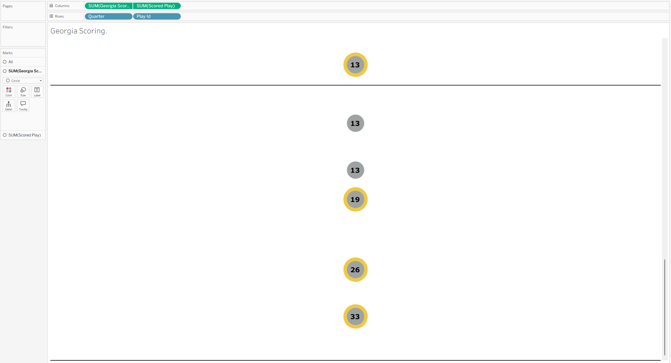
Once you're done with that, make a duplicate sheet from the one you've been working on, and replace the specific fields and colors from the first team with the other team. This includes the field to highlight the scoring plays, the color of the score marks, and the measure used to label the score marks. Now all sizes will match up between the two score trackers.
Here you can do any extra formatting or interactivity that you want. I've included a dummy highlight in these charts to make it more manageable if you were to click on the chart. If you wanted to, you could have it highlight specific teams plays or even base it on the type of plays. If you would like to see how you can add a dummy highlight, you can check out my blog on how to implement them in Tableau here.
With all the sheets completed, you just need to put together the dashboard following the item hierarchy from the start of this blog. With that, you can format as you like with padding and margins. I've also put a border around the horizontal container the holds the charts to group together everything. In the end, you've now made a chart representing the play-by-play of a football game, allowing you to see the ebbs and flows of the game itself. You can find the completed dashboard, which you can download, here on my Tableau Public page.