


With over two months having passed since I finished training at the Data School, I thought it was about time to go back and recap what I've covered and thought about my training. There's plenty that I've learned and managed to do, many of which are skills that I will take on for the rest of my career. So for this blog, I'll be going through the different parts of training, what I've learned and what I thought about them.
Tableau Desktop & Prep
Tableau is, what I would say, the main product that we use during the Data School. It's promoted through our portfolios, using in the application process, and is a big part of the company's history. Despite Tableau Desktop's use even before I started at the Data School, it wasn't the first thing we actually covered related to Tableau.
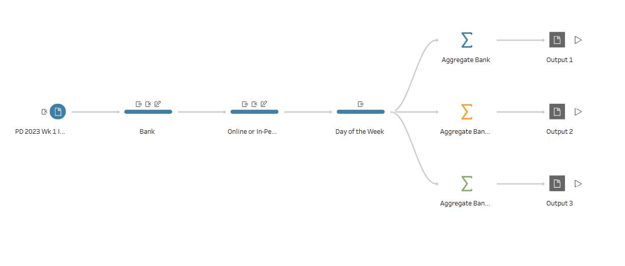
We went through Tableau Prep in the first week, having a small project and presentation to give on it on my first Friday. We would continue to go back to Tableau Prep throughout training, slowing down as we started to use Alteryx. But it was something that I enjoyed using in our first week, as the concepts that it covered was familiar to me due to my computer science background at college.
At the start, we would do Preppin' Data challenges, which I continued through the rest of training and used throughout some of my blogs. It was a useful basis to get familiar with data preparation and pipeline before we get to visualizations. But in the end, I ended up moving on more towards Alteryx for my data preparation application so I haven't used Tableau Prep since training.
Soon after, we started with some official training in Tableau Desktop. There was little bits related to Tableau Cloud and Server, but since they weren't my particular interests, I didn't get much farther into it. I do know that some people get a lot more familiar with it depending on their placements.
A lot of time was used throughout training on Tableau Desktop, which I enjoyed a lot. I liked learning about the intricacies of the application, and how charts and calculations are made. I did have some prior experience with Tableau, but on a very very amateur level and more on the side of passive familiarity. I do think that helped at the start, but in the end everyone got to a very good level of talent with data visualization.
It helps that the skills that we learned here does generally carry over to other data visualization applications. That is mainly in relation to the theory we learned during training, which was more towards the start. The rest came from the continual practice we did in Tableau Desktop.
Mainly towards the first half of training, we would have Makeover Mondays and Workout Wednesdays that we would do to build up our Tableau Public portfolio and Tableau Desktop skills. I preferred the Workout Wednesdays to the Makeover Mondays as I liked the technical challenges that they tended to provide. I've tried to include below an embed of a dashboard on my Tableau Public from a Workout Wednesday we did near the end of training that I enjoyed a lot due to its technical difficulty.

About three quarters of the way through training, we also do the Tableau Data Analyst Certified exam which is a nice way to start capping off the training. By that point, we had gone over almost all of the content of training, so it was a fun accomplishment to get before finishing everything off.
The end of our training had us participate in Dashboard week, where each day we would be given a task which had us make a dashboard in the end. Three of those days I made a Tableau dashboard, where I realized how much I had learned in using Tableau and making dashboards. I was able to make a dashboard so much quicker and with such higher quality compared to where I started. The kind of work that took me multiple days to make with tons of feedback to iterate on, I could do in a single day. I just went to show me how much they taught be in the training here at the Data School.
Alteryx
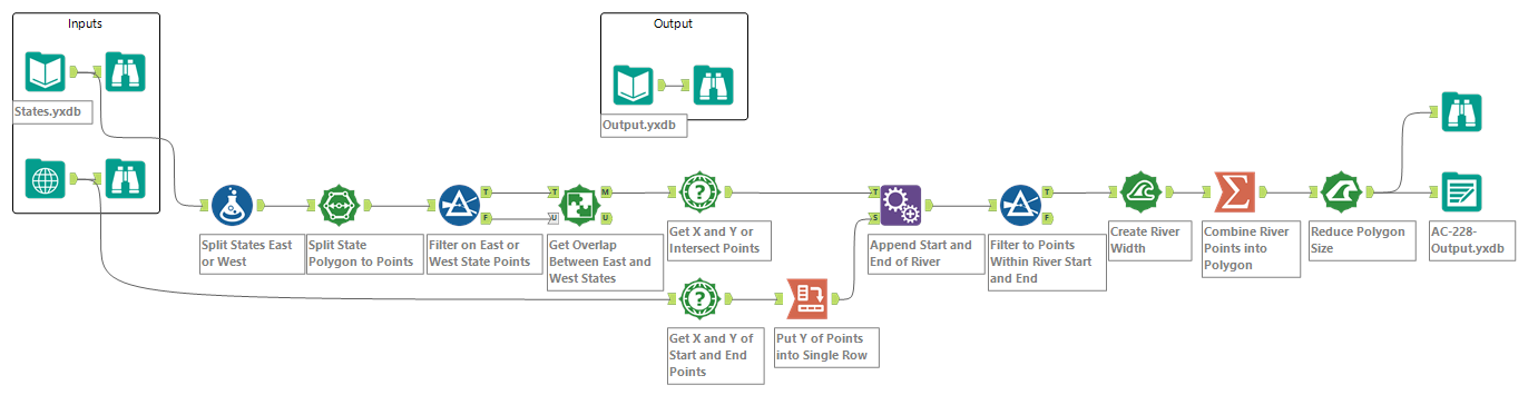
Alteryx Designer was introduced later into training compared to everything else. I got my first glimpse of it during a Meet & Greet I attended during my application process where it interested me. It was only more than a month into training when we started to get introduced to it.
It was quick to pick up due to the experience we had with Tableau Prep, just having more flexibility. It was only shortly after that we ended up taking the Alteryx Designer Core Certified exam, which ended up well with the training we had done. Shortly after finishing training, I also did the Alteryx Designer Advanced Certified exam, of which most of the content we had also done through the training.
To help practice, we ended up doing different Alteryx Weekly Challenges, which I ended up continuing to do throughout training and a little after. Most of my use of Alteryx after training has been with personal projects or short stints of needing to parse data. This is mainly because of how quick it is for me to use now with all the training and practice I had done through the Data School.
We did have an issue part way through training when we had out licenses renewed for Alteryx and ended up needing to switch to Alteryx One. The new platform has its benefits, but there are something I preferred with just Alteryx Designer.
A little bit is also done with Alteryx Server, when it comes to jobs and other elements of working with it. This again is something that I didn't dive much deeper into, but know that it can be something that I could've learned more about if I ended up in a placement using it.
Power BI & Query
Power BI and Power Query was introduced early on into our training. By the end of the first month of training, we had to do a short project using Power BI to show what we could already do just this far into training.
Power Query helped build on the basis that Tableau Prep already had, but showing us that there are many different tools and applications that we can use to get the same result. We were able to see the pros and cons of each of the tools and feel out for what our preferences were.
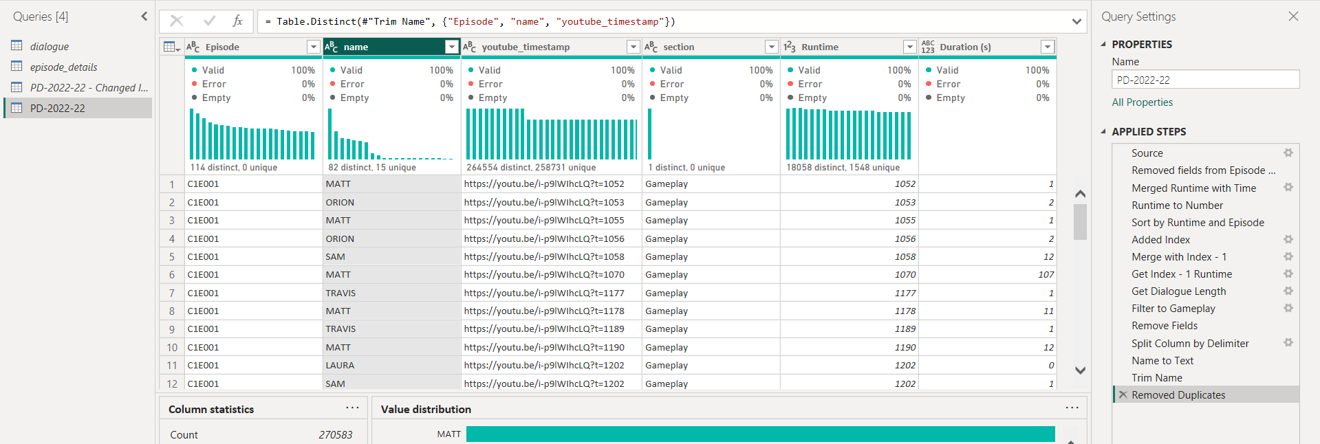
I enjoyed Power Query with being able to see the code behind each of the transformations I performed, allowing me to make small tweaks and changes here and there based on what I wanted. It was, however, harder to work with whenever I made a mistake, and also made more difficult when trying to work across different branches of the workflow.
Power BI is the other main visualization tool that we use during our training. It's shown to us after we've done Tableau Desktop, so the concepts used for rendering charts is already covered and we have some familiarity with different chart types. I found myself frequently comparing it to Tableau Desktop and seeing what I preferred and what I didn't.
I liked that Power Query was built into Power BI, so if I needed to make some changes to the data source, then it was right there for me to do. There is just more detail with when it comes to how the data is modelled as compared to Tableau Desktop's data source tab. Another part that I liked was Power BI's formulas to create new fields and tables. In Tableau Desktop, you can't make new tables which you can in Power BI, which can come in handy. Plus its syntax for calculated fields is nearly a full programming language which I am more used to and like to work with, as it gives me more flexibility when compared to Tableau's calculated fields.
It was also easy to start making charts, but that's where my preference for it stops. It doesn't have the same flexibility as Tableau when it comes to how you create charts, as you just click a chart and it makes it but limiting you to only the options in the application. Also attempting to do formatting was more difficult to get used to as it didn't feel super intuitive to find what I needed. It felt very much like a Microsoft product, which can be good for others.
It also doesn't have the same level of ease when it comes to sharing your dashboards that you've made. Tableau has Tableau Public, but there isn't the same kind of equivalent exclusive to Power BI, which makes it less appealing to me to work with in my spare time. Below I've embedded a dashboard that I made as part of an exercise in my second-to-last day of training, which I liked to make as I got to use a lot of different skills related to Power BI to create it.
Projects
Nearly each week during training at the Data School, I had a project to do. For the first five weeks, we had a project on the Friday related to the work and knowledge we had gained over the week. These were tough at the start as I wasn't as used to the crunch of work and the stakeholder management needed to do a great job for the projects. I had had some previous experience with client projects from college which came in handy and it helped to get me more used to presenting in public.
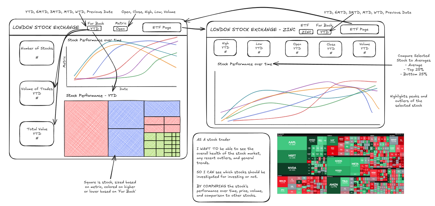
It also helped to define and get me adjusted to the work cycle that we needed when doing projects related to dashboards. We started with planning and data prep, then moved to user stories and sketching, then rounding it up with dashboarding. This became a useful loop to be used to when it came to our later projects.
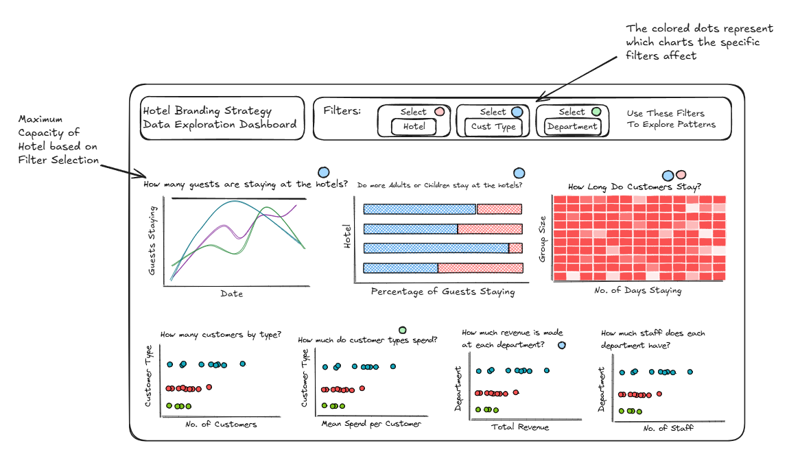
After that was the client projects. These were week long projects, spending roughly half the week on them. They were generally working with real clients, having six out of eight working with actual companies. This gave a lot of real world experience which was a lot of help to get an understanding of what it'll be like once we were done with training.
These vary much more when it comes to cohort to cohort. But in mine, I enjoyed the spread of work that we got to do. We only really worked with financial details (with our client project with a more personally interesting client moved to the cohort after), so it did get a bit boring towards the end. But the type of work we did varied between data preparation and dashboarding, using both Tableau and Alteryx. I enjoyed our Alteryx projects more since that's more in alignment with my personal interests, but there was opportunities to do data preparation in the more Tableau heavy projects. Our final project turned out really well, which helped to cap off these projects in a nice way.
And in our final week at the Data School, we had dashboard week. This had every day of the week as essentially putting all of the Friday projects from the start of training into a single day. It was a lot of work, especially needing to present every day, but really showed me how much I had learned and progressed from the start of my time at the Data School.
In the end, I really appreciate all that I was able to learn throughout training at the Data School, and can't wait to put it all into practice. Next stop: the Data Engineering training!