When first applying to the data school I had the idea of making a word cloud. To enable the to viewer to easily see which Majors and Major categories had how many students. Being new to Tableau I spend several hours trying to do it. The end product was as seen below.

Color: Major Category ( Education, Biological science ....)
Word size: Number of Students
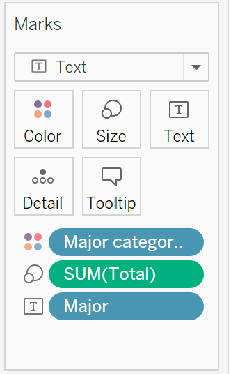
Very simply by dragging the Major category on to color Sum(Total) on to size and Major onto the text. We achieve the desired result.
Using the all-ages CSV from the following link you can have a go as well.
College Majors and their Graduates
Job Opportunities, Salaries and Gender Disparities