


Grouping products into categories based on running cumulative sales presents a specific challenge in Tableau. To calculate a "Running % of Total", every single product is required in the view to define the sort order. However, creating a summary table requires removing that product detail. This causes the sort order to be lost, the running calculation to break, and the groups to disappear.
Essentially, the goal is to create a Dimension (e.g. a dynamic grouping system) defined by a Measure (e.g. the Running Total).
This blog outlines a method to solve this using a logic of identifying boundaries. We will use a Glenday Sieve analysis as the example, but this logic could be applied to any Pareto, ABC Analysis or dynamic grouping scenario.
The Use Case: Glenday Sieve
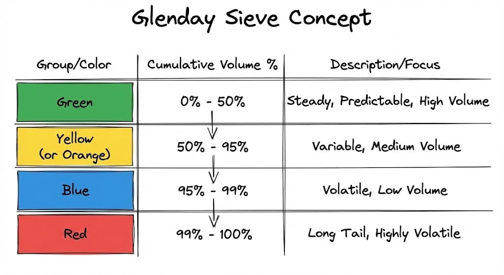
For this example we are building a Glenday Sieve. This is a supply chain methodology that prioritises items based on volume. The Glenday Sieve sorts items into four coloured streams based on cumulative volume:
- Green: The steady stream (usually the first 50% of volume)
- Yellow (or Orange): The next 45%
- Blue: The next 4%
- Red: The final 1%
These colours are not static properties of the product. They are dynamic. A product might be "Green" this month and "Yellow" next month depending on sales. Therefore the groups cannot be hard coded, and need to be calculated using a Table Calculation.
The Problem
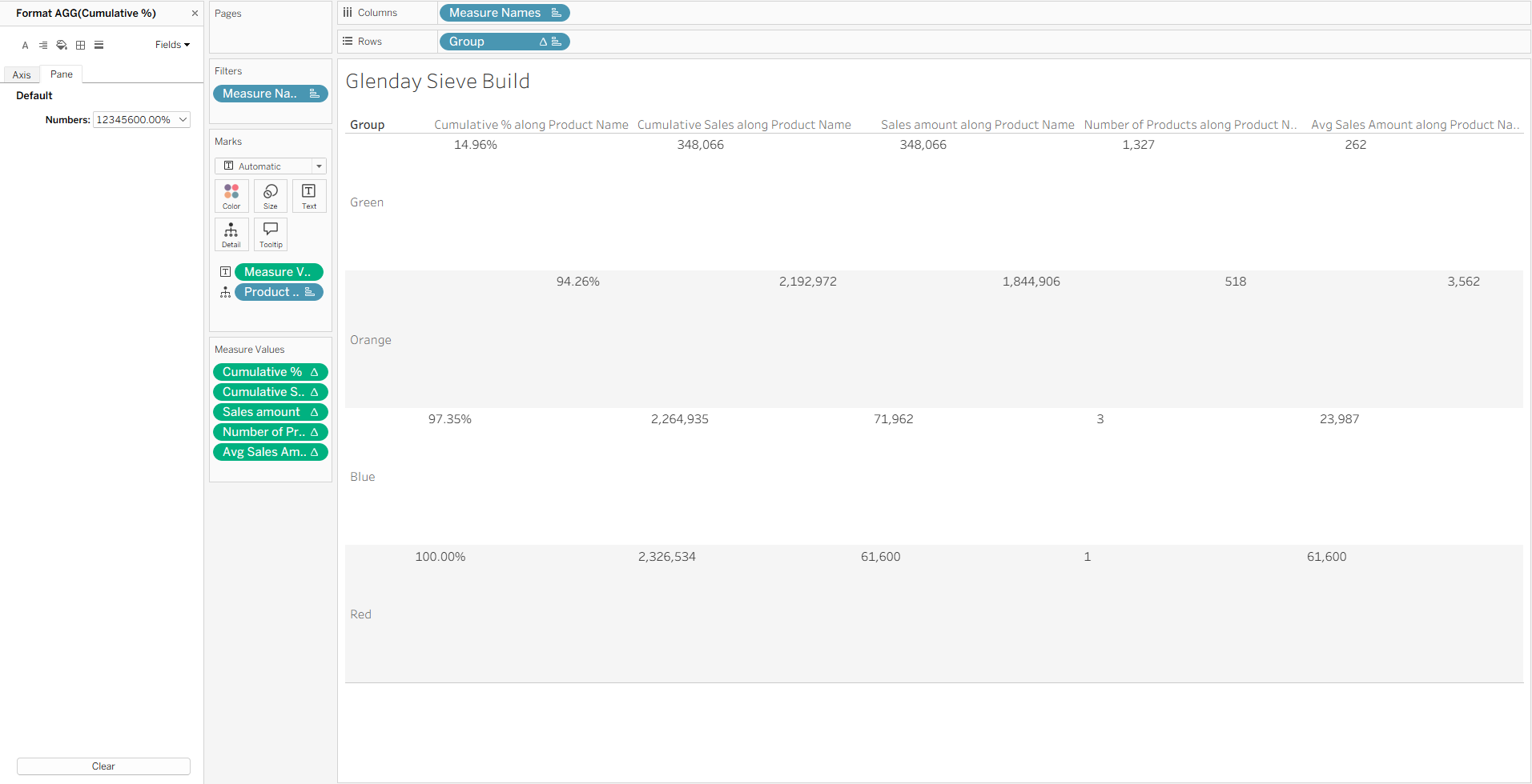
The requirement of this analysis is to view a summary table: 4 rows (Green, Yellow, Blue, Red) showing the total sales, cumulative % those products are contributing to Sales, and product count for each.
To achieve this summary in Tableau, the standard approach is to remove Product Name from the view. However, doing so removes the sort order required to calculate which items are "Green" and which are "Red".
Consequently, we need a way to work around this. We can retain Product Name in the view (on the Detail shelf) so the calculations work, but use a filter to hide the rows that do not represent a group boundary. This leaves only the last product of each colour group to act as the summary row.
Step by Step Guide (Using Sample Superstore)
In this example we are using Sample Superstore data, as well as looking at the "Long Tail" logic often used in Glenday Sieves, where the aim is to see how many small products make up the bulk of the volume.
Note: For this logic, the sort is Ascending (Smallest to Largest). If doing a standard Pareto (Largest to Smallest), follow the same steps outlined but switch the sort order to Descending.
1. The Setup
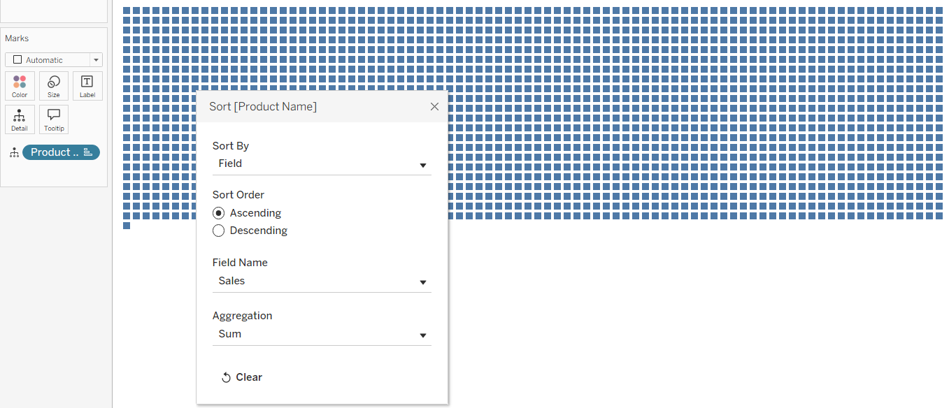
First, drag Product Name to the Detail shelf. Right click it and choose Sort.
- Sort By: Field
- Sort Order: Ascending
- Field Name: Sales
- Aggregation: Sum
2. The Foundation Calculations
We need to define where each product sits on the cumulative curve. Create these calculations in this order.
%oT (Percent of Total):

This calculates the contribution of the individual product relative to the entire dataset. TOTAL(SUM([Sales])) allows the calculation to see the grand total of all products in the view, regardless of how the view is filtered later.
Run%oT (Running % of Total):

This aggregates the %oT values cumulatively from the first product to the last. This creates the accumulating scale (0% to 100%) required to measure volume thresholds.
Group (The Colour Categories):
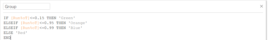
This assigns a label to the product based on its position in the running total, e.g. if the running sum is below 15%, the product is labelled 'Green'. As the running sum increases, products are assigned to subsequent groups. These thresholds can be adjusted to fit specific analysis needs.
3. The Boundary Check (The Filter)
To create a summary table while keeping Product Name in the view, we must filter out the majority of rows. We cannot simply aggregate the data, as this removes the sort order required for the Glenday Sieve logic.
Instead, we identify the specific "boundary" rows, i.e. the final product in the Green group, the final product in the Orange group, and so on. These rows are dynamic; as sales data changes, different products will automatically become the boundary for their respective group.
Cumulative %:
We use the LOOKUP function to inspect the row immediately following the current one. If the next row belongs to a different group, or if there is no next row (indicating the end of the dataset), the current row is identified as the boundary.
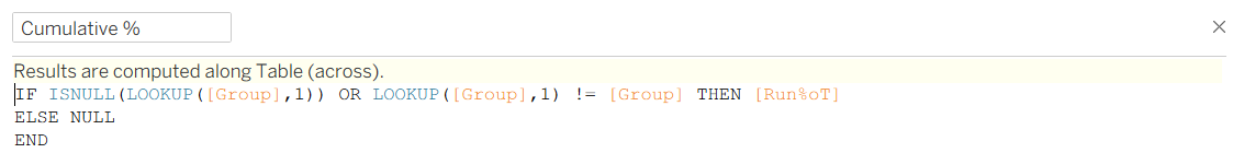
This calculation returns the current Running %oT value only if the row is a boundary. For all other rows (those somewhere in the 'middle' of a group), it returns NULL. This will then later allow us to filter for non-null values to product a clean summary table.
4. Isolating Group Values
Next, we need to isolate the different groups. As we used a RUNNING_SUM, the values for the 'Orange' group will include total sales of both the Green and Orange group, (and so on for Blue and Red). To determine the sales for the Orange group alone, we must subtract the total accumulated at the end of the previous group (Green). However, the Green total exists on a row hundreds of positions up the table. We need a method to retrieve that value and bring it down to the current row to be able to do the subtraction.
First, we need to calculate the running sum of sales, but ensure it only appears on the boundary row (as we did with the percentage).
Cumulative Sales:
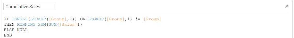
This calculates the total revenue accumulated from the very first product up to the current product. Being wrapped in an IF statement hides the running total for every row except the boundary row, just like the Cumulative % calculation.
Previous Sales Value:
Now we have the total at the end of the Orange group (£95,000) and the total at the end of the Green group (£50,000). To find the sales for just the Orange group, we need to isolate them.
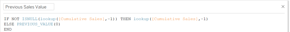
As the total for the 'Green' group exists hundreds of rows above the one for the 'Orange' group, we need a way to resolve the gap between the boundary. This calculation allows us to do so. It checks the previous row, and if that row is a boundary (and therefore has a valid Cumulative Sales value), it captures it. If the previous row is NULL (a hidden middle row), the calculation ignores it and retains the last valid value it found. This carries the previous group's total down the list until it reaches the current boundary.
Sales Amount (The Final Value):

Then we can subtract the carried-forward total of the previous group from the current cumulative total, to isolate the sales revenue generate specifically by the current group.
5. Product Count Calculations
To analyse the volume of items in each group, we can apply the same logic we did to Sales using a count instead of sum, to work out how many products are assigned to each group.
Total Products:
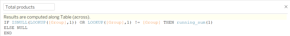
Standard aggregations like COUNT() would not work here as Product Name is in the view, Tableau sees every row as a distinct item and would simply return a count of "1" for every row. To get the volume of the group, we need a cumulative counter. RUNNING_SUM(1) effectively numbers the rows based on the sort order. This tells us that the Green boundary is, for example, the 1,327th item in the list, providing the number we need for the subtraction logic later.
Previous Product Value:
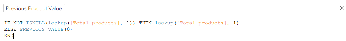
Similar to the sales previous product calculation, this carries the running count of the previous boundary down to the current boundary.
Number of Products:

This then calculates the distinct number of products in the current group by subtracting the count of all previous groups.
Average Sales Amount:

This is not essential for the table, but it gives the user a bit more context in providing the average value of a product within each group.
Constructing the Table:
Now, we have all of the calculations we need to construct the table.
- Columns: Drag
Measure Namesto Columns. - Rows: Drag
Groupto Rows. - Detail: This should already be here, but ensure
Product Nameis on Detail (Sorted Ascending based on Sum of Sales). - Text: Drag
Measure Valuesto Text. By default Tableau will add every available measure to the shelf, but get rid of everything other than:
Cumulative %Cumulative SalesSales AmountNumber of ProductsAvg Sales Amount
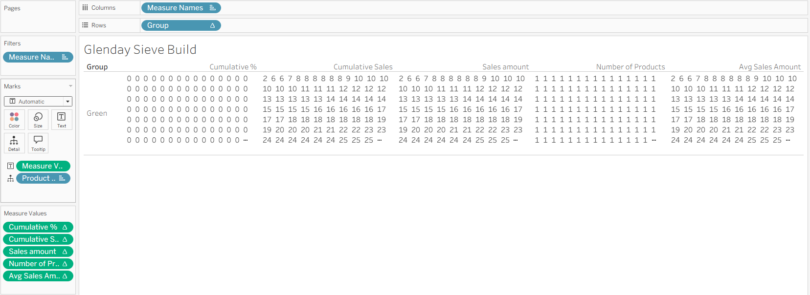
At this point, the view may appear chaotic, but this is to be expected as we have not changed the settings for the Table Calculations.
Configuring the Table Calculations and Sorting
Now we need to configure exactly how Tableau computes these values. This involves defining the scope (Compute Using) and the sort order for each field.
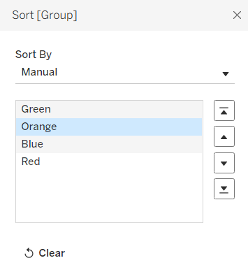
1. Configure the Group Row:
- Right click the
Grouppill on the Rows shelf. - Select Compute Using > Product Name.

- Manual Sort: The groups may appear in alphabetical order (e.g. Blue first). Manually drag the rows in the view to arrange them in the correct Glenday order: Green, Orange, Blue, Red.
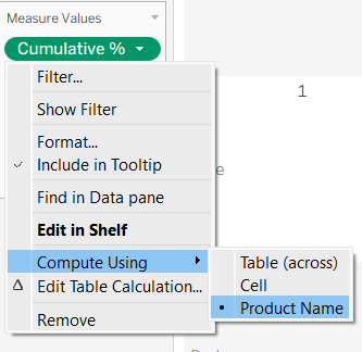
2. Configure the Measures (Nested Calculations): We need ensure that every calculation inside each measure is looking at the Product Name.
- Right click the first pill on the Measure Values shelf (e.g.
Cumulative %) and select Compute Using > Product Name.
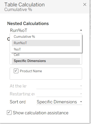
- Then click on Edit Table Calculation and make sure every Nested Calculation (e.g.
%oT,Run%oT,Group) has Specific Dimensions is selected and Product Name is ticked.
- Repeat this process for every measure pill on the shelf.
3. Fix the Number Formatting: At this stage, your Cumulative % column might only be showing values of 0 or 1. Tableau is rounding the decimals (e.g. 0.14) to the nearest whole number, and we need it to show more detail than this.
- Right click the
Cumulative %pill on the Measure Values shelf. - Select Format.
- Change the number format to Percentage (2 decimal places).
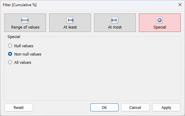
4. Add Cumulative % onto Filters
The final step is to drag Cumulative % onto the Filters pane > Special > Non-null values and Apply. Make sure that filter is also being computed using Product Name as we did for all of the other pills. Now, this should leave a single number in each column and row of the table, without any odd positioning of the numbers, as you have filtered out all of the NULL values (everything that is not a boundary row).
This leaves the bare bones version of the table with all of the appropriate aggregation, which can then be formatted to maximise the impact of the visualisation.
Formatting Final Touches:
Here are some ideas for formatting:
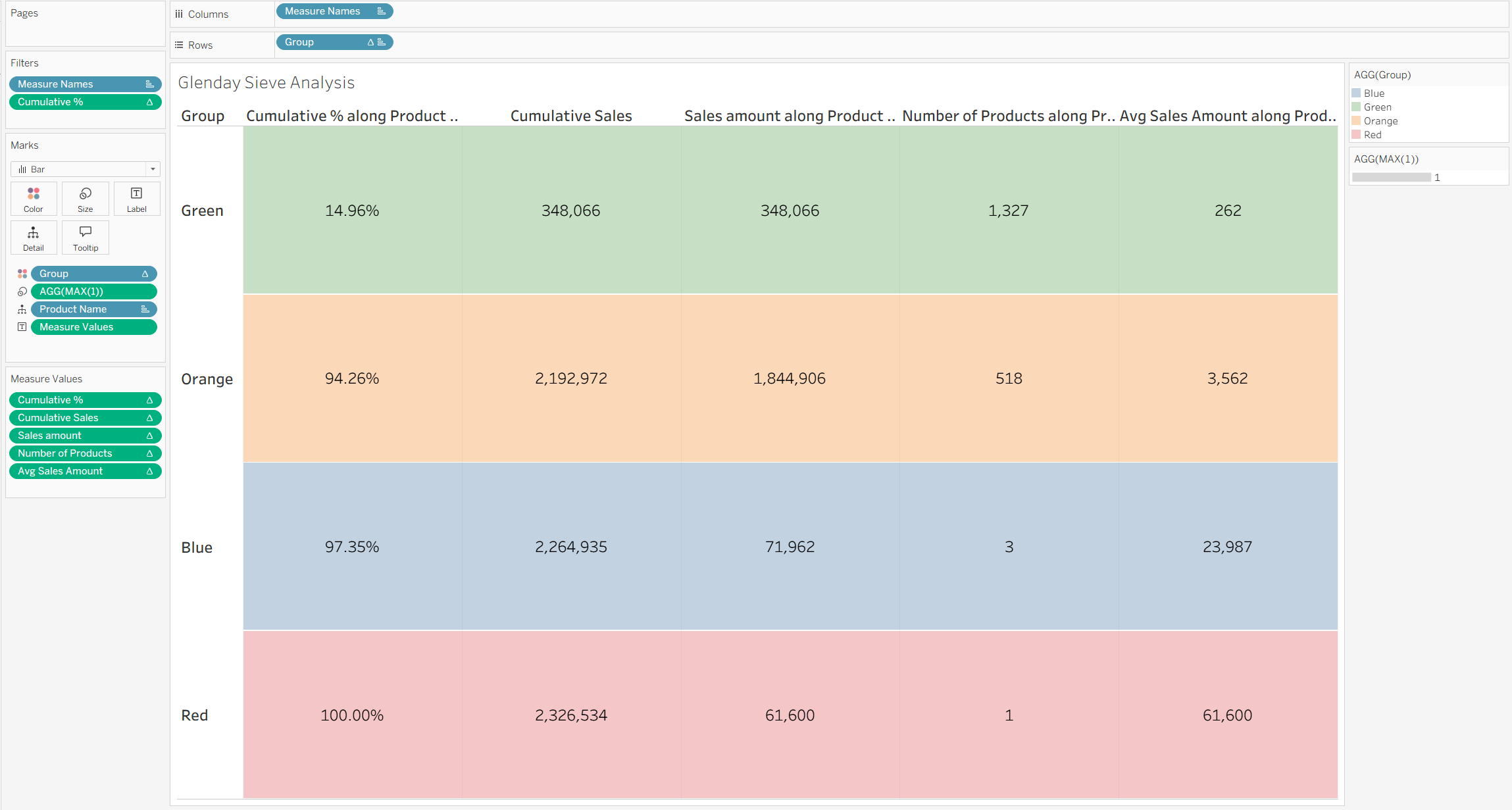
- Putting 'Group' on colour and colouring by the Glenday Sieve colour labels, and turning the opacity down to around 35%
- Adding a pill straight into the Marks card of MAX(1) (double-click on the space below the last mark on the card and start typing), which can then be placed on size. Change the Mark type from automatic to Bar, and make the Size the maximum size, which should colour the rows of the table
- Formatting the currency marks of the table to have the appropriate currency sign and number of decimal places i.e. Cumulative Sales, Sales Amount, and Avg Sales Amount
- Formatting the Text Labels (all the numbers in the table) to be a bigger font size and aligned to the middle
- Formatting all the Measure Names and Headers to be a bigger and bolder font
- Removing Product Name from tooltips as that information is not necessary (it displays the given Product Name on the boundary row which is not necessary information for this analysis), as well as MAX(1)
Summary
This method allows for the retention of granular detail (Product Name) in the view to enable Table Calculations to function, while using the filter to present a clean and aggregated summary as the final visualisation.
While we used this for a Glenday Sieve on Sales, you can adapt this PREVIOUS_VALUE bridge logic to to group data by other moving targets.