In my last blog post, I summarized how the Makeover Monday Challenges help us become better Data Consultants. So much for the theory… here are my experiences on what I learned about myself while under the gun. 😉
Minute 00:00
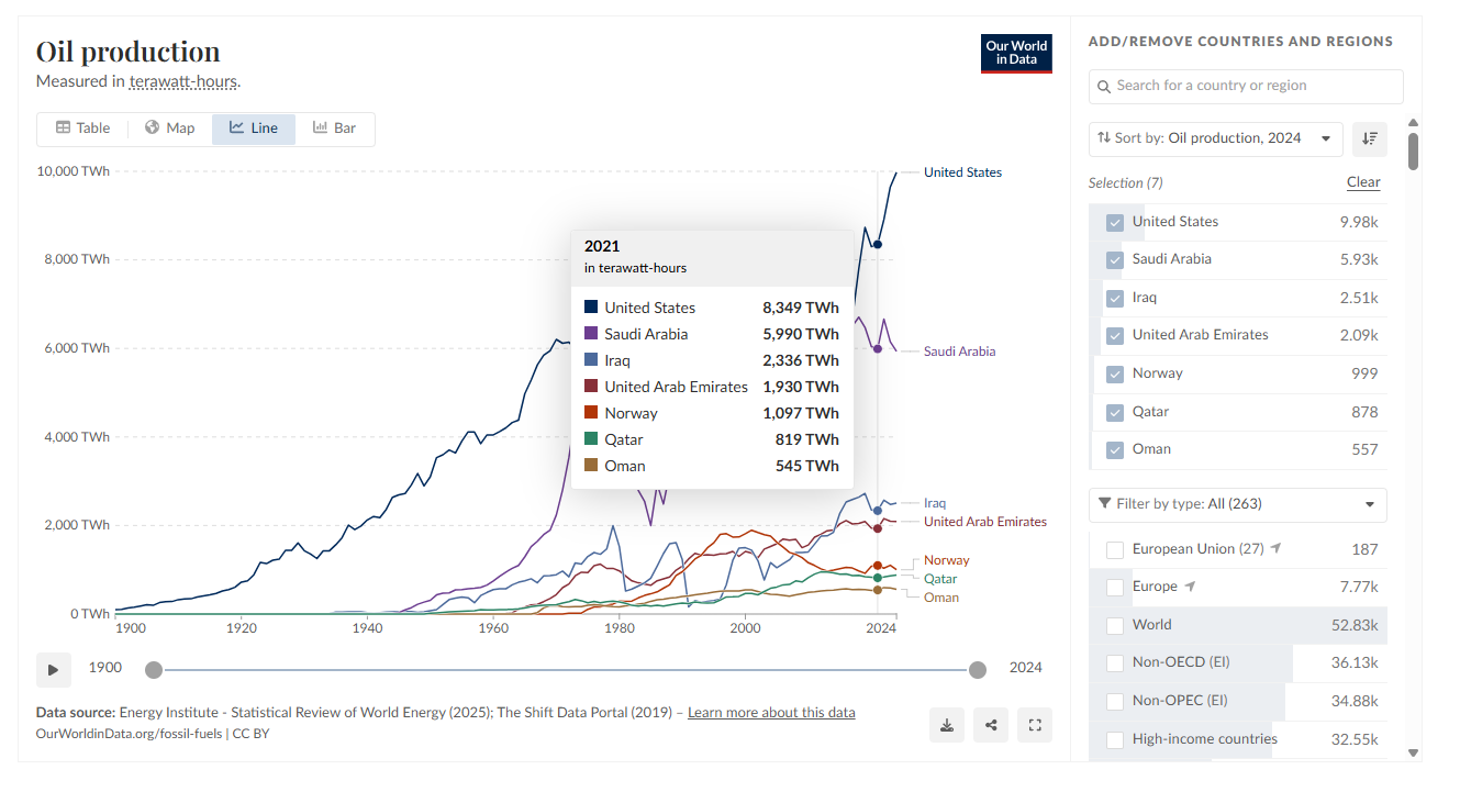
I open the current Makeover Monday Challenge. This week’s topic: global oil production in TWh.
First, I get an overview and try to wrap my head around the visualization. Bit by bit, I realize how extensive the data is and that I don’t bring much prior knowledge to the table regarding oil production. I start hunting for a suitable story. Together with Gemini, I try to get up to speed quickly. We bounce ideas back and forth: What historical and current events in oil-exporting countries are visible in the data? What twist or interesting angle of global oil production could I use for my visualization? What alternative display formats might be interesting? How do I need to prepare my visual to spark interest?
Minute 20:00
Still no "eureka" moment. At this point, a simple redesign of the graphic feels a bit boring, so I keep searching for a great idea. I give myself another 10 minutes—I’m sure I’ll have a breakthrough then and can start building. “For sure.”
Minute 30:00
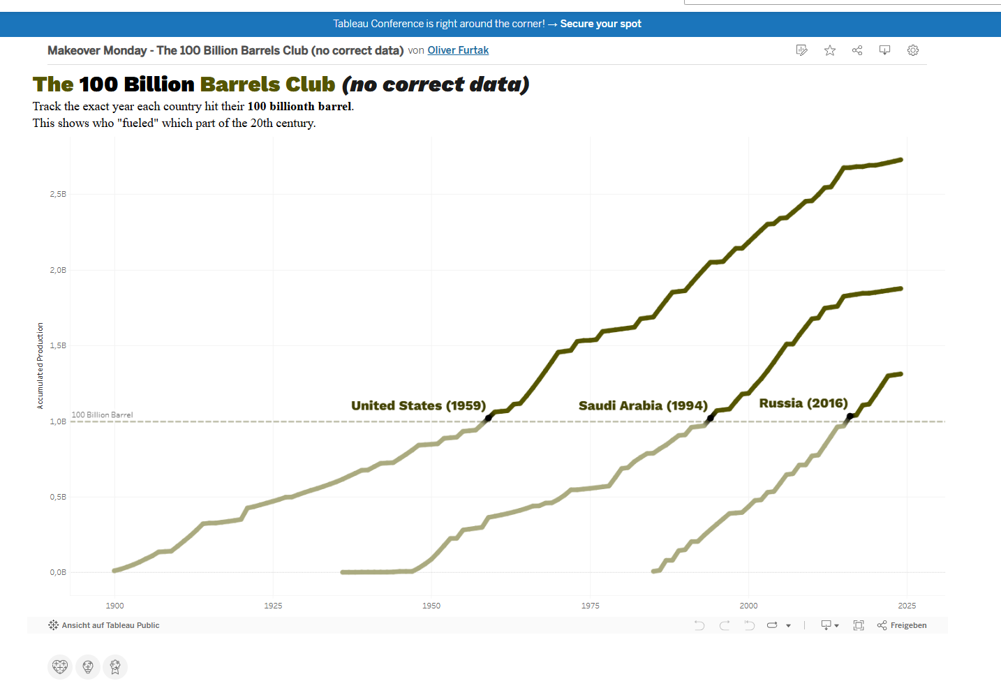
An idea has caught my interest. I want to show the cumulative production volume over time. To implement this, I dive into the data and create calculated fields that sum up the annual production. At this stage, data research is the priority. I need to know if it works—I can’t start the visualization before that. Ideally, I should have found a few good examples on Tableau Public by now, but I abandon my search after just 2 minutes. As long as the data isn’t working, I don’t have the peace of mind to keep looking. I haven't made a sketch yet either, because the data prep is giving me a slight headache. What if the data doesn’t provide the information I want to visualize? It feels like a battle against an invisible enemy—my own nervousness and rising excitement.
Don’t Lose Your Cool
I know these situations from experience. One thing’s for sure: stress leads you to make decisions more "intuitively"—or rather, more "rudimentarily." The brain constantly tries to take mental shortcuts and regularly loses the (proverbial) thread in the process. Stress is a poor advisor. If my experience has taught me anything, it’s that you should sleep on important decisions and never go grocery shopping on an empty stomach. ;-) I know that on challenging days, a long break helps me keep a cool head and plan my next steps. Everyone has to find their own sweet spot between productive excitement and paralyzing stress.
Minute 55:00
I’ve lost it… I’m desperate because the numbers aren’t showing the values I hoped for. My troubleshooting over the last few minutes has failed. There’s an error in the running calculation and the unit conversion from TWh to barrels. What follows are 10 minutes of ineffective poking around in the data, the story, and the visualization—along with a healthy dose of internal cursing. ;)
Minute 70:00
I restart Tableau and re-import the original data without any adjustments. This time it seems to work better. An error must have crept in earlier. I quickly build my chart and recreate all the necessary calculated fields. Since time is now incredibly tight, I basically "take to my heels" and try to save whatever I can at breakneck speed. In the process, I leave many important details by the wayside and, at the very last second, almost forget to give my graphs a proper color scheme. I try to adjust the label positioning: Unfortunately, I didn't make a sketch, and now it turns out I can only display 3 labels side-by-side. If I want to include all the data, there’s far too little space between the graphs. My graphic immediately looks completely cluttered. Why didn't I sketch this out beforehand?!
Focus on What Matters
I decide not to develop the visualization any further. I limit myself to 3 data points and take 2 minutes to select suitable colors. This at least gives my visualization a bit of brand recognition.
Minute 90:00+
In the final chaotic minutes, I try to make the best of it. But in the end, I add the words “no correct data” to my title. The data accumulation didn't work the way I imagined. The years shown don’t match the official data, but there’s no time left to fix it. Time’s up!
What I Learned About Myself
Exhausted from the inner tension and stress, I close my laptop in disappointment. My only consolation: “At least I adjusted the colors at the last minute and gave the visualization a small touch of recognition.” I like the visual language, and it’s motivation enough to rework the visualization at a later date. Once again, I’ve learned how important it is not to spend too long looking for that one "extraordinary" idea. Furthermore, the lack of planning led to rushed decisions that didn't live up to my vision in the end.
Admitting Mistakes to Learn From Them
Fortunately, I can find a lot of good in this experience. Today’s challenge reminded me of what I can do better in the future. Through these experiences, I am constantly evolving and becoming more resilient in dealing with stress. These are vital lessons for mastering future challenges. Instead of thinking I missed an opportunity, I focus my inner energy on what I will do better next time. I can highly recommend internalizing this approach to reach your "Zen level" as soon as possible. ;-)
Further Links
Here is the original dataset with visualization. https://ourworldindata.org/grapher/oil-production-by-country
Here is the link to my visualization. https://public.tableau.com/views/MakeOverMonday_100BN_Barrel_Club/The100BillionBarrelsClub?:language=de-DE&:sid=&:redirect=auth&:display_count=n&:origin=viz_share_link