


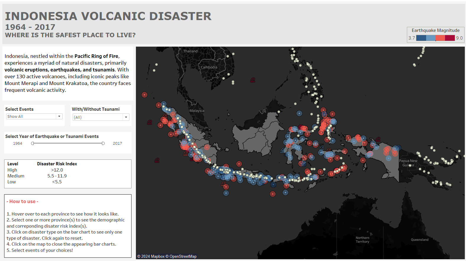
This post came little late after our last dashboard week because I didn’t have finished dataset at that time. This post is to finish off what I started. You can find the finished dashboard here.
Interactive visualization for Indonesia Volcanic Disaster. I didn’t use finished data for this project. Rather, I gathered the data from different sources as well as prepared using one tool, Alteryx. Gathering and preparing the data used took a lot longer than the visualization itself.
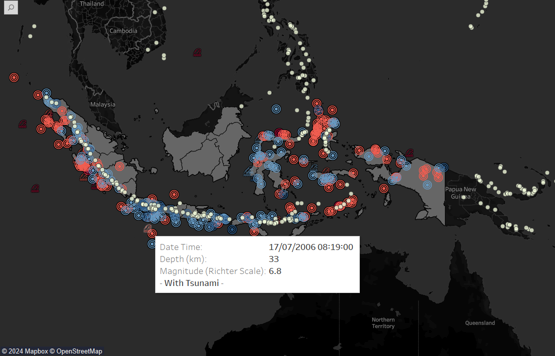
1. Extracting from PDF report of Indonesian earthquake catalogue (source)
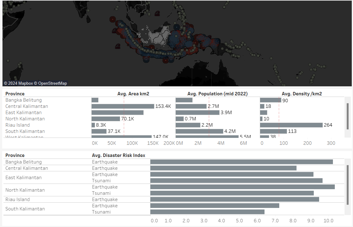
2. Extracting from PDF report of Indonesian risk index (Disaster Risk Index – IRBI 2022 (source)
3. The images were scraped from Indonesian government's tourism website which need to be compressed to be suitable for Tableau. I used free service from Cloudinary to compress it dynamically, only by changing the URLs.
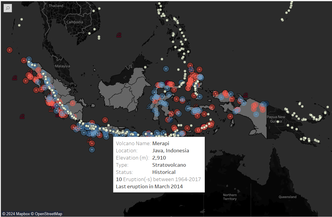
4. Last but not least, Kaggle for the volcanoes data and their historical eruptions
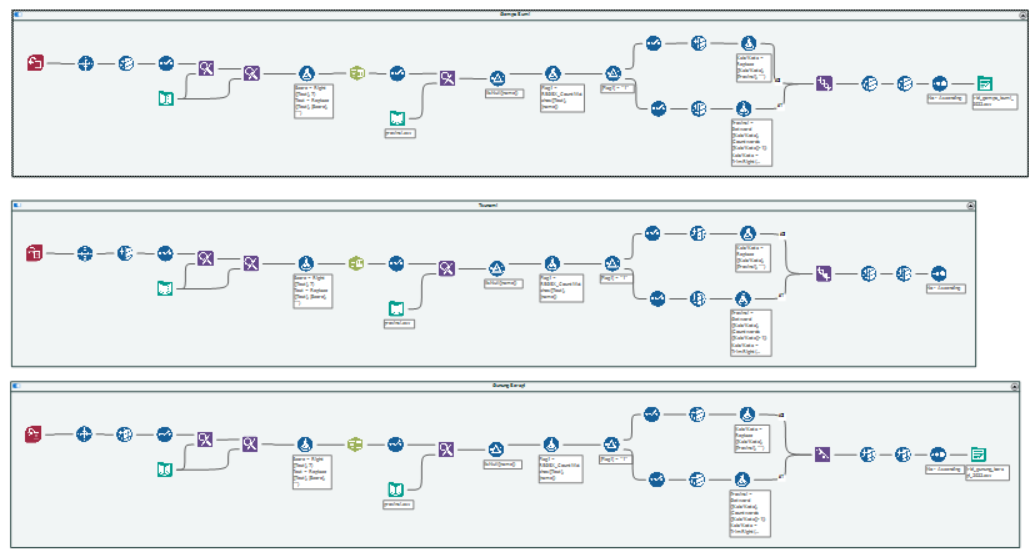
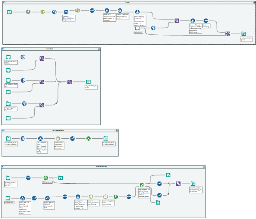
And this is all my workflow look likes.
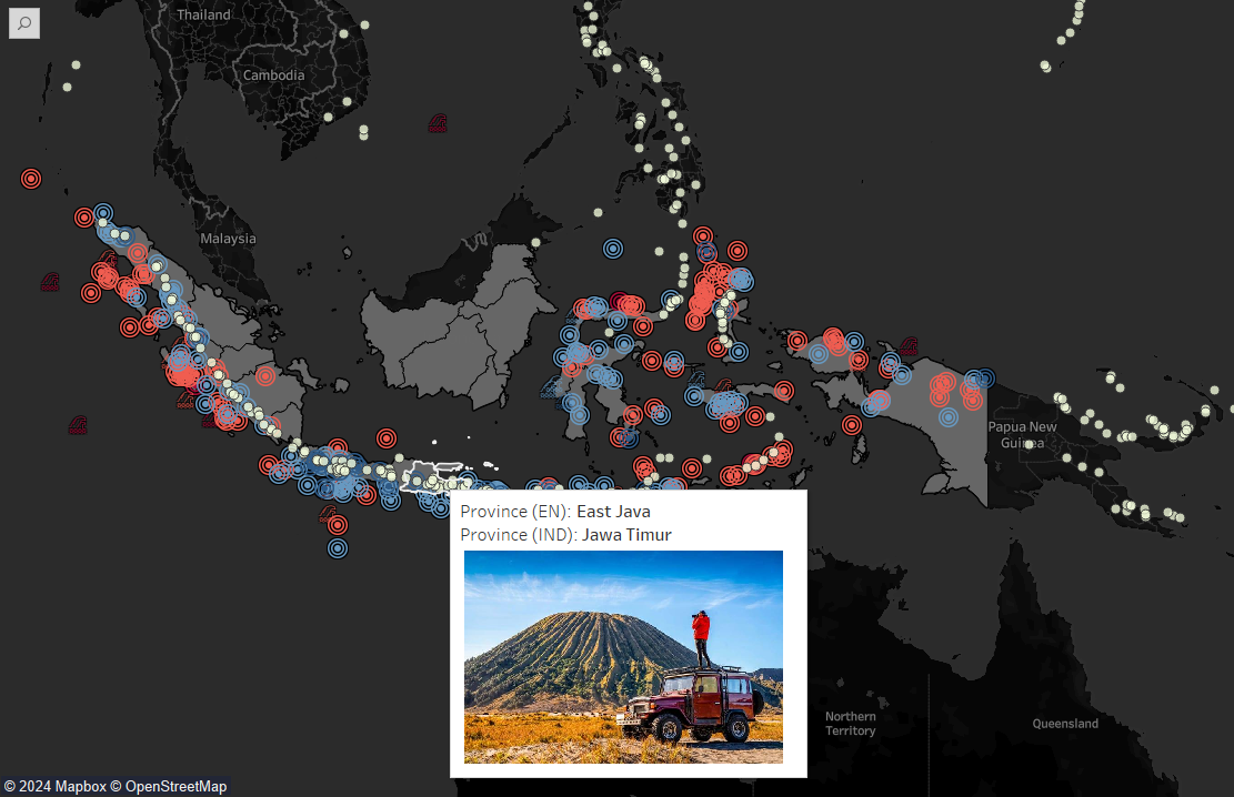
For the visualization, it was not that complicated. I implemented dynamic zone visibility and couple of dashboard actions.
Time flies very fast. Now, we are ready for placement!