


On the Week 11 Training, we have a task to do another business-like dashboard using Real World Fake Data (#RWFD). I selected the supply chain one (found here). My first intention was to explore network visualization as supply chain has very busy networks. One of the classical problem is “Traveling Salesman Problem (TSP)”. However, it was not possible with the data because it doesn’t have spatial data at all.
The second intention was to do inventory analysis. It was also limited as the data doesn’t have inventory traffic. Well, I only performed simple inventory analysis in the warehouse level which answer if the warehouse overstock or understock.
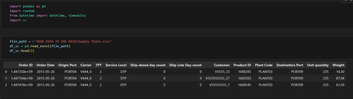
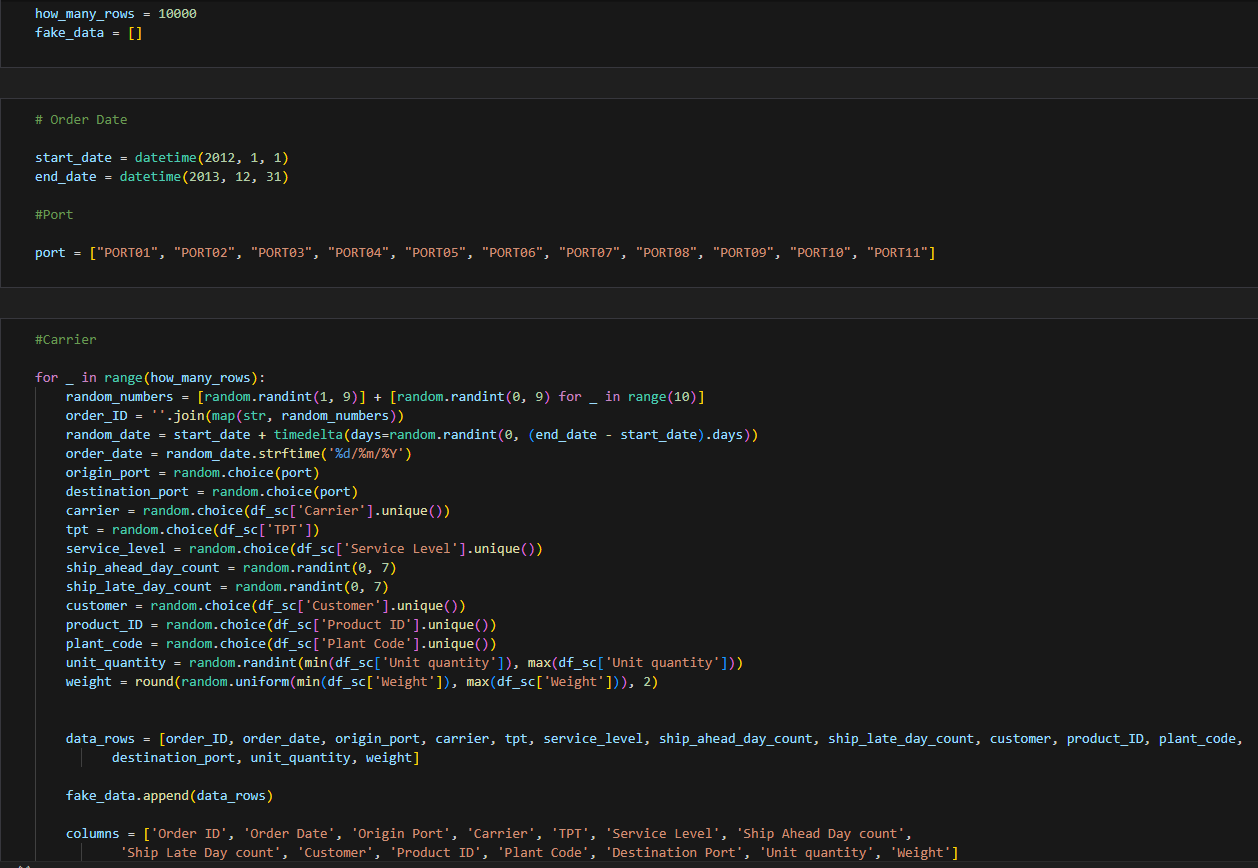
Lastly, I decided to focus on shipments analysis and visualization with one additional dashboard to visualize What-IF analysis. However, one big problem is that the data with 9215 records but only has one single order date. Yes, those 9215 records have one date: 26 May 2013. This of course will limit my analysis. So, what can I do? I generated my own fake data, instead.
I used python with pandas to generate 10,000 rows randomly and expand the date from 01 January 2012 – 31 December 2013. You can change how many rows you want to have there and modify some variables based on your data set. You can download the code here.
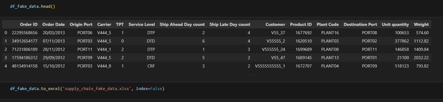
This is how the generated fake data looks like.
Hope it helps to un-limit your analysis 😊
Cheers,
Nuki