In Tableau, we can forecast values in a time series using simple drag-and-drop function. Tableau uses an exponential smoothing prediction model where it identifies consistent patterns within measurements that can be extended into upcoming time periods. To implement forecasting in our visualization we usually need a date field and at least a measure. However, Tableau can also create forecasting with a dimension field having integer values paired with at least a measure.
In this blog, we will explore how we can add a forecast in a time series and adjust some settings to meet our requirements in the visualization. We will be using Sample Superstore dataset for the demonstration.
Adding a forecast
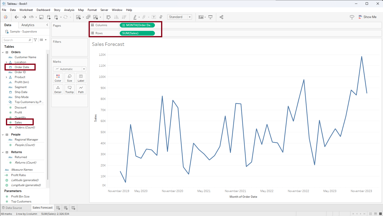
Step 1: Let's create a time series of sales by dragging the 'Sales' measure into the rows shelf and 'Order Date' into the columns shelf. Right-click on the 'Order Date' pill and select a continuous month. A time series of sales with continuous month intervals will be created in the view as shown below.
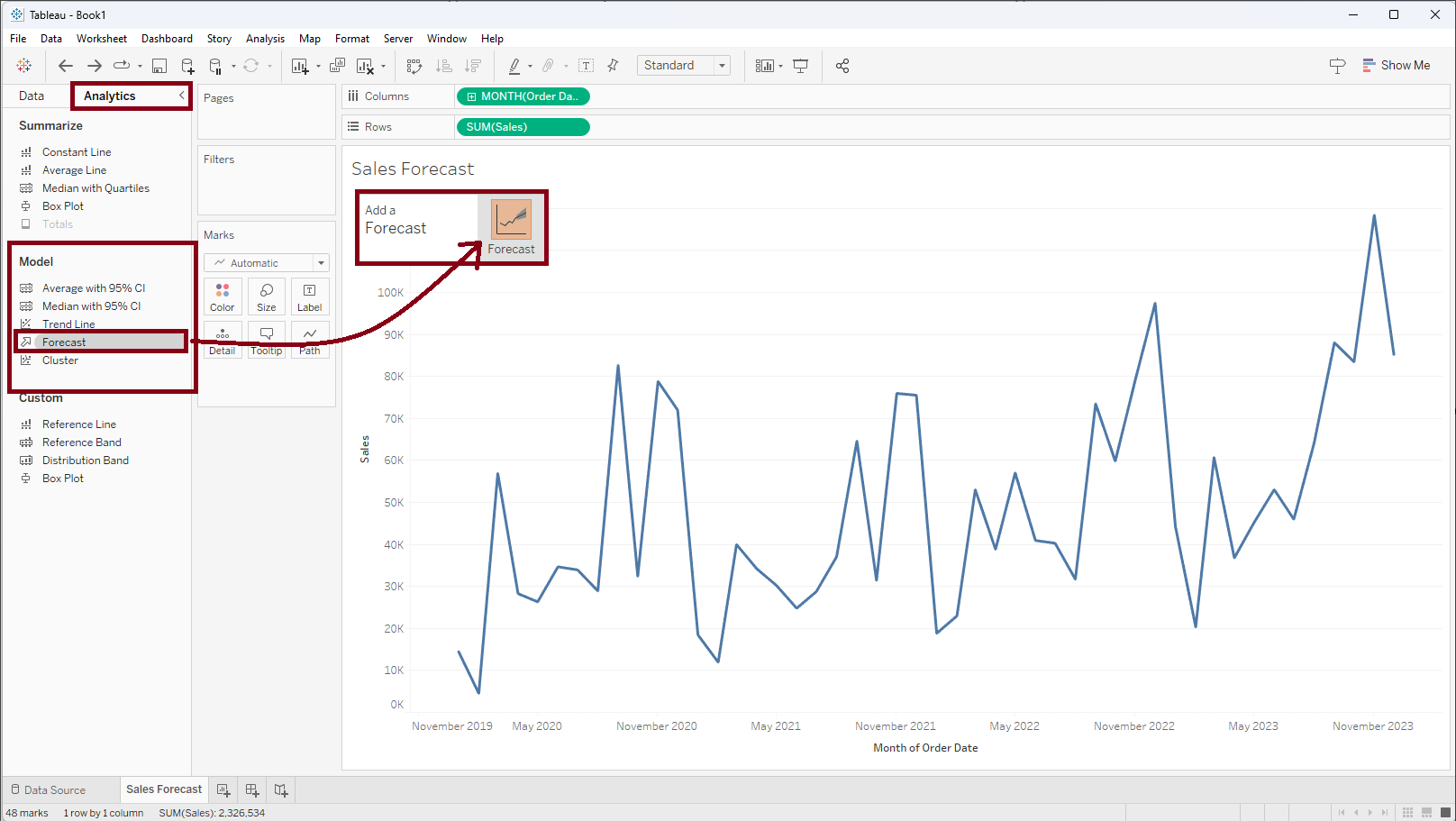
Step 2: Within the 'Model' segment of the 'Analytics' pane, choose 'Forecast,' then drag a it into the visualization area and drop it inside the forecast box, as shown in the screenshot below.
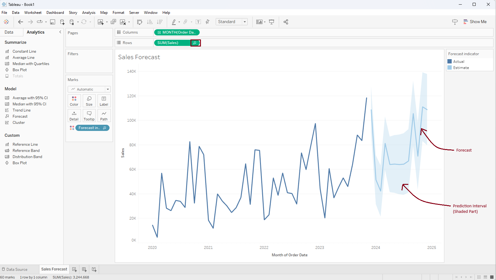
As a result, Tableau will automatically create forecast points for the time series. The shaded part above and below the forecast line is the prediction interval. The upward arrow inside the sum(sales) pill indicates that a forecast has been applied.
Forecast Model Information
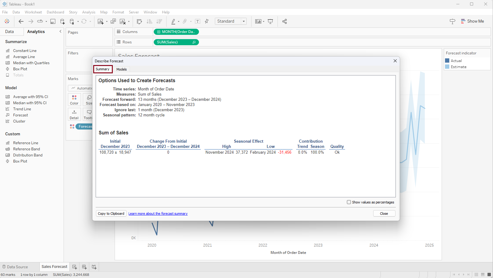
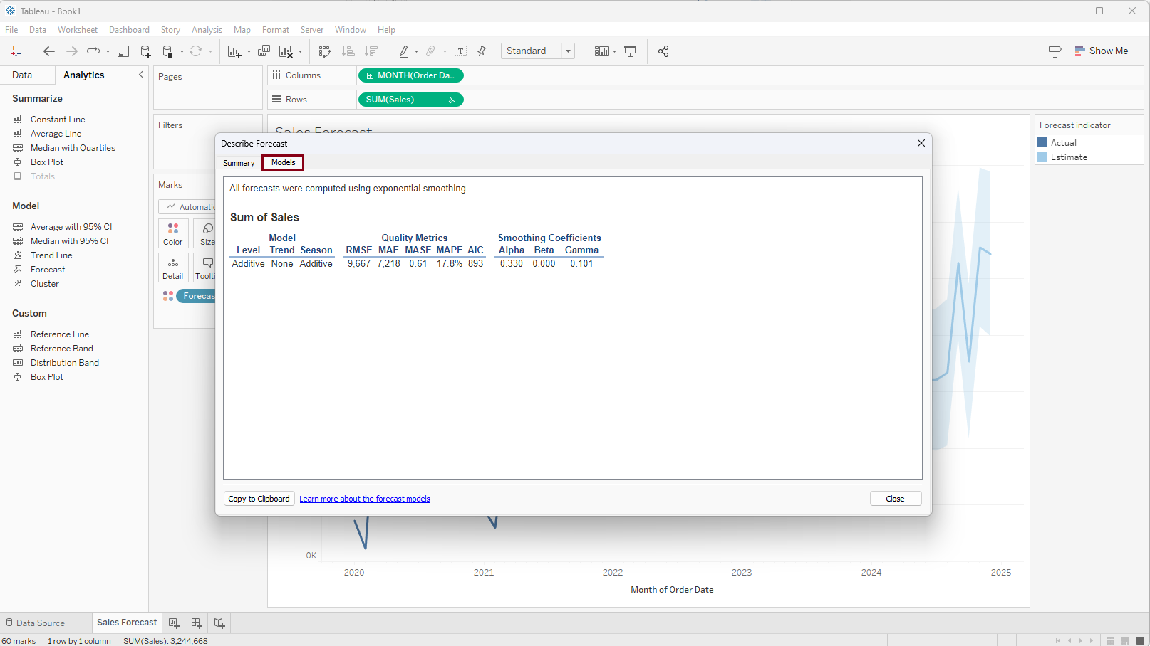
To get information on how the forecast was generated right click on any part of the view, select 'Forecast', and select 'Describe Forecast...'
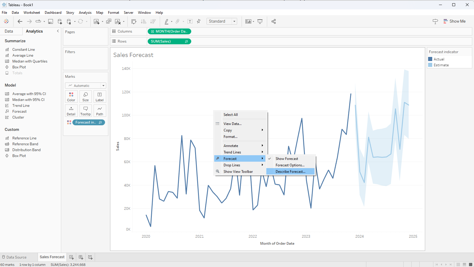
As a result, a 'Describe Forecast' window will appear where we have the opportunity to explore into the details utilized by this model through the 'Summary' and 'Model' tabs. This allows us to gain insights into the process behind generating the forecast.
Updating Model with Forecast Options
Tableau autonomously identifies the most suitable forecast model according to our data. However, we have the flexibility to modify certain details to fine-tune the model. To make adjustments, simply right-click on any segment of the visualization, select 'Forecast,' and then choose 'Forecast Options...' as shown in the screenshot below.
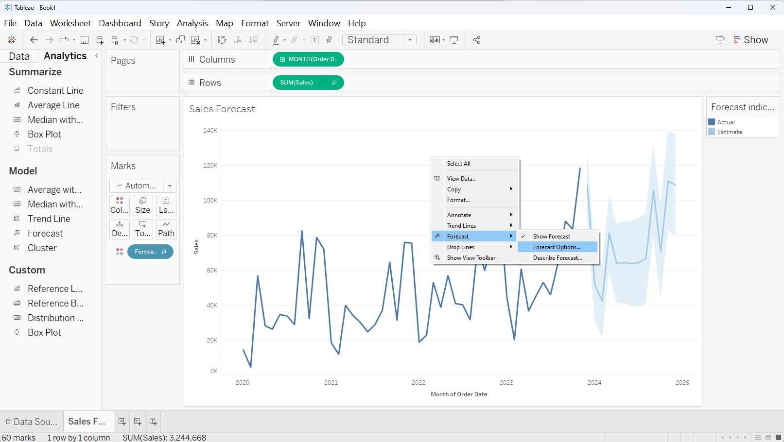
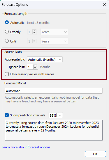
A 'Forecast Options' window will appear where we can make necessary adjustment. Let's discuss about the available option one by one.
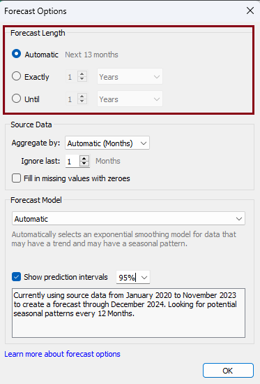
Forecast Length
Tableau automatically determines the forecast duration based on our data. Nonetheless, we can select 'Exact,' allowing us to manually input the precise number of time intervals for the forecast. Alternatively, we can opt for 'Until,' where we can input numeric values and a time unit to indicate the desired endpoint of the forecasted time period.
Source Data
Within the 'Source Data' segment, we have the ability to designate the time period for aggregation. By default, Tableau has excluded a single month from the model; however, we can modify this field as needed. Additionally, there's an option to mark 'Fill in missing values with zeroes,' to replace the missing values in the measure with zeroes.
Forecast Model
Under the 'Forecast Model' section we have an option to choose 'Custom' and update the 'Trend' and 'Seasonality'. The default value of the prediction interval is 95%, and we can choose or input that value as per our requirement. In addition, we can uncheck 'Show prediction intervals' to remove the shaded prediction interval portions from our visualization.

