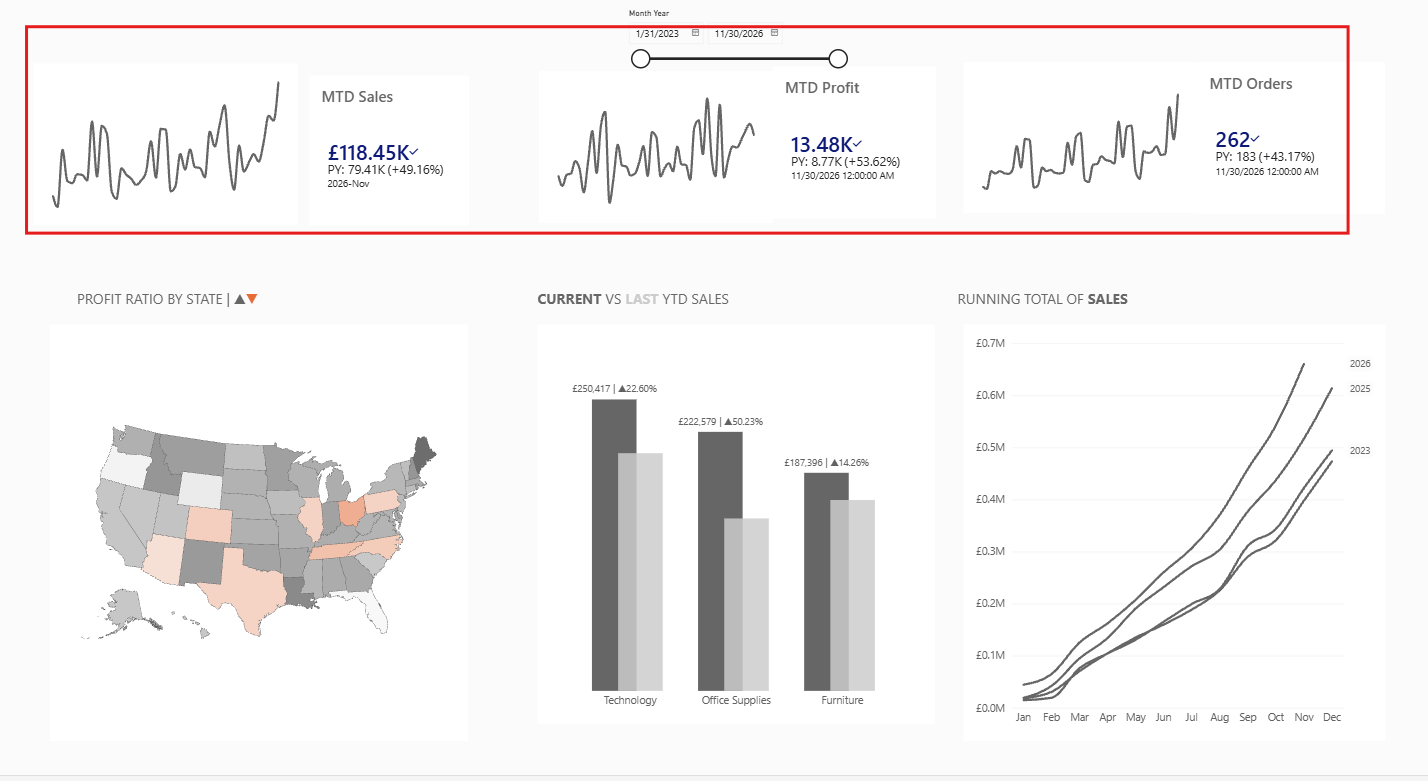
Here is a Dashboard, a recently made (A remake of Robbin Vernooij 's work), using the superstore data. In this blog I will discuss aspects which I thought were most interesting.
Embedding
You're probably wondering how you are viewing this dashboard right now? Luckily you are able to embed your dashboard into any website. I'll show you how to below.
1. When your dashboard is created, navigate to the 'publish' button within the home tab. Make sure any pages, that you do not want to be viewed are hidden. This will take you to the Power BI workspace
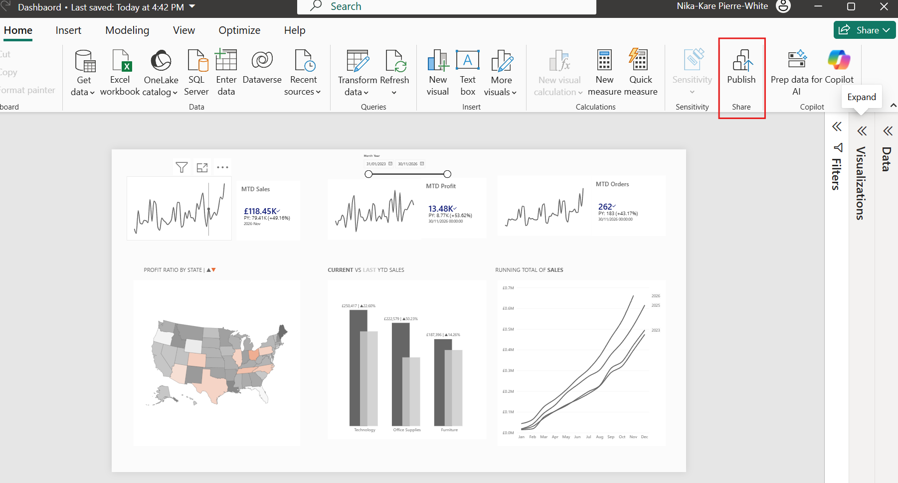
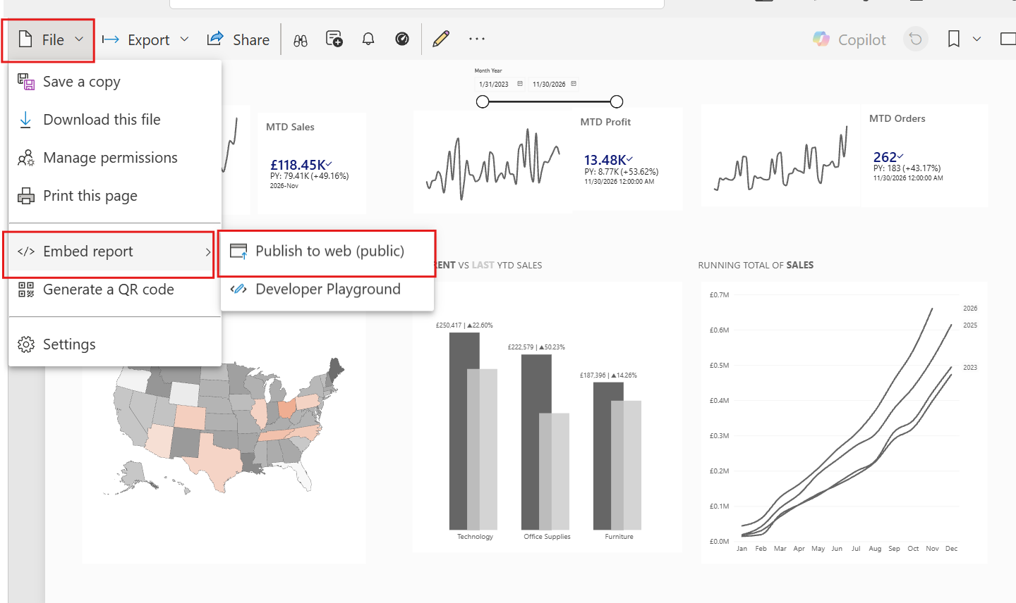
- Your page should look something like this. You then need to publish the dashboard by selecting file->Embed report-> Publish to public.
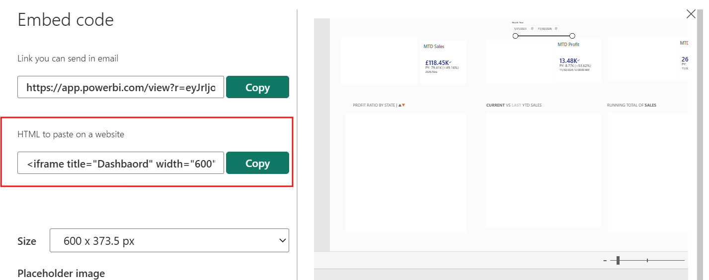
- You should be able to see this window. Here you can select the sharing link or the HTML code which can be pasted onto a website
Now you know how you are able to see the dashboard in front of you. I'll get into the interesting parts.
KPIs
Here I will discuss how I got the KPIs to look as they do.
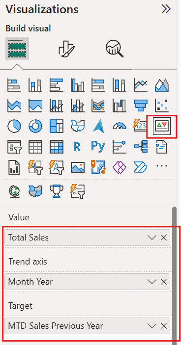
- Visualisation- Insert the KPI visualisation and insert your value, trend axis (usually a date e.g. month, year and target value of choice)
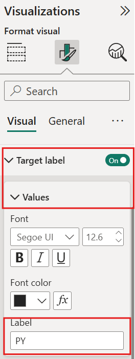
- Formatting Text- In order to change the text in front of the target, navigate to Target label under the visual tab, ensure the toggle is on and customise the text. Ensure that the date toggle is on also, so that it appears in the KPI.

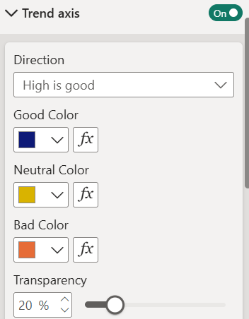
- Formatting Colour- In this dashboard the colour of the KPI value changed depending on if it is positive or negative. To do this navigate to trend axis under the visual formatting, turn the toggle on and alter the colours. You will notice a trend line appear on the KPI, simply turn the toggle off and colour formatting will remain active.
Overlapping Bar Charts
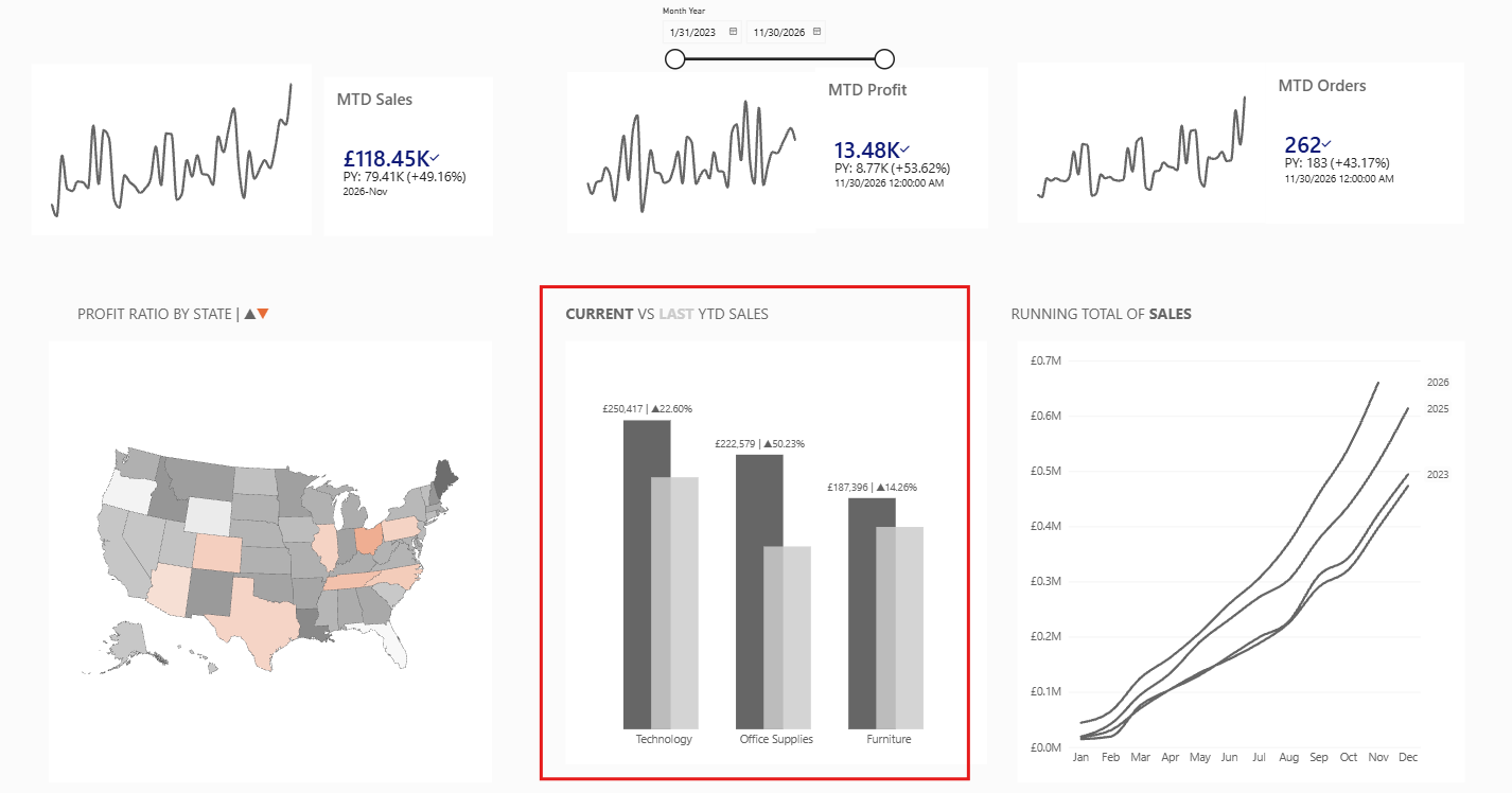
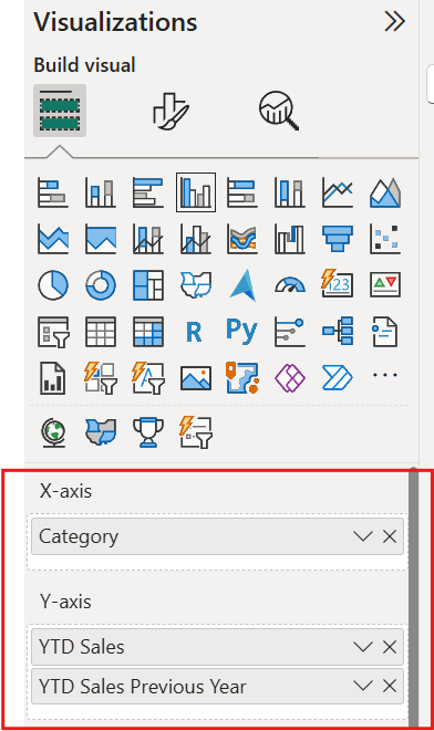
- Visualisation- Inset the 'clustered column chart', and add the desired fields to the x and y axis.
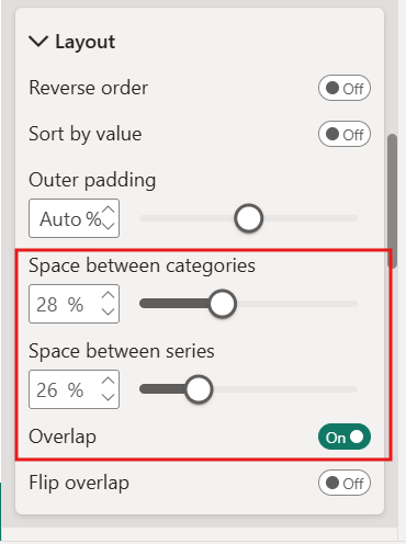
- Formatting- In order to have the bars overlap, navigate to the layout tab under 'format your visual' and ensure that the overlap toggle is on. And alter the space between categories and series to your liking.
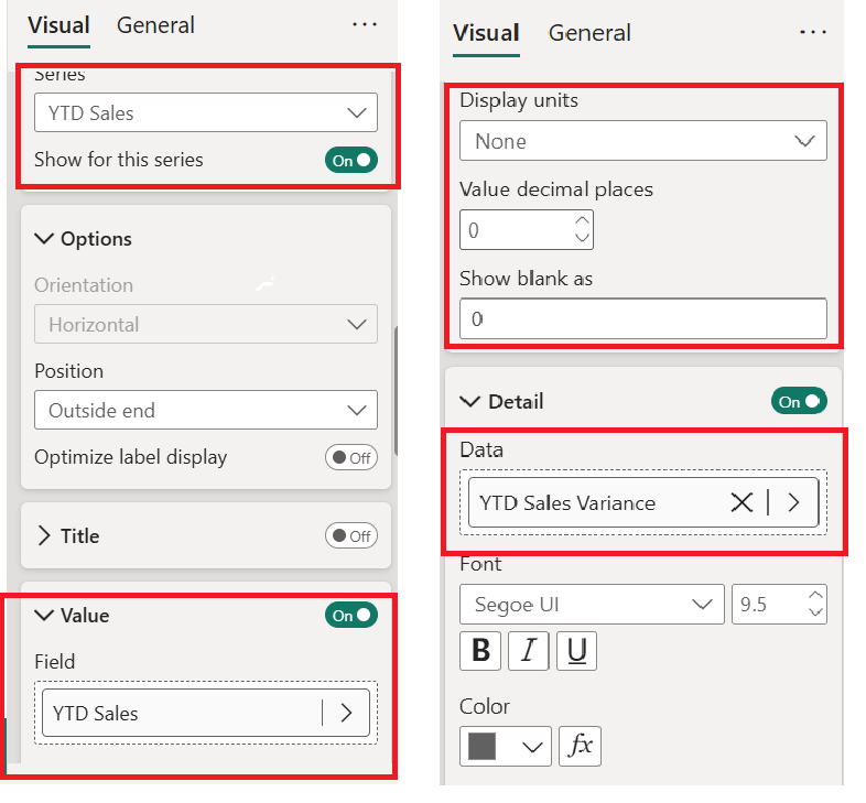
2.Label- Navigate to value, and add the desired field. Ensure the display settings are as shown to the right. In order to get other values on the label, add them to the details card.