


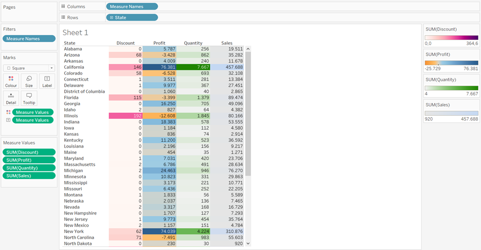
Highlight tables and heatmaps help people to read the information more effectively because the texts stand out with different colors. On the photo is a simple example of superstore table with 4 measures (Discount, Profit, Quantity and Sales) for each state.

However, sometimes it is not best practice to have only one color legend for all your measure values, because the numbers are on different scales. This blog show you a one-minute-trick to separate the color legends for measure values.
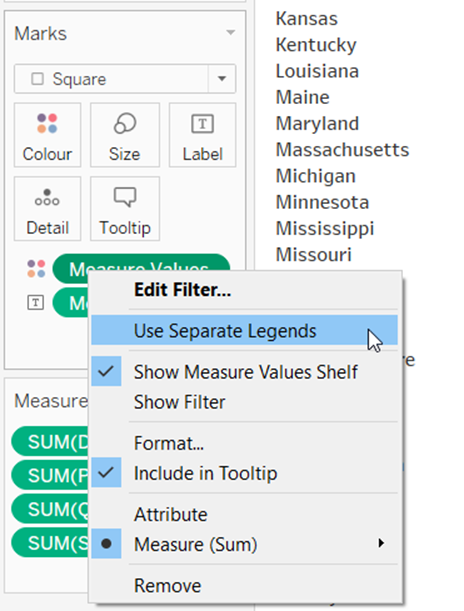
On Marks Card, click on Colors for Measure Values (see photo). Choose Use Separate Legends.
Now note that you have now 4 separated color legends on the right hand side. Change the colors the way you wanted it to be.
And done! Now you have seperated color legends!