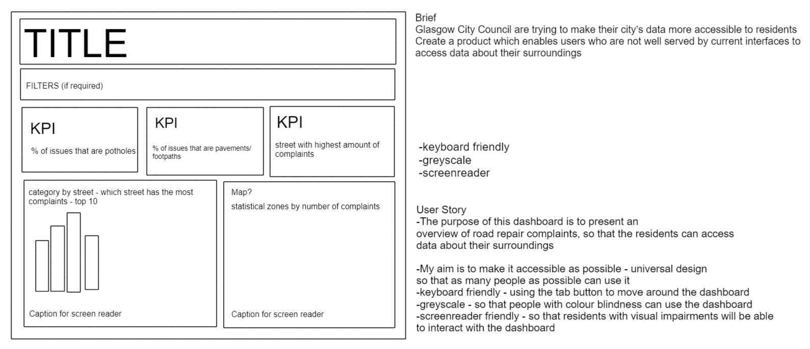
For the first day of dashboard week, we had to make a dashboard that meets accessibility requirements. I aimed to create a dashboard focused on universal design so that it would be accessible to as many people as possible. However, I did want to ensure that the dashboard was keyboard friendly for people who struggle with their fine motor skills, and suitable for people with visual impairments (using a greyscale colour palette and is screen reader friendly).
Firstly, I created a plan for how the day would go. This was so that I would stick to these times to ensure I completed all the work required in the time we were given. I then created a plan for the dataset which involved data exploration and time set aside for any data prep required (I used Tableau Prep). Once the data prep was completed, I created my user story and drew out a plan for how my dashboard would look. I wanted to keep my dashboard simple to make it easy to navigate when using the 'tab' key. My final dashboard ended up looking slightly different to my Excalidraw; it contained a few more elements than what I originally planned out.
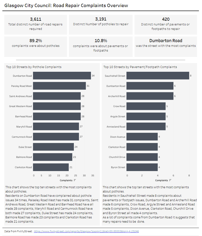
Below is the dashboard I created. I added 3 more KPIs and instead of doing a map I created another bar chart which split up complaints by potholes and pavements/footpaths. I did this to convey the overall story within in the dataset; the top row of KPIs show how many potholes/pavements/footpaths need to be fixed whilst the bottom row of KPIs are focused on the number of complaints.
The 2 charts in the middle show the top 10 streets with the highest number of complaints (split by potholes and pavements/footpaths). The whole dashboard is in greyscale so that people with colour-blindless will still be able to utilise the dashboard. The charts have been captioned in 'everyday' diction so that when the screen reader is moving through the dashboard, the text flows like real speech.
However, as part of my feedback, the mark labels on the charts needed to be larger to make them easier to see and I needed to be consistent with my diction (i.e. the top row of KPIs do not read as smoothly as the chart captions).
Below is the link to the data source.
I tested my dashboard using the windows narrator which read out all the captions required, and my dashboard passed the test I did using the colour contrast checker and colour blindness checker. It is also keyboard friendly - the tab key moves to the top KPIs from left to right, the bottom KPIs from left to right, then the left chart, right chart and the link to the dataset. As a result, I felt that I had met the requirements for today.
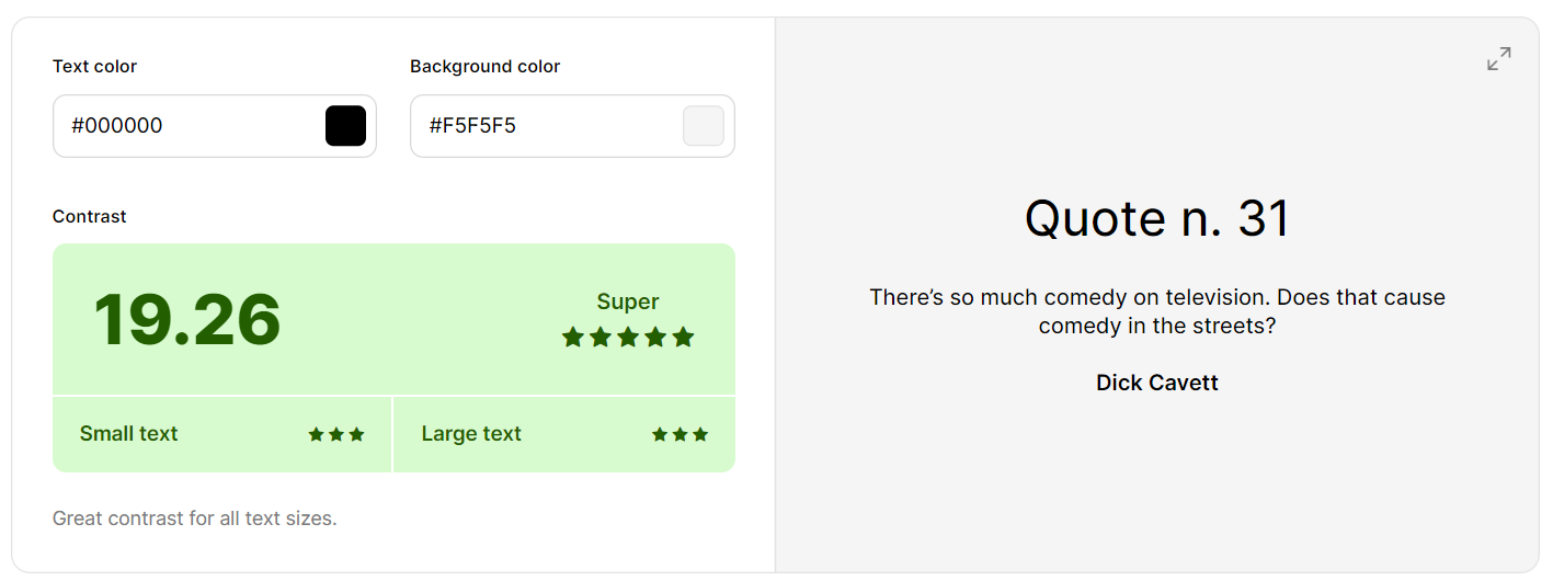
My dashboard was checked using this Colour Contrast Checker.
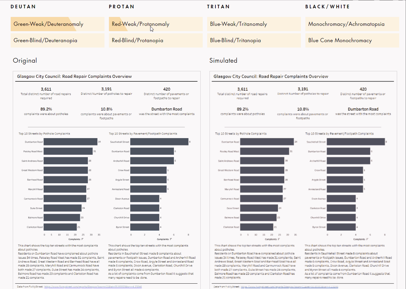
I also checked my dashboard with a colour-blindness checker to ensure it could still be seen well against the variety of colour blindness people may have.
One thing I have learnt that I will continue to take forward this week is creating a detailed plan of how the day will go before I start looking at the data/creating the dashboard. It really helped ensure that I was on time and kept me focused on the task at hand.