


Containers: you either love them or hate them.
The task was to search for a dashboard that we liked the design of and match the colours and containers (we didn't need to recreate the content of the chart).
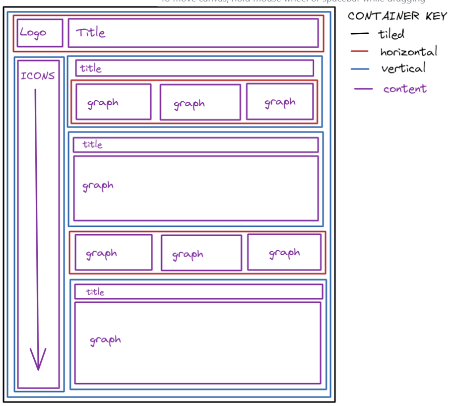
Below is an image of the containers I needed to use to recreate the dashboard I found. Drawing out the skeleton of the dashboard really helped as containers can be confusing if you don't know where to start. Excalidraw is a great app to use!
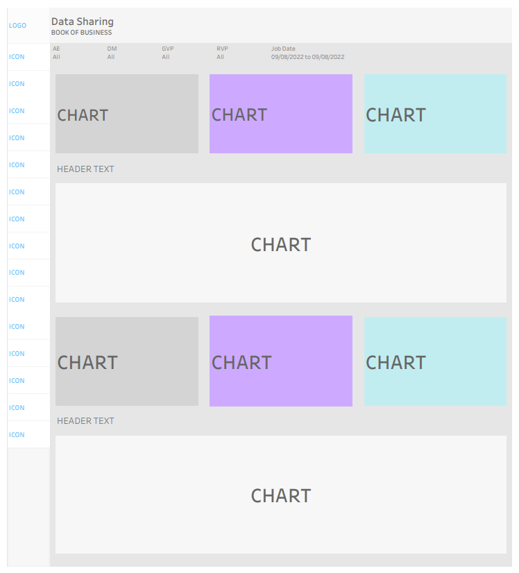
Below is an image of the dashboard I recreated, matched with colours and containers.
As there were many elements and charts within the dashboard, it was a little tough knowing where to start. However, I found the best thing was to just split the dashboard up into sections and tackle each part. I find that containers get easier to use once more elements are present on the dashboard because you can see where everything is in relation to each other, as opposed to having an empty space.
Using padding was also a great tool to manipulate the way the elements in the dashboard looked, and allowed me to recreate the dashboard closely. I enjoyed that task and it is definitely something I will think about and use when creating and designing my own dashboards.