


Creating dashboards to be accessible for colour blind people spans wider than avoiding using red and green together. There are a range of colour blindness variations to consider (this is something that I learned today):
Red-Green colour blind: difficulty in distinguishing between red and green.
Blue-Yellow colour blind: trouble distiguishing between blue and green and also distinguishing between red and yellow.
Monochromatic: individuals see no colour at all.
For more information about the different types of colour blindness check out the link below:
 Rob Woods
Two useful sites I used to test if my colour choices were distinguishable for most/all colour blindnesses were:
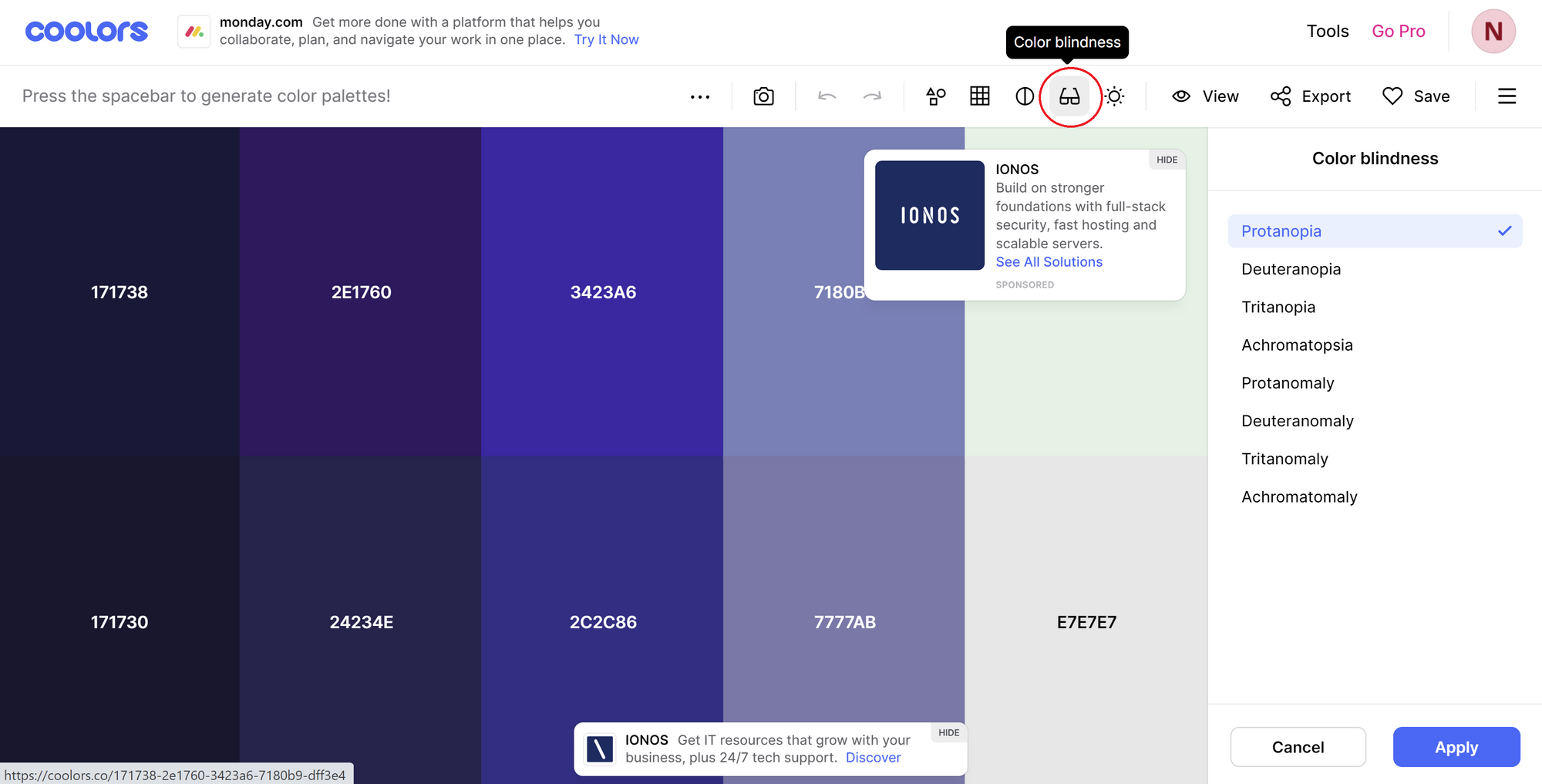
Coolors - a website that allows you to generate colour pallettes. It also has a feature that allows you to view the colours you have selected under different colour blindness filters:
CV Simulator - a mobile app that acts in a similar way to Coolors. Using your mobiles back camera to capture your work, it will show you what your work will look like with different variations of colour blindness.
In the end I found that these 4 colours together were fairly easy to distinguish across all colour blindness variations:
#81b0d0
#e3a960
#d14e41
#343332