


The general purpose of a "slicer" in PowerBI is to filter out information. However, with a little bit of DAX, we can use a single slider to not only filter our information but highlight it too! This blog will provide a brief how-to guide on building out this slider.
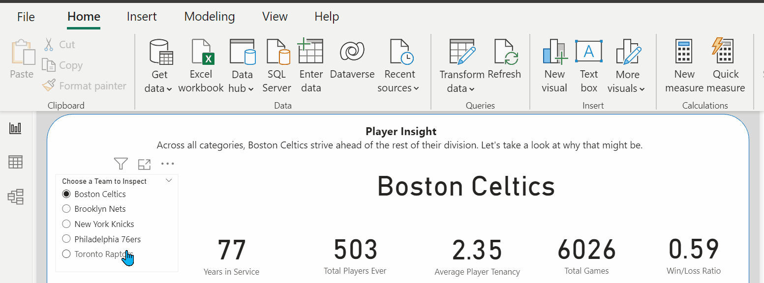
Let's look at what our final output could look like:
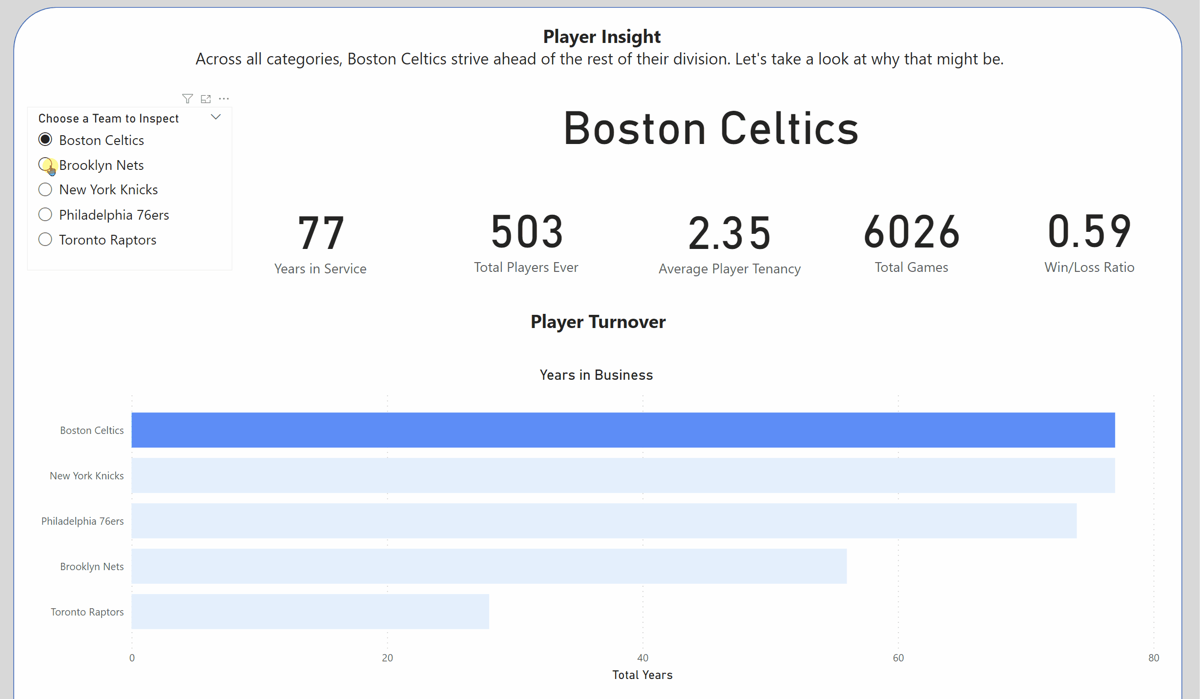
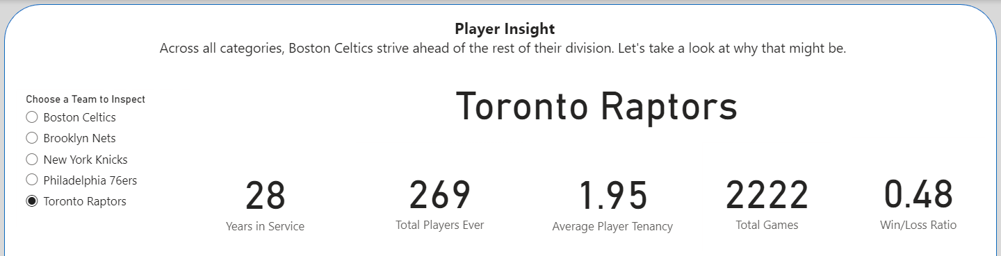
Here, we can see both the KPIs/BANs updating to the selected filter on the slicer, but also the chart's bars changing colors.
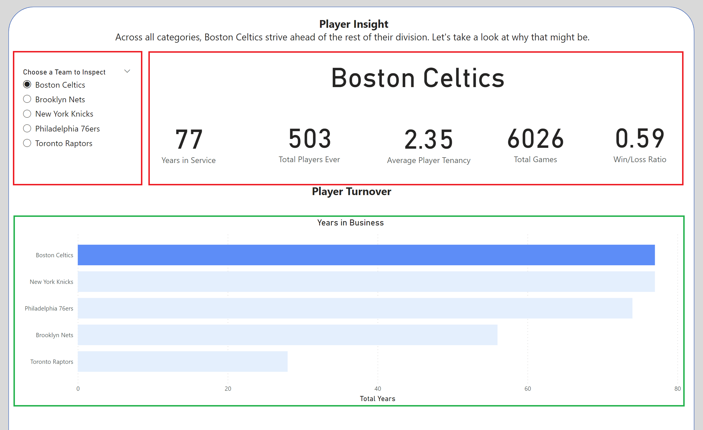
This blog will split into two sections, the first (sectioned off in red below), quickly discusses how to build the slicer, and filter selected values. The second section (boxed off in green below) discusses how to use the same slicer to also highlight data within a visualisation.
Section 1: Filtering
This how-to guide will split building the above dashboard into two sections. The first part will explore building the first half of the interaction, building the slider to affect a collection of BANs or KPIs.
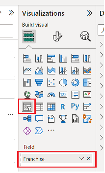
First, import the charts that you wish to filter by selecting a chart type from the visualisation panel, and selecting the measures and values they are to present.
Secondly, we need to input the slicer, also found within the visualisation panel - and within the "Field", place the value that you wish to filter on. The presentation of the slicer can be changed within the "format panel".
To choose which charts the slicer interacts with, select the slicer, and then within the ribbon at the top of the page, navigate to the "Format" tab. Within the format tab, select the "Edit Interactions" option. This will open up options for each of the charts on your page. Click on the circle to disallow filtering on the selected chart, or click on the bar chart to allow filtering.
Section 2: Highlighting
Now to highlight a separate selection of visualizations.
- First, we need to duplicate our data table
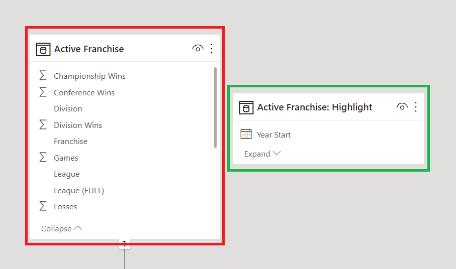
Our first data table allows the filtering of the KPI and the creation of the slider. The second data table, denoted with the "Highlight" naming convention will allow for the highlighting of the other charts we decide to make.
As you can see, the second table has no connections to the original table or other tables. This allows it to stand independent of other data.
2. Next, we create the visualization that we intend to highlight using the duplicated data set, such as the bar chart created in the above example.
3. With our new data set, we will need to create a new measure, with a small amount of DAX, which we can call "highlight". It will adhere to the following format:

Text below:
Highlight =
VAR SelectedFranchise =
ALLSELECTED ( 'Active Franchise'[Franchise] ))
RETURN
IF (
ISCROSSFILTERED ( 'Active Franchise'[Franchise]),
IF ( MAX ( 'Active Franchise: Highlight'[Franchise] ) IN SelectedFranchise, 1, 0 ),
0)
)
To break down how this works, the variable ‘SelectedFranchise’ captures the value selected in the slicer. If the value selected from the slicer matches the name of the franchise in our visualizations, then the value 1 (one) is returned, else a 0 (zero) is returned. If there is no selection from the slicer, the measure will return 0 (zero).
4. Using this Boolean result, we can apply conditional formatting to the colours of our visualisation.
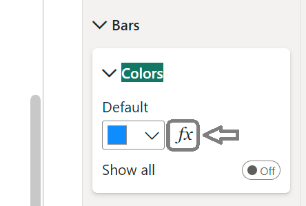
Within the format tab, navigate to the marks colors option, and select the "fx" box, allowing the application of conditional formatting to your visualizations color. This will open the following window:
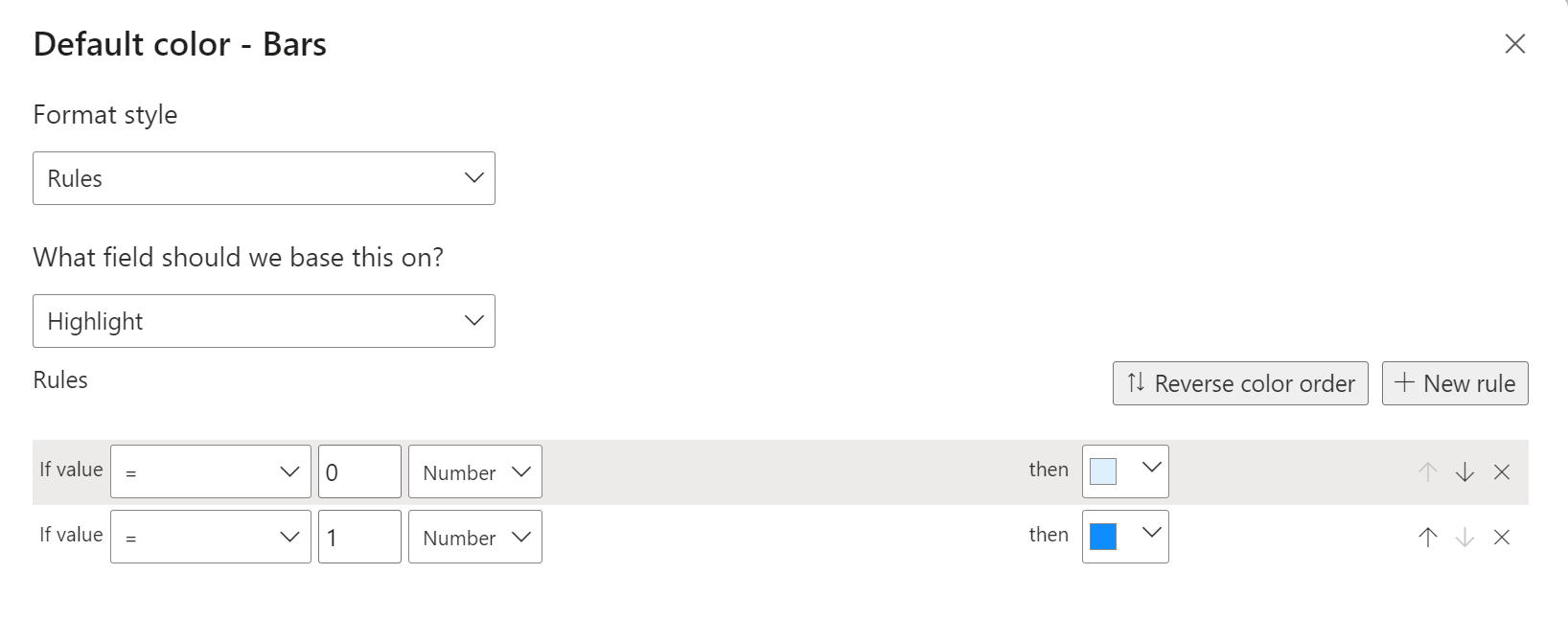
Select the newly created "highlight" measure as the field to base the rule on and set up the color options for your zero and one results.
Your slicer should now work as both a filter and highlighter.