


Dashboard week is a 5-day challenge, each day confronted with a new data set, either given straight out or directed to where to build or capture it from, before investigating and presenting the data in a series of visualizations.
Today's task, laid out in our Coach, Lorna's, recent blog post - is to take one of Season 2's Real World Fake Data (#RWFD), which is based on Tableau's Accelerators. Each topic has a list of questions you should aim to answer. As part of being a good analyst or consultant, you need to be able to answer questions with the data, and/or come up with new data required to better answer the questions.
With a background in finance, I chose the Financial Overview (Data) task, answering a series of questions through a dashboard (or dashboards).
The Plan
I started out sketching my ideas in Excalidraw, with only a few hours on the project, I knew there was high value in designing a dashboard as if I, hypothetically, had all the time in the world. This would allow me to talk about future iterations, and what I would like to do with more data.
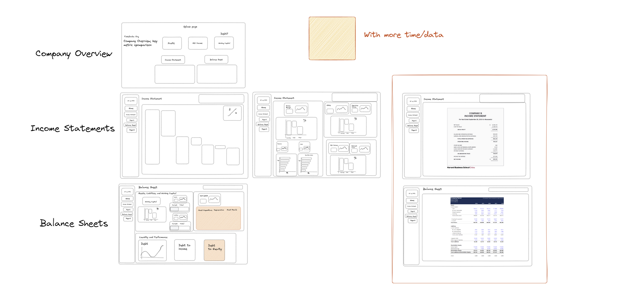
Here I have laid out several levels of my dashboard design. The first layer, allows for an executive summary (company overview) on each of the 5 companies in the data set. The second layer, income statements, was planned to have an overview page, a details page, and finally, a reporting page, that would allow for the export of a reporting ready document. Similarly, the balance sheet would have a details page and reporting page. From the get-go, I knew the reporting page would have to be a future iteration, but thought it would be good to include it here as well.
The Data
On first interaction, I saw that the data had been aggregated to quite a high level, and this would cause some issues with how granular I had planned the dashboard. However, overall, it was very easy to work with.
With time constraints, I was unable to do the current year vs. the previous year within the dashboard, which was my initial hope, however, the calculations required to build such a view have been created.
The Final Design
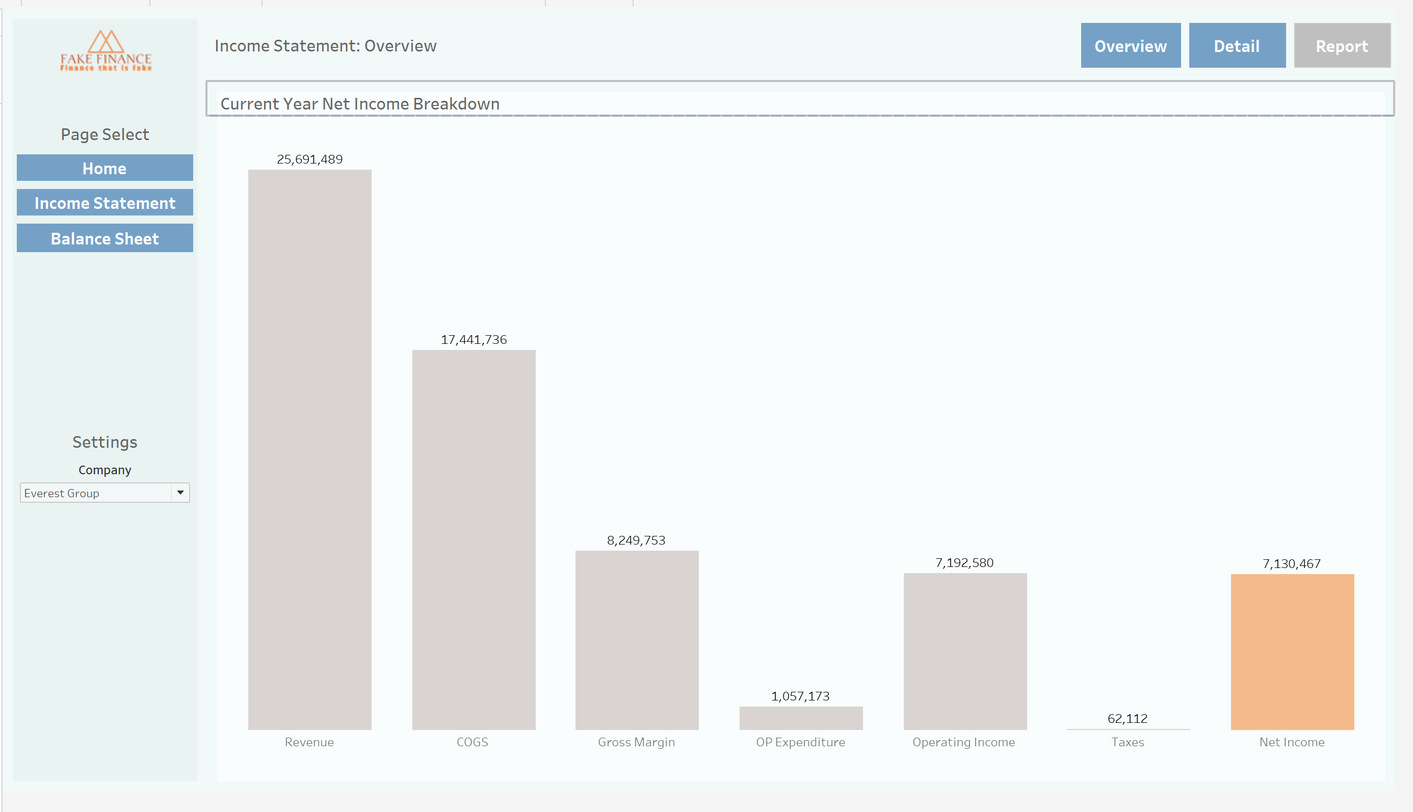
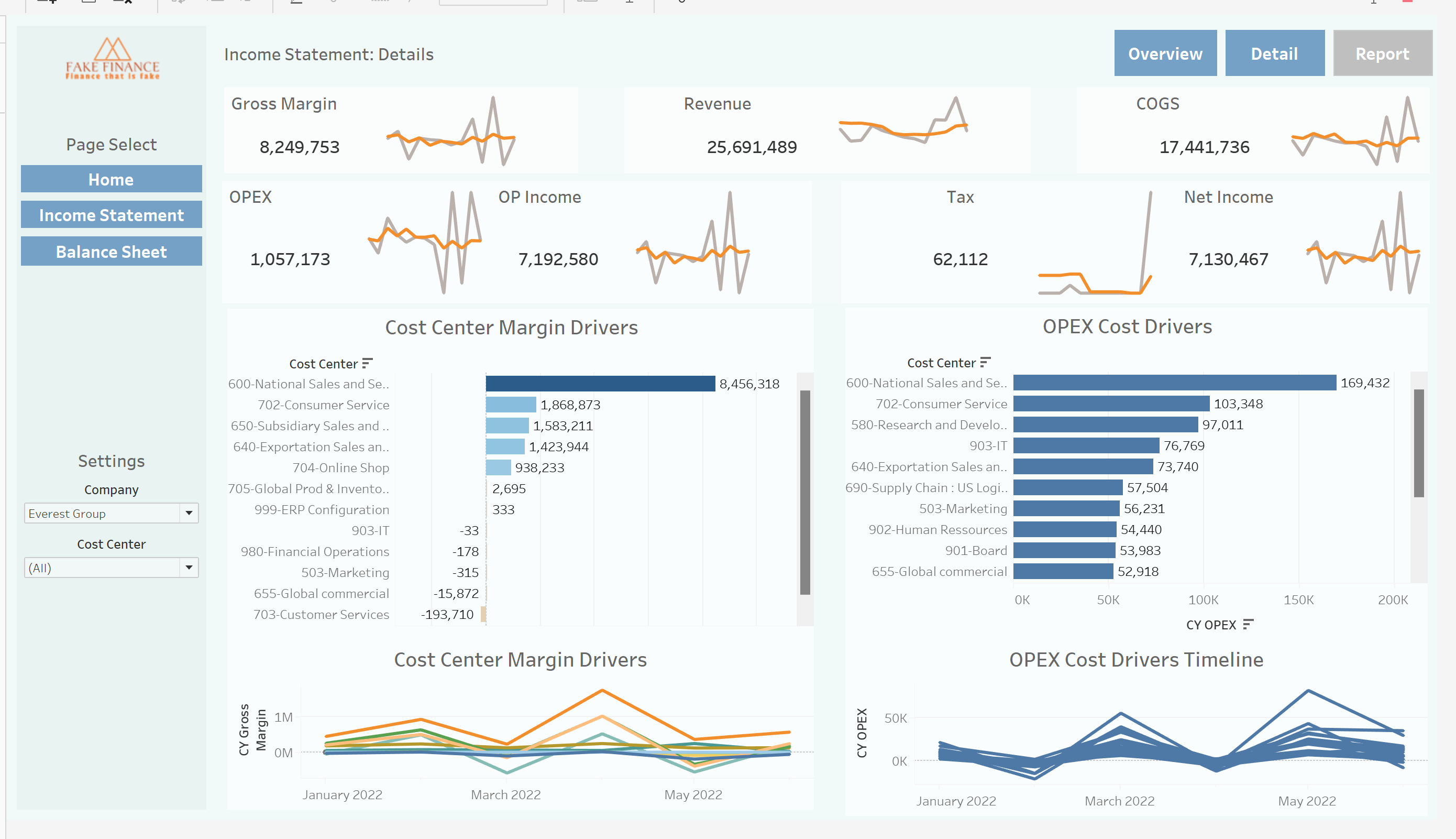
With the time constraints, I was able to create the initial landing page for executive overview, as well as the details pages for both the Income statement and balance sheet view. I was also able to create the overview sheet for the income statement as well, however, found it difficult/impossible to create a waterfall chart with multiple measures.
below are the pages:
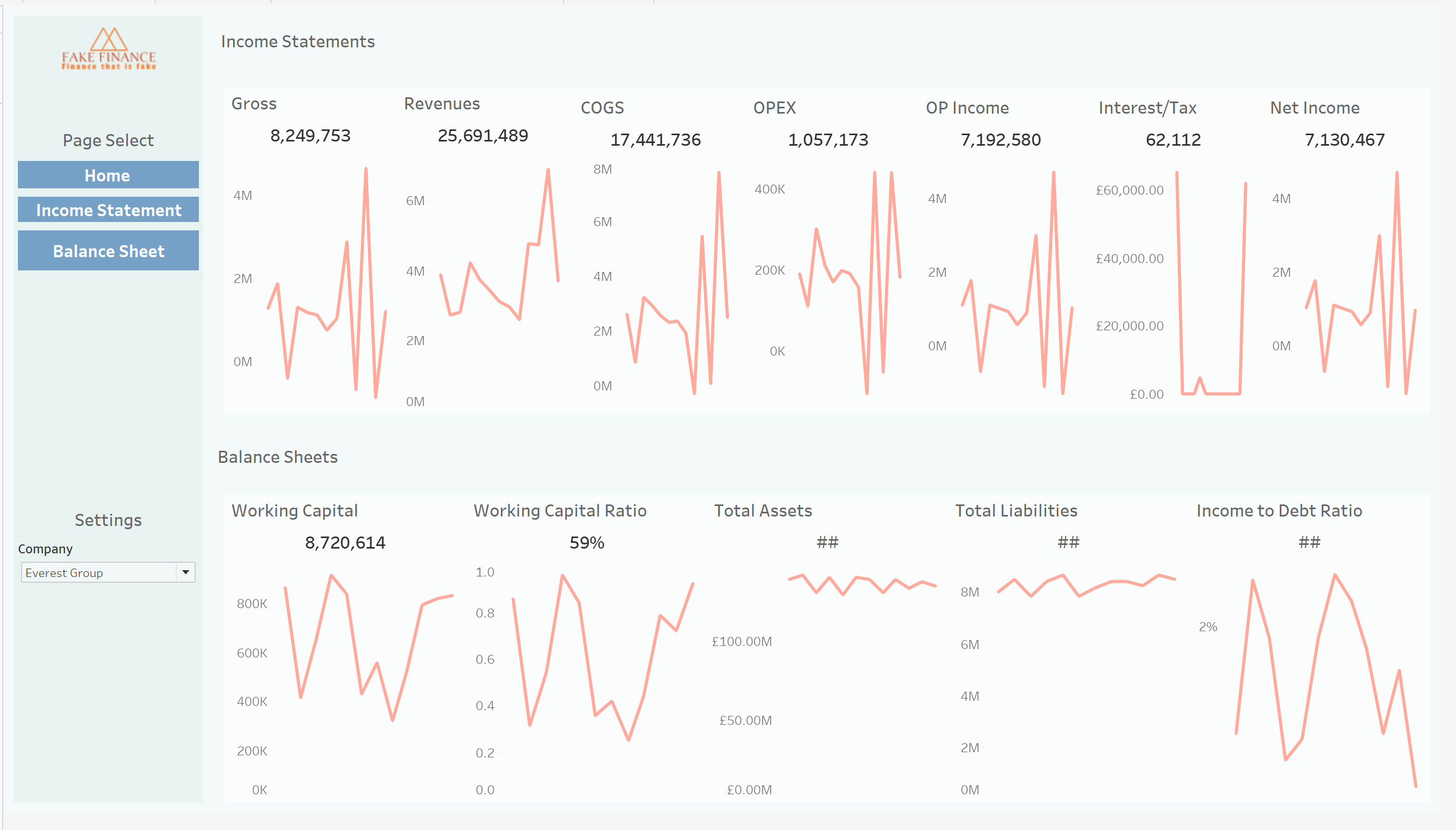
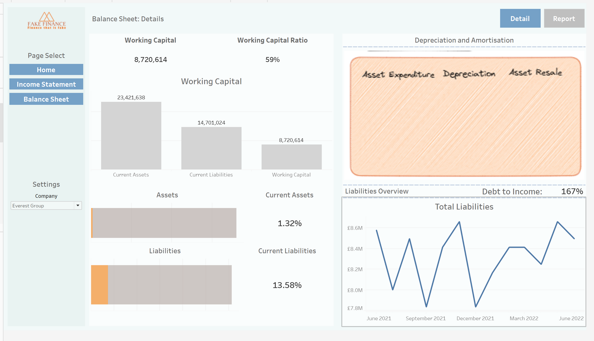
These dashboards are still very much a work in progress and would require a level of fine-tuning and clean-up before being placed into production. However, we are able to still capture some important information.
We can see on the last page, that the debt-to-income ratio is 167%, here I have used current liabilities to encapsulate debt, as no debt column was issued. Most companies would be worried about this high level of deviation.
Additionally, the working capital ratio is at 59%, where most companies prefer it to be in the region of 120%.