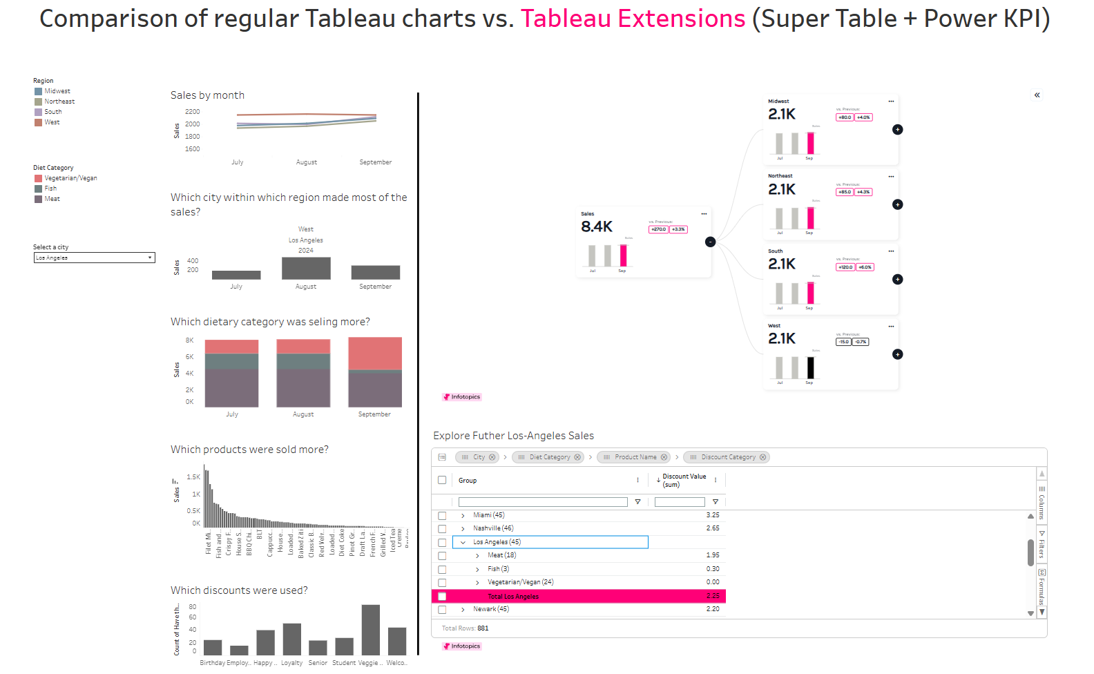
One of the biggest challenges with traditional Tableau dashboards is balancing high-level insights with detailed analysis. While charts are excellent for spotting trends, users often need to ask follow-up questions that require navigating between multiple worksheets or dashboards.
This is where Infotopics Tableau Extensions stand out. Two of the most powerful extensions are Power KPI and Super Tables, and when used together, they create an interactive analytical experience that goes far beyond standard Tableau visualizations.
The comparison below highlights the difference between a traditional Tableau dashboard and a dashboard powered by Infotopics extensions (with a practical example below).
Traditional Tableau Dashboard vs. Tableau Extensions
The left side of the dashboard uses regular Tableau charts:
- A line chart showing monthly sales
- Bar charts comparing cities and meals
- Stacked chart for diet categories
- Filters for selecting cities/regions
While this provides valuable insights, answering detailed business questions often requires switching between multiple charts and manually connecting the information.
On the right side, the same data is presented using Power KPI and Super Tables, creating a much more intuitive exploration experience.
Power KPI: Tell the Story Before Showing the Details
Power KPI transforms traditional KPI cards into an interactive hierarchy.
Instead of displaying a single number, it allows users to progressively drill through business dimensions.
For example, in my dashboard:
- Total Sales
- → Sales by Region
- → Sales by State
- → Sales by City
Each KPI card also displays the sales for the last three months, along with comparisons against previous values. Rather than opening multiple worksheets, users simply click through the hierarchy to understand where sales are increasing or declining.
This creates a natural analytical flow:
Total Sales → Region → State → City
Instead of forcing users to search for information, Power KPI guides them directly to the area that requires attention.
Super Tables: Drill Down Beyond the KPI
Finding the right city is only the beginning.
Once a city is identified in the Power KPI hierarchy, Super Tables allows users to investigate why the numbers look the way they do.
For example, after drilling down to Los Angeles, Super Tables lets me explore:
- Which diet category generated the highest sales
- Which products sold the most
- Whether those products were sold with or without discounts
- Discount values for individual products
- Hierarchical product-level details without creating additional worksheets
Instead of building several separate charts and drill-through dashboards, everything is available in a single interactive table.
This dramatically simplifies root-cause analysis.
A Real-World Example
Imagine the KPI shows that Los Angeles recorded the highest sales for September.
With a traditional Tableau dashboard, the next questions require jumping between different charts:
- Which diet category performed best?
- Which products contributed the most?
- Were discounts responsible for the increase?
- Which individual items drove the sales?
Using Super Tables, all of these questions can be answered in one place.
You simply expand the hierarchy:
Los Angeles ↓Diet Category ↓Product ↓Discount InformationThe entire analytical journey happens inside one interactive table instead of across multiple worksheets.
Why This Combination Works So Well
Power KPI and Super Tables complement each other perfectly.
Power KPI answers:
- Where is the problem?
- Which region, state, or city should I investigate?
Super Tables answers:
- Why did it happen?
- Which category contributed the most?
- Which products drove sales?
- Were discounts involved?
One extension identifies the area of interest, while the other provides the detailed explanation.
Benefits Over Traditional Tableau Charts
Using these extensions offers several advantages:
- Fewer dashboards to build and maintain
- Faster drill-down from summary to detail
- Reduced visual clutter
- Interactive hierarchical exploration
- Business-friendly interface that requires fewer clicks
- Better decision-making by connecting KPIs directly with detailed transactional data
Instead of creating numerous worksheets for every level of analysis, users can explore data naturally through a guided workflow.